
Brand kit examples: what the best ones get right?
 Jul 30,2026
Type “brand kit examples” into Google and you’ll get a wall of Pinterest boards, Canva tutorials, and roundups that show you a Netflix logo next to a Spotify color palette and call it a day. None of it tells you why those kits work, or what to actually do with that information when you’re the one building a brand from scratch.
A brand kit isn’t a mood board. It’s the operating system for everything your company puts out into the world: your logo, your colors, your type, your voice, and the rules that keep all of it consistent when five different people are making five different assets under deadline pressure. The examples worth studying are the ones that hold up under that pressure. This article walks through what a real brand kit contains, which examples are worth your time, and how to tell the difference between a kit that looks good on a slide and one that actually works in production.
What goes into a brand kit?
A brand kit is the compressed version of your brand identity: the files and rules a designer, a freelancer, or a new hire needs to produce anything on-brand without asking you a single question. At minimum, that means your logo suite (primary mark, icon-only version, horizontal and stacked lockups), your color palette with exact hex and Pantone values, your typography system for headlines and body text, and a short set of usage rules covering spacing, sizing, and what not to do with the logo.
The good kits go further. They include a voice and tone guide, a photography or illustration style, and sometimes a social media template set so nobody’s improvising a new look every time a post goes out. That’s the difference between a kit that documents your brand and one that actually defines your brand identity in a way people can execute against.
If your business currently runs on a logo file someone made in Canva three years ago and a vague sense of “we use blue,” you don’t have a brand kit. You have a starting point. Getting from there to a real system is faster than most founders assume, and it’s exactly what a fixed-scope process is built for: a Brandframer 360 package delivers the full kit, logo suite through guidelines, in 48 hours, not the six-week back-and-forth most agencies default to.
How do you know if your brand kit is complete?
Run through this test: could someone hand your kit to a freelancer who’s never seen your brand and get back something usable, with zero follow-up questions? If the honest answer is no, you’re missing pieces, and it’s rarely the logo that’s missing. It’s usually the rules around it.
A genuinely complete kit answers five things without anyone having to ask. What’s the primary logo and when do you use the alternate lockup instead? What are the exact colors, not “navy blue” but the hex code? What two typefaces, and which one is headlines versus body copy? What’s off limits (stretching the mark, recoloring it, dropping it on a busy photo)? And where does the whole system live, so it’s not scattered across someone’s old email attachments.
Founders building their first kit alone tend to nail the logo and the colors, then stop. That’s the part people notice missing later, usually mid-project, when two different freelancers interpret “use the brand blue” two different ways because nobody wrote down the hex code anywhere they could find it.
What makes one brand kit example better than another?
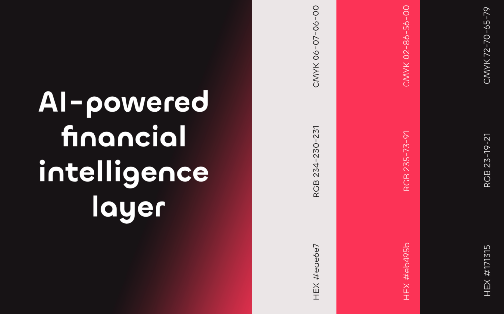
Here’s the honest answer: it’s not about how pretty the color swatches look on a Pinterest board. It’s about whether the system holds together when it’s stretched across a hundred different use cases. A great brand kit example still looks like the same brand on a business card, a billboard, an Instagram story, and a poorly lit trade show booth.
Consistency under pressure is the real test. Reddit’s design community asks this exact question constantly, and the answers that come up again and again point to the same handful of brands: companies whose kits are public because their systems are strong enough to survive being copied, remixed, and put in front of designers who’ve never worked with the brand before. That’s not an accident. It’s what happens when someone thought through the edge cases before the launch, not after.
You can test any kit yourself with one question: could a freelance designer who’s never seen your brand before build something on-brand using only the kit, no phone call needed? If the answer is no, the kit has gaps. Most DIY kits fail this test not because the logo is bad, but because nobody wrote down the rules that make the logo usable.
Which real brand kits are actually worth studying?
A few brands keep their kits, or close approximations of them, publicly documented, and they’re worth a look for different reasons.
Slack built its brand kit around a color system flexible enough to survive a full rebrand in 2019 without losing recognizability. The lesson here isn’t the colors themselves, it’s that they built the palette to expand, not just to exist.
Mailchimp leans hard into a single illustrated character (Freddie, the chimp) and a distinctive serif wordmark, and the brand guidelines spend more time on tone of voice than most kits spend on anything. Their public style guide is a good reference for what a voice section should actually contain, not just “friendly and approachable” with no examples.
Spotify runs one of the most cited public brand kits because its color-blocking and duotone photography rules are specific enough that two different designers, in two different countries, produce nearly identical results. That’s the whole point of a rules-based system.
Worth naming honestly: these are venture-funded companies with in-house design teams and budgets most founders reading this don’t have. Looking at their kits for structure and logic is useful. Trying to match their production value with a two-person startup budget is a fast way to burn a month on assets nobody will notice. What you’re borrowing from Slack or Spotify isn’t the aesthetic. It’s the discipline behind the aesthetic, and that scales down just fine.
Do brand kits look different across industries?
Yes, and the differences matter more than most generic guides admit. A fintech brand kit leans on precision: tighter grids, a narrower color range, typography chosen for trust and legibility over personality. A skincare or beauty brand kit usually goes the other way, prioritizing warmth, texture, and photography style over rigid systems. A restaurant or hospitality kit often centers on a single strong mark plus a flexible pattern or texture system that works on menus, signage, and packaging without redesigning anything from scratch.
The mistake founders make is importing a kit style from a different category because it looked good in a case study. A SaaS founder copying a lifestyle brand’s loose, illustration-heavy kit ends up with a brand that reads as unserious to enterprise buyers. Match the kit’s tone to how your buyer actually makes decisions, not to what’s trending on design Twitter this month.
Should you build your brand kit yourself or hire someone?
Depends entirely on where you are. If you’re pre-revenue and testing an idea, a scrappy kit you build yourself in an afternoon is fine. Nobody’s judging your color palette before you’ve validated the business.
The calculus changes the moment you’re raising, selling, or hiring. A founder who walks into an investor meeting with a Canva template and no consistent system is signaling something about attention to detail, whether that’s fair or not. And it compounds: every inconsistent asset you produce now is something a designer has to unwind later, which almost always costs more than building it right the first time.
This is where a fixed-price, fast-turnaround process earns its keep. You’re not paying for months of strategy decks and stakeholder workshops most agencies pad into the process. You’re paying for a senior designer to build the actual system, logo suite, color palette, type, and guidelines, in a defined window, at a price you know upfront. No AI shortcuts in the actual design work either; every mark is built by a person who’s done this hundreds of times before.
What mistakes do founders make building a brand kit alone?
The most common one is treating the logo as the whole kit. A logo without a documented color system, type pairing, and usage rules isn’t a brand kit, it’s a single asset that someone else will inevitably use wrong.
The second is skipping the “don’t” section. Every strong kit tells you what not to do with the logo (don’t stretch it, don’t recolor it, don’t drop it on a busy background) because that’s where inconsistency actually creeps in. A kit with no constraints isn’t flexible, it’s just undefined.
The third is building the kit in isolation from how the business actually operates. If your company is going to lean heavily on social content, your kit needs a template system for that from day one. If you’re B2B and your main asset is a pitch deck, the kit needs to be built around slide layouts, not Instagram grids. A kit that ignores where your brand will actually live is a kit you’ll be redoing in six months, which is exactly the kind of signal covered in more detail if you want to understand why startups underinvest in branding early and pay for it later.
How much should a real brand kit cost?
This varies wildly depending on who you ask, and that’s part of the problem. Freelancers on marketplaces will quote anywhere from $50 to $5,000 depending on experience and scope, with wide gaps in what’s actually included. Traditional agencies routinely start conversations north of $10,000 and stretch timelines to six or eight weeks, much of it spent in discovery calls and stakeholder alignment rather than actual design work.
A clearer way to think about it: decide what you actually need (logo only, or logo plus a full system with guidelines) before you start collecting quotes, because the price swings are almost always tied to scope creep, not skill. If you want a breakdown of what a founder should reasonably expect to pay at each tier, the branding packages for startups guide covers that in more detail. Brandframer’s own structure keeps it simple on purpose: $280 for the essentials, $480 for a fuller system, $987 for the complete 360 package with guidelines, delivered in 48 hours regardless of tier.
What should your first brand kit actually include?
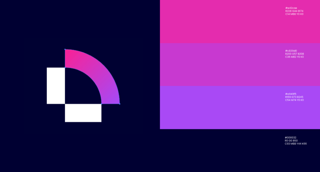
If you’re starting from nothing, don’t try to build Spotify’s kit on week one. Start with the primary logo and one alternate lockup, a color palette of no more than five colors with hex codes locked in, two typefaces (one for headlines, one for body), and a single page of usage rules. That’s enough to keep a team consistent for the first year. You can see how other founders have structured this from scratch in these brand guidelines examples, which break down real documents section by section rather than just showing finished logos.
Everything else, the voice guide, the social templates, the packaging system, gets added as your business actually needs it. Building a 40-page guideline document for a company that hasn’t shipped its first product yet is effort spent in the wrong place.
Every brand kit example in this article started the same way: someone decided their brand needed an actual frame around it, not a folder of loose files and good intentions. That’s the whole premise Brandframer is built on. Tell us what you’re building, pick the package that matches where you are, and you’ll have a complete, usable brand kit in 48 hours instead of six weeks of calls you don’t have time for.

