
Fashion logo: how to design one that’s unforgettable?
 Jul 26,2026
Most guides to fashion logo design open with a definition. Skip that. A fashion logo has one job most other logos don’t: it has to survive being shrunk to nine millimeters on a woven label and still look intentional. That’s a harder brief than it sounds.
Search “fashion logo” right now and you’ll mostly find galleries of iconic brand marks, stock vector sites, and logo generators. A few pages get into fonts and wordmark trends, but almost nobody walks a founder through what makes a mark work, what it costs, or how visible it should even be. That last question turns out to matter more than most founders expect, and it’s where this guide goes further than what’s currently ranking.
What separates a fashion logo that works from one that doesn’t?
strong fashion logo does three things at once. It stays legible at small sizes, it holds up in pure black and white, and it fits the visual world of the collection it represents. Miss any one of those and the mark falls apart the moment it leaves a mockup.
Legibility at scale is the one founders underestimate most. Your logo isn’t just a hero image on a homepage. It’s a woven label the size of a fingernail, a debossed detail on a button, an embroidered patch on a sleeve. If it only reads well at 400 pixels wide, it isn’t finished yet.
Here’s the honest nuance: a fashion logo doesn’t need to explain your brand the way a law firm’s or a fintech’s does. The product, the fabric, the photography, and the packaging carry a huge share of that meaning. Your logo’s job is narrower than founders assume, and treating it like it has to do everything on its own is how you end up with something overdesigned and forgettable.
Want a mark that’s actually built for a hangtag, not just a Figma frame? Brandframer delivers a complete visual identity system, logo included, in 48 hours, starting at $280.
The main types of fashion logos brands use
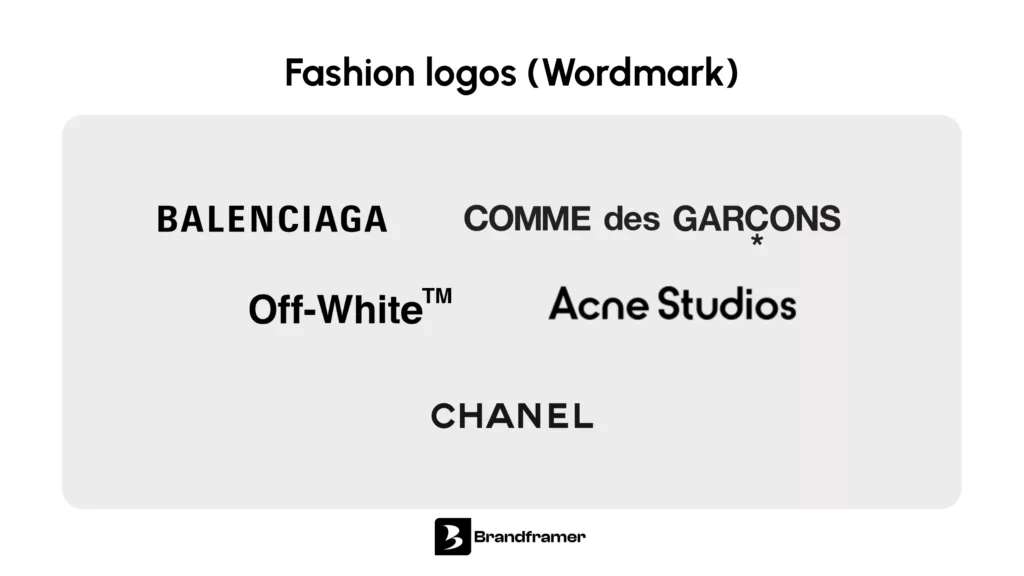
Wordmarks dominate fashion more than almost any other industry, and there’s a reason for that beyond taste. Clothing sells on the name itself, on how it sounds and how it reads on a label, so a typography logo that just renders the name cleanly tends to outperform an abstract symbol that needs explaining.
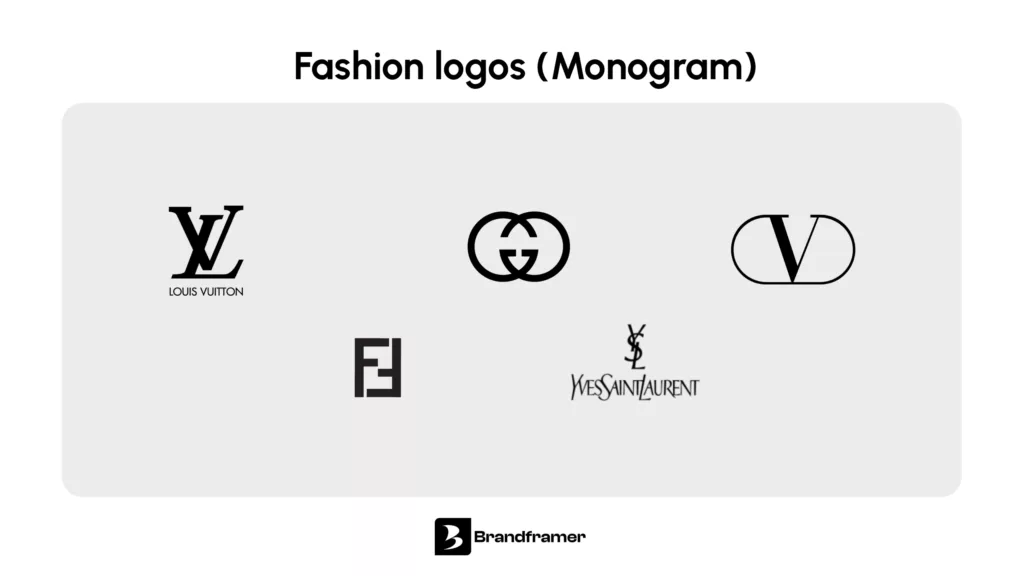
A monogram compresses initials into a single symbol, and it’s everywhere in premium and heritage-leaning fashion because it reads as established even on a young brand. If your name is long or your positioning leans classic, a monogram logo is worth testing before you commit to a full wordmark.
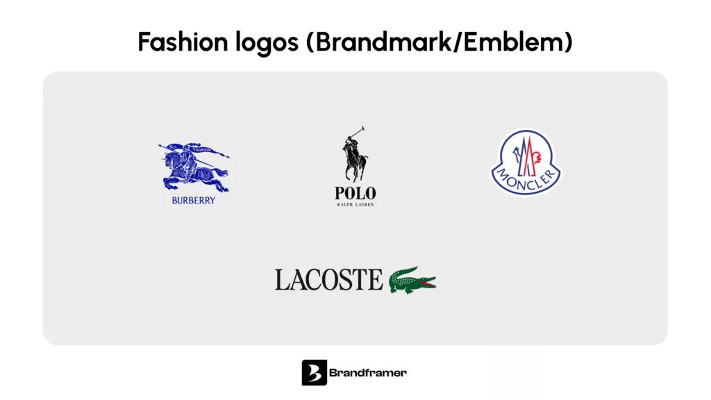
An emblem or brandmark works as a standalone symbol, separate from the name, and it survives best on small hardware like zipper pulls or buttons. Combination marks pair a symbol with type and give you the most flexibility, at the cost of needing more space to breathe. None of these is objectively better. The right one depends on where your product sits and how people will actually encounter your name.
Loud or quiet: the visible logo debate founders keep getting wrong
Spend twenty minutes in fashion communities online and you’ll find a genuinely split conversation. A lot of people say they actively prefer clothing with a small, barely-there logo over anything loud. And separately, some luxury lines deliberately leave their logo off certain pieces on purpose, precisely because a visible mark would broaden the audience beyond who they actually want buying in.
That second point is worth sitting with. Removing a logo isn’t always about subtlety for its own sake. Sometimes it’s a gatekeeping decision, a way of keeping a product legible only to people who already know what it is. That’s a completely different goal from a logo that’s small because the brand can’t commit to a stronger identity yet.
So which approach is right for you? Neither is universally correct, and that’s the actual point. This isn’t a taste question you settle once. It’s a positioning decision, and it should track your price point and what your customer is actually buying the logo for in the first place.
A premium streetwear label built on visibility and status needs a logo that reads from ten feet away. A quiet, elevated basics brand selling on fabric quality and cut needs the opposite: a mark so restrained it almost disappears, because loud branding would contradict the whole pitch. Copying whichever approach is trending this month without checking it against your own pricing and customer is how brands end up with a logo that actively works against their positioning.
Not sure which lane fits your brand? That’s a strategy conversation, not a guessing game, and it’s exactly what gets sorted out before a single design line gets drawn on a Brandframer 360 project.
Common mistakes new clothing brands make with their logo
The most common mistake is designing the logo in isolation and hoping a full brand identity assembles itself around it later. It doesn’t. A logo without a color system, typography, and usage guidelines behind it tends to get reinterpreted differently on every packaging run, every social post, every hangtag, until the brand looks inconsistent within six months.
The second mistake is chasing a trend that doesn’t match the brand underneath it. A hand-drawn, distressed logo looks great on a vintage-inspired label and completely wrong on a technical performance brand. The aesthetic has to come from the product, not from whatever’s popular this quarter.
The third is skipping the black and white version entirely. Printers, embroiderers, and packaging vendors will ask for it eventually, and building it after the fact almost always means compromises the color version wasn’t designed to handle.
If any of this sounds familiar, the fix usually isn’t a quick logo swap. It’s worth checking the broader signs your brand needs a refresh before deciding whether you need a new logo or a full identity reset.
What a professional fashion logo actually costs and how long it takes?
Freelance logo work for a fashion brand typically runs anywhere from a few hundred dollars to several thousand, and the price largely tracks the process, not necessarily the quality. Long discovery calls, multiple rounds of concepts, and open-ended revisions all add cost and, more importantly, add weeks.
Brandframer runs three fixed-price tiers instead: Basic at $280, Premium at $480, and BrandFramer 360 at $987 for a complete identity system beyond just the logo. Every tier delivers in 48 hours. No open-ended revision cycles, no six-week timelines, no surprise invoice at the end.
How the design process works when you skip the back and forth?
Most agencies burn the first two weeks on discovery calls and mood board approvals before a single logo concept exists. Brandframer skips that. Ten years of building identities for founders across every category means the process starts from what’s already proven to work, then gets tailored to your brand instead of reinvented from a blank page.
You get a complete package back in 48 hours: logo, color palette, typography, and brand guidelines, ready to use across labels, packaging, and social. Need a site to put it on too? Brandframer works with a trusted development partner for that, so the identity and the website launch as one coordinated push instead of two disconnected projects.
FAQ
Are logos out of fashion? Not exactly. Loud, oversized branding has cooled for a lot of buyers in favor of quieter marks, but a well-built logo is still core to how a fashion brand gets recognized. What’s shifted is visibility, not necessity.
Why do some luxury brands leave their logo off certain pieces? Usually on purpose. A visible logo widens who recognizes and wants the product, and some brands would rather keep that circle small than maximize visibility.
How much should a startup clothing brand spend on a logo? Enough to get a system, not just an image file. A logo alone without color, type, and guidelines tends to cost you more later in inconsistent execution than it saves upfront.
Where this leaves your logo
A fashion logo isn’t a standalone design exercise. It’s one piece of a system that has to hold up on a hangtag, a social grid, and a storefront sign at the same time, and it has to match a visibility level your positioning can actually back up. Get the type right, get the black and white version done early, and don’t let a trend override what your product is actually saying.
If you’d rather skip the months of back and forth and get a complete identity system built around your actual brand, Brandframer delivers logo, palette, typography, and guidelines in 48 hours, starting at $280.

