
Top Signs Your Brand Needs a Refresh (And What To Do About It)!
 Jul 13,2026
Every founder eventually catches their own logo looking tired in a pitch deck and wonders if it’s them or the brand. Usually, it’s the brand. Signs your brand needs a refresh rarely show up as one dramatic moment. They creep in quietly: a color palette that looked sharp back in 2022, a deck that doesn’t match the website anymore, a logo you’re low-key embarrassed to put on a hoodie.
A refresh isn’t the same as tearing everything down and starting over. It’s a targeted update: sharper logo, tighter color system, typography that actually matches where your company is today. Founders who catch these signs early skip the awkward moment of explaining, mid-fundraise, why their brand still looks like it’s running on seed-round energy.
Here’s how to tell the difference between a brand that just needs polish and one that’s genuinely fine as is.
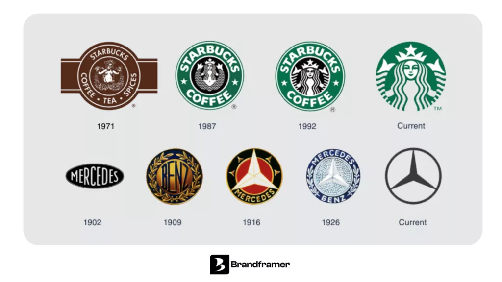
What is a brand refresh (and how is it different from a rebrand)?
A brand refresh updates the visual and verbal pieces of your identity, things like your logo, color palette, typography and messaging, without touching your company’s core positioning or name. A rebrand goes deeper. It reworks strategy, sometimes the name itself, occasionally the whole business model.
Here’s a simple test. If your product, your customers and your mission haven’t changed, but the way you present them feels dated or inconsistent, that’s a refresh problem. If your entire business has shifted (you pivoted, merged, or your original positioning stopped making sense to anyone), that’s rebrand territory, and a different conversation entirely.
Most founders who message an agency about “rebranding” actually need a refresh. The company is fine. The visuals just stopped keeping pace.
A refresh doesn’t require six weeks of workshops and mood boards to prove a point. Brandframer builds a full identity system, logo, palette, typography and guidelines, in 48 hours, starting at $280 for the Basic tier.
What are the clearest signs your brand needs a refresh?
The most obvious sign is inconsistency. Your logo looks one way on the website, slightly different on your pitch deck, and a third way on your LinkedIn banner because someone exported it wrong two years ago and nobody noticed.
Then there’s the size problem. Zoom out your logo to app-icon size or drop it into dark mode and see what happens. If it turns into an unreadable smudge, that’s not a stylistic choice, it’s a design flaw that’s been quietly costing you recognition.
There’s also the pitch-room tell. A founder who shows up to a sales call with a Canva logo and no brand guidelines is already losing the room before saying a word. If you’ve caught yourself explaining your brand instead of letting it speak, that’s the brand failing to do its job.
And there’s the growth mismatch. The identity you built pre-launch, scrappy, minimal, cheap to produce, doesn’t always survive contact with Series A investors or enterprise buyers who expect a company that looks like it can be trusted with a six-figure contract.
None of these signs mean your business is broken. They mean your visuals stopped growing at the same rate you did.
How often should you do a brand refresh?
Most companies refresh every two to four years, though the real trigger isn’t a calendar date, it’s a mismatch between how you look and where your business actually is. A pre-seed startup that just closed a Series A round, doubled headcount, or moved from consumer to enterprise sales has probably outgrown its original identity well before the two-year mark.
Founders who wait until the mismatch becomes obvious (a competitor’s rebrand makes yours look ancient, or a client asks if you’re still in business) end up doing reactive work under pressure. The better move is proactive: check in on your identity roughly once a year and ask whether it still represents the company you’re running today, not the one you started.
There’s no universal clock here. A design agency should probably refresh more often than a boring, stable B2B logistics company, simply because design trends move faster than shipping routes do.
Waiting for the “right time” to refresh is how founders end up doing it during a crisis instead of on their own schedule. Brandframer’s fixed pricing, $280, $480 or $987, means there’s no reason to keep pushing it another quarter.
What is the rule of 7 in branding?
The rule of 7 is an old advertising principle stating that a person generally needs to see a brand’s message around seven times before they remember it or act on it. It comes from decades-old ad research, but the underlying logic still holds: one glance at your logo isn’t enough to build recognition, no matter how good that glance was.
This matters for a refresh because a scattered, inconsistent identity resets that count every time. If your Instagram bio uses one logo file, your website another, and your email signature a screenshot from 2023, you’re not accumulating seven consistent exposures. You’re giving people seven different, half-remembered impressions that never add up to trust. It’s the same principle behind Nielsen Norman Group’s usability research on consistency: people build familiarity and trust fastest when the same patterns show up the same way, every time, everywhere.
A tight, consistent identity is what lets those seven exposures actually stack. Every touchpoint reinforces the last one instead of contradicting it.
What are the 5 C’s of branding?
There’s no single official version, different sources swap one or two terms, but the most common framework lists clarity, consistency, creativity, credibility and connection as the five pillars a brand needs to hold together.
Clarity means someone can understand what you do within a few seconds of landing on your site. Consistency means your brand shows up the same way whether someone finds you on a billboard or a cold email. Creativity is what makes you memorable instead of interchangeable. Credibility comes from actually delivering on what your branding promises. Connection is the emotional layer, the reason someone chooses you over a nearly identical competitor.
A refresh usually targets the first three C’s directly (clarity, consistency, creativity) since those live in the visual system. Credibility and connection follow once the identity stops working against you instead of for you.
Five C’s, one consistent brand. That’s the whole point of doing this work properly instead of patching it forever.
What is the 3-7-27 rule of branding?
The 3-7-27 rule is a marketing framework describing how much repeated exposure it takes for a brand message to actually stick: three seconds to grab attention, seven interactions to build basic recognition, and twenty-seven exposures to build real trust.
It’s not a scientific law so much as a practical mental model, but it lines up with how founders experience their own growth. Nobody trusts a brand after one ad or one cold email. Trust gets built in layers, across a website visit, a LinkedIn post, a founder update, a product demo, each one reinforcing the last.
This is exactly why consistency matters more than any single design choice. A gorgeous logo that shows up differently on every channel never accumulates those 27 exposures cleanly.
Speed helps here too. The faster you get a consistent identity live across every channel, the sooner that exposure count starts working in your favor instead of against it.
When does a refresh turn into a full rebrand?
Here’s the honest part: a refresh won’t fix a business problem. If your sales are declining because the product doesn’t solve a real problem, or your team churns because the culture is broken, a new logo won’t touch either one. Founders sometimes reach for a visual fix because it’s easier and faster than the harder internal work, and that’s worth naming directly.
That said, some signals genuinely point past a refresh and into full rebrand territory. A merger or acquisition, a pivot into a completely different market, or a name that’s become tangled up in a negative association are all reasons to have the bigger conversation rather than a cosmetic one. If your company’s mission has fundamentally changed since you named it, no amount of new color palette fixes that gap.
But if the core business is solid and it’s just the visual layer that hasn’t kept up, a refresh is the right-sized move. It’s faster, cheaper, and it doesn’t force you to re-explain who you are to every existing customer and investor. Founders comparing the two options can see the full breakdown in this brand identity package overview, alongside the best branding package for your small business (at every stage and budget).
The bottom line on refreshing your brand
Spotting the signs early is the whole game. Inconsistent logos, a design that doesn’t survive a pitch room, an identity that hasn’t grown since your seed round, these aren’t cosmetic annoyances. They’re small, compounding costs that show up every time someone judges your company before you’ve said a word.
A refresh doesn’t need to be a quarter-long project or a five-figure invoice. Brandframer runs on fixed pricing, $280 for Basic, $480 for the mid-tier, $987 for the full BrandFramer 360 system, and delivers logo, color palette, typography and guidelines in 48 hours flat. Ten years of doing this across thousands of projects means the process is dialed in enough to skip the parts that waste founders’ time.
If you’re ready to compare your options before picking one, this breakdown of the top brand refresh services is a good next stop. Otherwise, if any of the signs above sound familiar, that’s the answer. Start the refresh before another investor meeting reminds you why you were putting it off.

