
What is a typography logo? Definition, font types, and examples
 Jul 10,2026
Most founders spend weeks agonizing over their brand colors and barely thirty seconds thinking about their font. That’s backwards. The typeface in your logo is doing more positioning work than almost any other visual decision you’ll make. It signals your price point, your audience, and your level of seriousness, before a single word of your copy has been read.
A typography logo (also called a wordmark or logotype) is a logo built entirely from letterforms. No icon, no symbol, no abstract mark. Just your brand name, set in a typeface that’s been chosen, spaced, and sometimes customized to carry the full weight of your visual identity. Google, Coca-Cola, FedEx, and Vogue all run on typography logos. So does every law firm, every consulting practice, and every SaaS company that has decided its name is memorable enough to stand alone.
This article breaks down how typography logos work, why font choice is actually a positioning decision, and how to know whether a wordmark is the right call for your brand.
What exactly is typography in a logo?
Typography in a logo isn’t just “picking a font.” It’s the systematic control of every visual property of your lettering: the typeface family, the weight, the spacing between individual letters (kerning), the spacing between lines (leading), the scale relationships between words, and any custom modifications made to specific letterforms.
When a designer sets a wordmark, they’re making dozens of micro-decisions that collectively determine how your brand reads before anyone reads it. A tight, high-contrast serif set in all-caps reads as established and authoritative. The same brand name in a rounded, wide-tracked sans-serif reads as approachable and modern. The letters are identical. The perception isn’t.
This is why logo typography sits at the intersection of design and strategy. It’s not a stylistic preference. It’s a positioning statement.
If you want to go deeper on the fundamentals that govern all of this, the core principles behind effective logo design are worth reading before you make any typeface decision.
Brandframer delivers complete brand identity systems in 48 hours, including a custom wordmark built to carry your brand positioning from day one. Plans start at $280. See what’s included at brandframer.com.
What are the 4 types of typography used in logos?
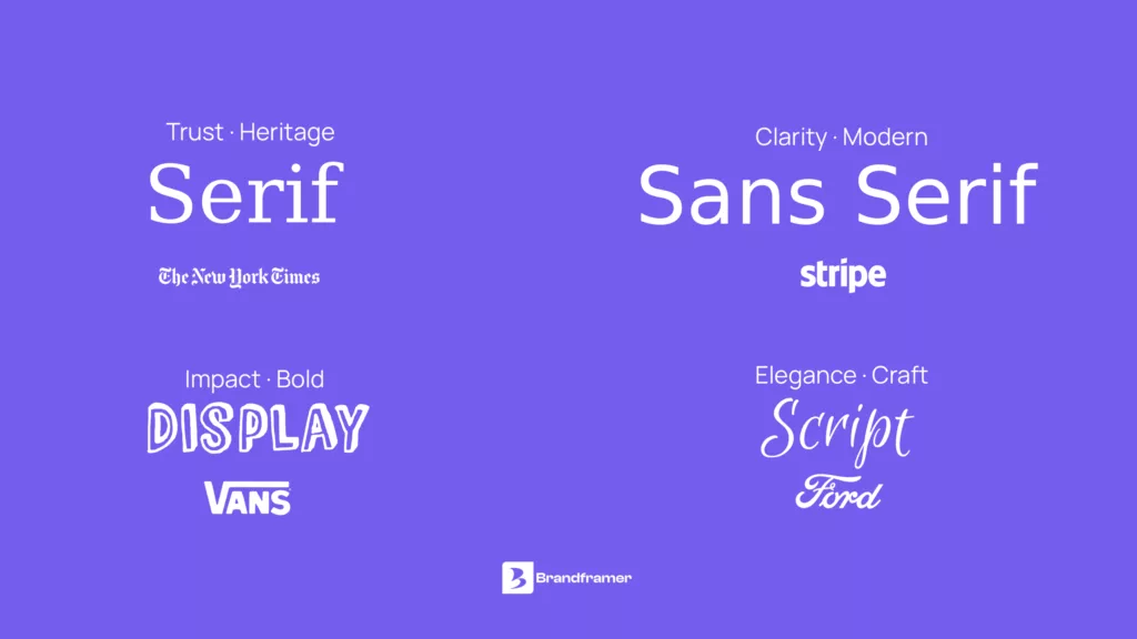
Four main typeface categories show up consistently in logo design. Each one carries a distinct emotional register, and choosing the wrong one is one of the most common (and most expensive) branding mistakes a founder can make.
Serif typefaces, like those used by Vogue, Ralph Lauren, and The New York Times, have small finishing strokes at the ends of letterforms. They read as traditional, authoritative, and premium. If your brand is positioning toward trust, heritage, or high-ticket professional services, a serif is often the right call. Law firms, financial advisors, luxury goods, editorial brands: all natural serif territory.
Sans-serif typefaces drop those finishing strokes entirely. Google, Airbnb, and Spotify all use variations of sans-serif wordmarks. The effect is clean, direct, and scalable across screens. Sans-serifs dominate in tech, SaaS, and direct-to-consumer brands because they read as modern and unencumbered.
Script typefaces mimic hand-lettering or calligraphy. Coca-Cola is the canonical example. Script communicates warmth, craft, and personality, which is why it works for consumer goods, food and beverage, and brands that want to feel personal rather than institutional. Used poorly, it reads as casual to the point of amateurism.
Display typefaces are built for impact rather than extended reading. They’re loud, often unusual, and carry strong personality. They can work for a distinctive brand with a clear aesthetic (think streetwear, creative agencies, or entertainment), but they age fast and don’t scale well into secondary typography systems.
One honest caveat: these categories are starting points, not rules. The best typography logos often live between categories, using a modified serif that reads with the clarity of a sans, or a geometric display face that carries the weight of a traditional wordmark. Category knowledge tells you where to start looking. It doesn’t tell you where to stop.
Your typeface choice doesn’t exist in isolation. It has to work inside a complete visual system, which is why understanding what a brand identity package actually includes matters before you commission a wordmark.
What is the difference between typography and a logo?
This is a question that trips up a lot of founders, and the confusion is understandable.
Typography is a discipline: the art and practice of arranging type to make written language readable, legible, and visually engaging. It’s a system. Every piece of text you see, from this article to a billboard to a cereal box, involves typographic decisions.
A logo is a specific artifact: the primary visual mark that represents a brand. It can take many forms. Some logos are pure symbols (the Apple apple, the Nike swoosh). Some are combinations of a symbol and a wordmark. And some are built entirely from typography, with no symbol at all.
A typography logo, then, is a logo where the typographic treatment of the brand name is the logo. The distinction matters because it changes what you’re designing. You’re not picking a font for a word. You’re building a visual identity out of letterforms that has to work at 16px on a mobile screen and at 3 meters on a trade show banner simultaneously.
What are real-world examples of typography logos?
The most durable wordmarks tend to share a few properties: they’re built on a typeface with genuine character, they’ve been kerned with obsessive care, and they’re distinctive enough to survive context collapse (meaning, they’re still recognizable in black and white, reversed out, or shrunk to favicon size).
FedEx uses a clean sans-serif that looks unremarkable at first glance. Look closer at the negative space between the E and the x, and you’ll find an arrow. That kind of intentional detail is what separates a typography logo from a word set in a downloaded font.
Vogue has run on the same serif wordmark for decades. The typeface is elegant and severe. It doesn’t need to change because the brand has never tried to be anything other than what it is.
IBM uses a custom geometric sans-serif with horizontal striping built into the letterforms. It’s unmistakably a tech company. It’s also unmistakably from a specific era of tech, which is part of the point.
Subway embeds arrows into the S and Y, reinforcing the brand’s positioning around speed and movement without adding any graphic element outside the typography.
What these brands share is intentionality. The typography doesn’t just name the brand. It describes it.
How do font weight, spacing, and kerning affect a wordmark?
Three variables account for the majority of the craft difference between a good typography logo and a forgettable one.
Weight is the thickness of the letterstrokes. A heavy or bold weight communicates presence and confidence. A light weight communicates refinement and restraint. Many of the most effective wordmarks use a weight that’s slightly unexpected for the category, because it creates contrast against competitors. A law firm that uses a light-weight serif stands out against a field of bold, heavy competitors. A tech startup that uses a heavier geometric sans reads as more substantial than its peers.
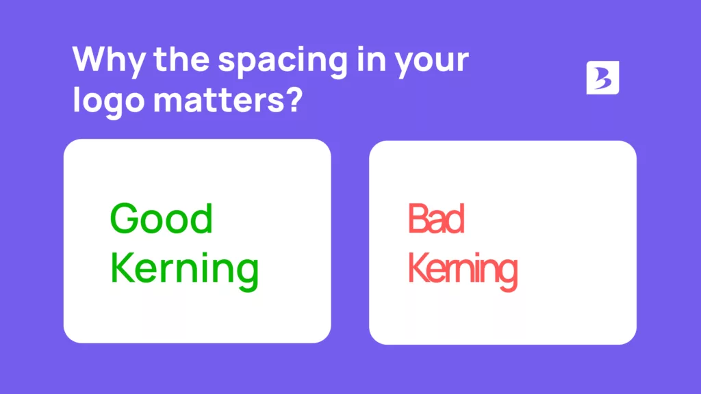
Kerning is the adjustment of space between individual letter pairs. Every typeface has optical inconsistencies: certain letter combinations (AV, To, WA) create visual gaps that look uneven even when the spacing is technically correct. Professional typography logos fix these gaps manually, pair by pair. It’s time-consuming and invisible when done right. When it’s not done, experienced eyes notice immediately.
Tracking is the overall spacing across a word or phrase. Loose tracking (wider letter spacing) creates a more open, editorial feel. Tight tracking creates density and urgency. The same typeface at two different tracking values reads as two completely different brands. This is why downloading a free font and typing your company name is not the same thing as having a logotype designed.
Brandframer has delivered complete brand identity systems for founders in SaaS, consulting, e-commerce, and professional services. In 48 hours. Starting at $280.
When should you choose a typography logo over a symbol or combination mark?
A wordmark is the right call in a few specific situations, and the wrong call in others. This is the tradeoff most branding articles skip over.
Choose a typography logo when your brand name is your primary asset. If your name is distinctive, memorable, and central to your positioning, putting a symbol in front of it dilutes the very thing you’re trying to build. Consulting firms, personal brands, and companies named after a proprietary concept (think Stripe, Slack, or Notion) often do better with a wordmark because the name itself is the brand.
A wordmark also makes sense when you’re operating in a category where symbols feel generic. If every competitor has an abstract icon that loosely suggests their industry, a clean typography logo can read as more confident and direct by comparison.
Where a wordmark struggles: brand names that are long, difficult to pronounce, or not distinctive enough to anchor a visual identity on their own. If your company name is a common word or a generic compound noun, a symbol gives the visual identity a hook that the typography alone can’t provide.
The honest answer is that the wordmark vs. symbol decision is downstream of the naming decision. If you’re asking whether your name can carry a wordmark, you’re really asking whether your name is strong enough. That’s a brand strategy question before it’s a design question.
What makes a typography logo work across all formats?
A typography logo has to survive a brutal range of contexts: a 16×16 favicon, a 300dpi business card, a website header, a billboard, an embroidered patch. Most fail at one end of that spectrum or the other.
The logos that hold up across all formats tend to share the same underlying structure: strong letterforms with clear counters (the white space inside and around letters), a typeface that retains its character at small sizes, and a proportion that works both horizontally and stacked.
Color is part of this too. A wordmark designed only in full color often falls apart in single-color applications. If your typography logo can’t run in solid black on a white background and still look intentional, the underlying design has a problem. Color should enhance a typography logo. It shouldn’t be doing the heavy lifting the letterforms themselves should handle.
This is why the wordmark isn’t a one-file deliverable. A properly built typography logo includes versions for every usage context: full color, reversed, single-color black, single-color white, and clear space specifications that prevent it from being crowded or misused in production.
Building a typography logo that does real positioning work
A typography logo is actually the harder option, because there’s nowhere to hide. With an icon, visual interest can carry a weak wordmark. With a pure typography logo, the letterforms are the entire argument. Every spacing decision, every weight choice, every modification to individual letters is visible.
That’s also what makes it powerful. When a wordmark is right, it reads instantly, ages well, and scales across every context without losing its character. It doesn’t need to be explained. It doesn’t date itself by chasing a visual trend. And it makes your brand name the single most recognizable thing about your visual identity, which is usually exactly where you want founders and customers to land.
If you’re ready to build a brand identity system around a wordmark that does that kind of work, Brandframer’s team delivers a complete brand identity including logotype, color palette, typography system, and brand guidelines in 48 hours.
References
This article draws on established typographic principles and industry standards documented across the following resources:
- AIGA, the professional association for design
- Google Fonts Knowledge, a typographer’s guide to type
- I Love Typography, editorial reference on typeface history and design
