
How to make a logo memorable?
 Jul 27,2026
A founder pitches a room full of investors, and three weeks later nobody in that room can describe the logo on the deck. That’s not bad luck. That’s a design problem, and it’s fixable before you spend another dollar on branding.
Memorability isn’t a vibe. It’s a specific outcome you can test for, and most of the advice floating around treats it like a checklist of nice-to-haves (be simple, be unique, be timeless) without explaining why those things stick in a brain and how to know if yours does. This guide skips the checklist and gets into the mechanism: what makes a logo memorable, how to test it in under a minute, and where the pursuit of “unique” quietly backfires.
Why some logos stick and some get forgotten?
A memorable logo is one your brain can reconstruct from a fragment. That’s the real test, not whether people like it, but whether they can picture it after looking away.
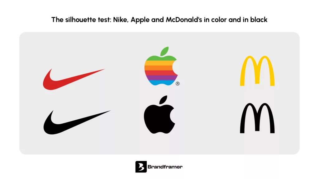
Human memory doesn’t store images the way a camera does. It stores distinctive features: a shape, a color pairing, an angle that nothing else in the category uses. Nike’s swoosh works because it reduces to a single gesture your hand could draw from memory. McDonald’s arches work the same way. Strip away the color and the name, and the shape alone still reads.
This is why cluttered logos fail at memorability even when every individual element is well executed. The brain can’t extract one dominant feature from five competing ones, so nothing gets encoded strongly enough to recall later. A logo with one clear idea beats a logo with three good ideas fighting for attention.
If you’re building out the visual language behind that idea, our breakdown of logo design principles covers the full set of design fundamentals worth knowing before you brief a designer.
Speed matters here too. The founders who get this right usually aren’t the ones agonizing for months over mood boards, they’re the ones who nail one distinctive idea early and move on to building the business. That’s the whole premise behind Brandframer’s 48-hour turnaround: a focused process beats an open-ended one, every time.
How do you make a brand memorable?
Here’s the distinction most guides skip. A logo is a mark. A brand is everything that mark gets attached to over time, and memorability is built through repetition as much as design.
Even a strong logo needs consistent exposure to earn recall. Starbucks didn’t become instantly recognizable the day the mermaid was drawn. It became recognizable through thousands of repeated touchpoints where the same green, the same shape, and the same feeling showed up in the same order. Design gives you the raw material. Consistency is what turns that material into memory.
For an early-stage company, this means your logo has to work identically everywhere on day one: your site header, your invoice footer, your Twitter avatar, your pitch deck. Every inconsistent version dilutes the pattern recognition you’re trying to build. This is also why brand guidelines exist, not as bureaucratic overhead but as the thing that keeps your mark looking like itself across a hundred different applications.
Founders who are still deciding what belongs in that system might find our branding checklist for founders useful before locking anything in.
Want a logo built to hold up across every one of those touchpoints from the start? That’s what a $280 Basic package gets you in 48 hours, no back-and-forth required.
How to make a logo recognizable at a glance?
Recognizability and memorability aren’t quite the same thing, but they feed each other. Recognizable means someone can identify your logo when they see it. Memorable means they can recall it when they don’t.
The fastest way to check recognizability is the silhouette test. Fill your entire logo in solid black, no color, no gradients, no fine detail, and look at the shape alone. Does it still read? Can you tell what it is from across a room? If the answer is no, the logo is relying on color or polish to do work that the underlying form should be doing on its own.
This is exactly why so many strong marks are absurdly simple as pure shapes. An apple. A bitten circle. A swoosh. None of them need color to be identified, and that’s not an accident. Color is the last five percent of a logo’s job, not the first fifty.
Test your own logo this way before you finalize anything. Screenshot it, drop it into black and white, and shrink it down to the size of a favicon. If it still holds its shape at 32 pixels, you’re in good shape. If it turns into a smudge, the concept needs to simplify further, not the file format.
The three-second test: check if your logo will stick
Here’s a test you can run yourself in under a minute, no focus group, no survey tool required.
Show the logo to someone who hasn’t seen it, for exactly three seconds. Then take it away and ask them to describe or sketch it from memory. What comes back tells you almost everything.
If they describe the shape accurately, even roughly, the concept is strong enough to encode. If they describe a color or a vague feeling instead of a form, the logo doesn’t have a distinctive enough silhouette yet. And if they can’t recall anything specific at all, there’s too much competing detail or not enough of a single idea driving the design.
Run this with three or four people who aren’t your co-founder or your designer. Family members, a friend outside your industry, anyone whose first exposure is genuinely fresh. Their reactions won’t be polite the way your team’s will be, and that’s exactly what makes the test useful.
The over-originality trap
Here’s the moment of honesty most branding content skips: chasing originality for its own sake can hurt memorability just as much as being generic.
A logo that’s deliberately strange in order to stand out from competitors often ends up illegible instead of distinctive. If a shape is so unconventional that people can’t tell what category of business it belongs to, they won’t retain it as “the interesting logo,” they’ll retain it as confusing, and confusing doesn’t convert into recall. Memorability requires the brain to place a mark somewhere familiar enough to file it, while still being distinctive enough to stand out inside that filing system. Too far in either direction breaks the mechanism.
This is the tradeoff worth sitting with honestly: a slightly conventional mark, executed with one genuinely distinctive twist, will usually outperform a wildly original mark that nobody can parse. Distinctive doesn’t mean unrecognizable as belonging to your category. It means unmistakably yours within it.
What kills memorability before it starts?
Some design choices don’t just fail to help memorability, they actively work against it, and they’re worth naming specifically rather than folded into a general list of design mistakes.
Gradients and drop shadows are the most common offender. They look polished at full size on a laptop screen, then collapse into mud the moment the logo shrinks to a favicon or gets embroidered on a hat. Memorability depends on a clean silhouette, and effects like these blur the very edges your brain needs to encode.
Borrowed visual language is the second offender. Fintech startups reaching for the same abstract geometric mark, SaaS companies defaulting to a rounded gradient blob, wellness brands landing on the same leaf-and-circle combination: none of these are wrong on their own, but a mark that looks like six other marks in the category can’t claim a distinctive place in anyone’s memory. The brain files it under “that kind of logo” instead of under your name specifically.
And overcorrection is the third, less obvious one. In trying to avoid looking generic, some founders push toward complexity: an icon plus a monogram plus a tagline treatment plus a decorative flourish, all crammed into one lockup. Every added element is one more thing competing for the single slot your brand gets in someone’s memory. The fix usually isn’t more originality. It’s picking the one element that’s actually doing the work and cutting the rest.
What is the golden rule for logos?
If there’s one rule that survives every other piece of advice, it’s this: a logo should communicate one idea clearly, not several ideas vaguely. Simplicity, balance, and contrast all serve that single goal, they’re not separate rules so much as different angles on the same principle.
For the full list of design rules that support this idea in practice, spacing, alignment, color contrast, and scalability among them, our guide to the rules of design walks through each one in detail.
Building a logo that actually sticks
Memorability isn’t luck, and it isn’t something you bolt onto a finished design after the fact. It comes from a clear concept, a silhouette that holds up in black and white, and enough restraint to let one idea carry the whole mark instead of five ideas splitting the attention.
The founders who get this right treat it as a decision to make early, not a problem to fix after the logo has already shipped on business cards and a website. If yours has drifted, or you’re noticing the signs it might need a second look, our piece on when a brand needs a refresh is worth a read before you invest further in the current direction.
And if you’d rather skip the months of internal debate: Brandframer builds a complete identity system, logo included, around a single distinctive concept in 48 hours, starting at $280. No mood board marathons, no design-by-committee. Just a mark people actually remember, framed right the first time.

