The rules of logo design: 19 principles worth following
 Jul 05,2026
A logo isn’t a painting, and treating it like one is where most founders waste time and money. The real rules of logo design are less about taste and more about a series of decisions: what the mark has to survive, who it has to speak to, and where it’s actually going to live. Get those decisions right and the aesthetic tends to follow.
That last part matters more than it used to. Your logo isn’t just going on a business card anymore. It’s going on a Stripe checkout page, a dark-mode dashboard, an app icon competing with a hundred others on someone’s home screen, and possibly a trademark application if the business takes off. The rules below cover the sketchbook fundamentals, then go into the parts of the process that only show up once you’ve actually shipped a brand.
What are the foundational rules of logo design?
These are the rules almost every serious designer agrees on, and for good reason. Skip them and nothing built afterward holds up.
1. Start with the business, not the aesthetic. A logo is a compressed answer to “what does this company believe and who is it for.” Before anyone opens a design tool, they should know what the founder actually does differently and who’s supposed to feel something when they see the mark.
2. Solve for recognition before decoration. The job of a logo is to be remembered, not admired. A founder who shows up to an investor meeting with a logo that’s clever but forgettable has spent money on the wrong problem.
3. Design in black and white first. Color is the easiest thing to fall in love with and the easiest thing to fix later. If a mark only works because of its palette, the underlying shape isn’t strong enough yet.
4. Make it appropriate to the category, on purpose. A fintech startup and a children’s toy brand shouldn’t reach for the same typeface. This sounds obvious, but appropriateness is really about the reasoning behind a choice, not the choice itself. A weak rationale is why clients push back on strong ideas.
Brandframer builds from this foundation on every project: a complete brand identity system delivered in 48 hours, with plans starting at $280. Logo, palette, typography, and guidelines, all in one pass.
How do you make a logo that lasts for decades?
Founders don’t want to redesign in eighteen months. Longevity isn’t luck. It comes from a few deliberate choices made early.
5. Avoid chasing trends. Gradient logos, hand-drawn badges, and “friendly blob” mascots all had their moment, and all of them dated a brand within a couple of years. If a style is everywhere right now, it’ll look like this year by the time it’s outdated.
6. Keep the concept simple enough to sketch on a napkin. Not simple as in boring, simple as in reducible. If the core idea needs a paragraph of explanation to land, it’s too fragile to survive being shrunk to a favicon or blown up on a storefront.
7. Decide between a wordmark, a symbol, or a combination mark early. This isn’t a stylistic afterthought, it’s a structural decision that shapes everything downstream. Discover here our articles about Brandmark and about Wordmark to decide when each approach actually earns its keep.
8. Don’t be too literal. A logo doesn’t need to illustrate what the company does. Slack’s hashtag-adjacent mark says nothing about workplace chat, and that’s exactly why it’s aged well. Literal marks tend to box a brand into whatever the product looks like today, which is a problem the moment the product changes.
Does a logo need a symbol, or is a wordmark enough?
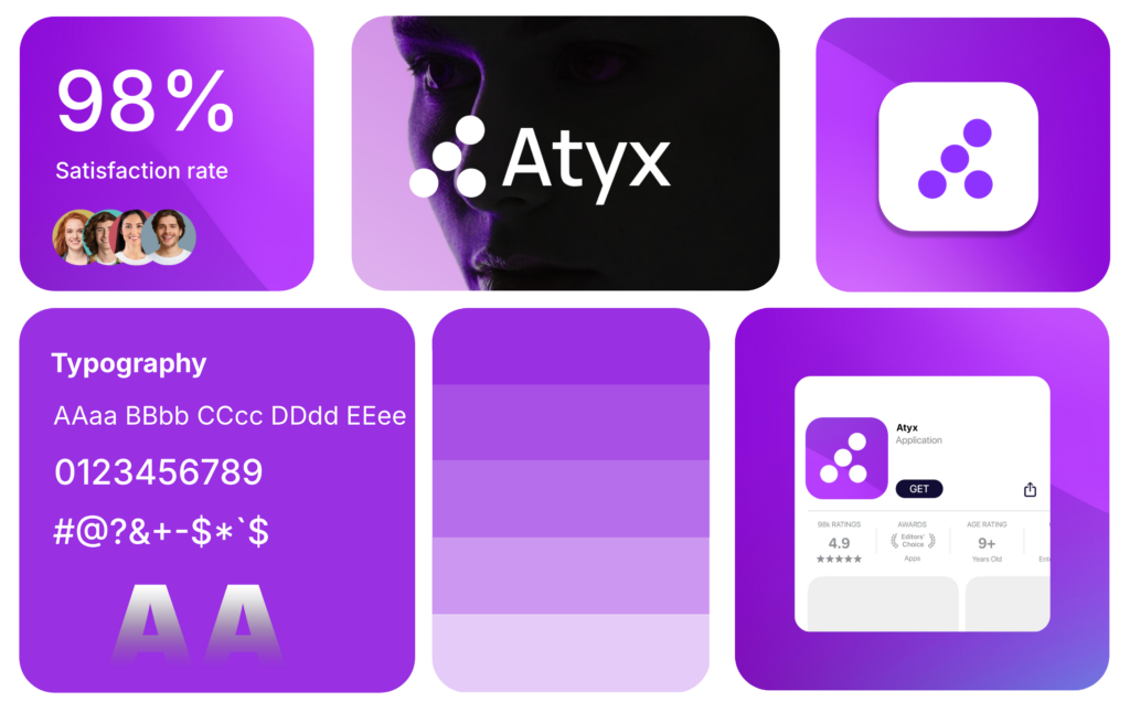
Short answer: it depends on the name, not on preference. A distinctive, short, ownable name can often carry the whole brand as a wordmark alone, especially early on when awareness matters more than iconography. A generic or long name usually needs a symbol to do some of the identity work the words can’t.
There’s a practical test here too. If the name is going to get cropped down to an app icon or a favicon eventually, and it almost always will, a pure wordmark has to survive that crop. If it can’t, you need a symbol as a fallback, even if the wordmark stays the hero everywhere else.
What rules matter for logo design in a digital-first product?
If your product lives on screens, these aren’t optional. They rarely show up in general design advice, but they decide whether a logo actually functions once it ships.
9. Design for the favicon size first, not last. A logo that looks great at 400px and turns into a smudge at 16px hasn’t actually been designed for how most people will encounter it: as a tiny tab icon they glance at fifty times a day.
10. Test in dark mode and light mode, both, before you approve anything. A mark that relies on a white background to read correctly will fight every dashboard, every Slack integration, and every dark-mode-default app it ends up living inside.
11. Build in a responsive lockup for narrow spaces. Mobile navbars, email signatures, and social avatars all compress differently. A logo system needs a full version, a compact version, and sometimes a mark-only version, planned from the start rather than improvised under deadline.
12. Consider how it needs to move, even if it doesn’t move yet. You don’t need a Pixar-level animated intro. But if the logo will ever appear as a loading spinner or an app splash screen, a design with too many overlapping elements will animate badly. Worth thinking about before it’s locked.
Brandframer has built identity systems for founders across SaaS, e-commerce, consulting, and professional services, all delivered in 48 hours, starting at $280. If your brand needs to work as hard on a phone screen as it does on a pitch deck, that’s the default, not an upgrade.
How do you protect a logo legally before you launch it?
This is the gap that costs founders the most money after the fact, and it’s almost never mentioned in design-focused advice because it isn’t a design problem. It’s a legal one that shows up during the design process.
13. Run a trademark clearance search before you fall in love with a direction. It’s a genuinely painful conversation to have after the fact: the mark is finished, everyone loves it, and it turns out a competitor two states over already owns something close enough to cause trouble. A basic search early costs almost nothing. Discovering the conflict after launch costs a rebrand.
14. Own your source files, not just the exported JPEG. A founder who only has a PNG from a freelancer who’s since gone dark can’t resize the logo properly, can’t hand it to a printer, and can’t make even minor edits without starting over. Vector files (AI, EPS, SVG) aren’t a nice-to-have, they’re the actual asset.
15. Register the mark in the categories that matter to your business. You don’t need blanket trademark coverage on day one. But if the brand is core to how you raise money or sell, at least understand which classes you’d want to protect and when it becomes worth doing.
How do you know when a logo design is actually finished?
Here’s the honest part: no rule on this list guarantees a logo that works. A technically perfect mark attached to a confused positioning strategy will still underperform. Design fixes design problems. It doesn’t fix a business that hasn’t figured out who it’s for.
16. Get outside eyes before you commit. Not just internal approval, actual outside reaction. It’s strikingly easy to miss an unfortunate resemblance, a hidden word, or an association that’s obvious to a stranger and invisible to anyone who’s stared at the file for three weeks straight.
17. Build the brand guidelines before you need them, not after the first inconsistent use.
18. Expect criticism, and learn to separate signal from noise. Every visible rebrand gets some public pushback now, that’s just the current internet. The question isn’t whether someone dislikes it. It’s whether the specific feedback points to something real (unclear at small sizes, doesn’t scale, feels off-category) or is just someone’s personal taste showing up in a comments section.
19. Ship it, then keep watching how it’s actually used. A logo system reveals its gaps in practice: the version nobody uses correctly, the crop that always looks wrong, the color that doesn’t hold up on a certain material. Plan to revisit the guidelines after three or six months in the wild, not five years.
The rules of logo design worth remembering are the ones that hold up under actual use: simplicity, appropriateness, restraint, and a plan for everywhere the mark has to survive. Most founders don’t have the time to run all nineteen of these themselves while also running the business.