
Fintech Logo Design Trends for 2026
 Jul 24,2026
Fintech logo design trends move faster than almost any other category, because fintech brands are under more pressure than almost any other category. A founder pitching investors, a neobank onboarding its millionth user, a payments platform trying to look less like a spreadsheet and more like infrastructure people trust with their money: all of them are watching what Stripe, Wise, and Revolut do, and adjusting.
That copying instinct is exactly why so much fintech branding looks the same right now. Dark backgrounds, a gradient, a clean sans-serif wordmark. It signals competence. It also signals nothing specific about the company wearing it.
What follows is not a generic logo trend roundup. It’s what’s actually shifting in fintech logo design for 2026, why it’s shifting, and where a trend is worth following versus where it’s just noise dressed up as strategy.
Why fintech logos are getting radically simpler?
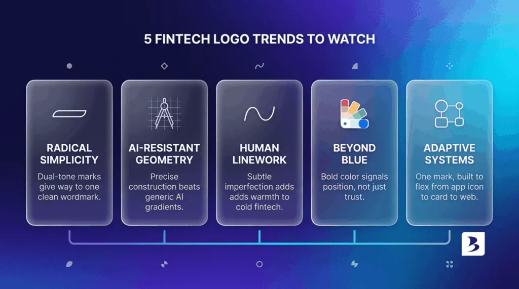
The clearest pattern across fintech rebrands this cycle is subtraction, not addition. Companies are dropping dual-tone marks, layered icons, and decorative flourishes in favor of a single clean wordmark or a stripped-down symbol.
Eddid Financial, the Hong Kong-based brokerage, is a good example. It swapped a layered, dual-tone logo for a minimalist wordmark and framed the move as reflecting simplicity as a core value, not just a fresher look. That’s a notable claim for a firm whose entire business is managing complexity for its clients. The visual restraint is doing reassurance work that a busier logo never could.
This isn’t really a fintech-specific trend. It’s a fintech-accelerated one. When your product already asks users to trust you with something abstract and high-stakes, a cluttered logo reads as a company that hasn’t figured out what it stands for yet.
If your logo still has three colors, a drop shadow, and a tagline crammed underneath it, you’re not behind a trend. You’re behind a clarity problem, and that’s worth fixing regardless of what year it is.
What does “AI-resistant” logo design actually mean?
You’ll see this phrase everywhere in 2026 trend coverage, and it’s worth unpacking because most articles use it without explaining it. AI-resistant logo design means marks built on precise, deliberate geometry, tight construction, and details that would be hard for a generic AI image generator to replicate by accident.
The logic is straightforward. As more startups spin up quick logos through AI tools, the visual output converges: soft gradients, generic rounded shapes, that same algorithm-friendly look. A logo that’s obviously hand-constructed, with exact proportions and considered negative space, signals human craftsmanship in a way a five-minute AI prompt can’t fake.
For fintech specifically, that distinction carries extra weight. A brand asking people to move their money needs to look deliberate, not generated. Precision reads as competence. Sloppy or generic reads as a company that didn’t think hard about anything, including your money.
Speed doesn’t have to mean sloppy, by the way. A 48-hour identity system can still be built on real geometric logic instead of a template. That’s the whole point of doing it fast and doing it right.
Why hand-drawn imperfections are showing up in cold financial brands?
Here’s a trend that looks contradictory next to AI-resistant precision, but actually works alongside it. Some fintech brands are introducing subtle weight variation, slightly organic curves, or hand-touched linework into otherwise clean marks.
The goal is warmth. Financial technology has a trust problem baked into the category itself: it’s abstract, it’s regulated, and most people don’t fully understand what happens between “I tapped pay” and money actually moving. A logo that feels engineered by a machine can widen that emotional distance. A logo with a trace of human hand narrows it back down.
You won’t see this everywhere, and you shouldn’t force it. A B2B payments infrastructure company selling to developers has less use for warmth than a consumer banking app selling to first-time savers. Know your audience before you decide your brand needs to feel more human.
Why blue is losing its grip on fintech branding?
Blue has been the default fintech color for a decade, for an obvious reason: it signals trust, stability, and competence, which is exactly what a company handling your money wants to project. That default is starting to crack.
Brex built its entire visual identity on orange and black specifically to reject the blue-means-trustworthy convention, positioning itself as a challenger to legacy corporate banking rather than another version of it. Mercury went further, building around purple, a custom typeface, and cinematic photography that reads closer to a fashion or automotive brand than a bank.
Neither choice was decoration. Both were strategic bets that standing out mattered more than fitting the expected mold. That’s the real trend underneath the color shift: fintech brands using color as a position statement, not just a mood.
Choosing a bold color only works if the rest of the brand backs it up. A loud logo on top of a generic product just looks like overcompensation.
What is an adaptive logo system, and does your fintech need one?
An adaptive logo system is a mark built to flex across contexts: a full wordmark on your website, a simplified icon for your app, a monogram for a favicon, all sharing the same underlying geometry so the brand stays recognizable no matter where it shows up.
This has become close to mandatory for fintech specifically, because fintech brands live across more surfaces than almost any other category. Website, mobile app, physical card, push notifications, embedded widgets inside partner products. A logo that only works as a horizontal wordmark falls apart the moment it needs to become a 32-pixel app icon.
The fintechs getting this right aren’t designing one logo. They’re designing a small family of related marks that all clearly belong to the same brand, tested at every size they’ll actually appear at before anything ships.
That’s also where a lot of DIY and budget logo work quietly fails. It looks fine on a homepage mockup and falls apart the second it hits an app icon or a card design. A proper identity system solves that from day one instead of patching it later.
Wordmark or symbol: which fits a fintech brand better right now?
There’s no universal answer, but there is a useful pattern. Wordmarks tend to suit fintechs that are still building name recognition, or whose whole pitch depends on sounding like exactly what they are (a bank, a broker, a payments platform). A clean wordmark removes ambiguity fast.
Symbols and abstract marks tend to suit fintechs further along, ones that can afford the fintech version of the Nike-swoosh problem, where the icon alone eventually carries the brand without the name attached. Try that too early and you’re just an unfamiliar shape nobody recognizes yet.
Eddid’s move to a minimalist wordmark fits a brokerage that still benefits from spelling out exactly what it does. A more established consumer app chasing an icon-first identity, the kind that shows up as a single glyph in a crowded home screen, is playing a longer game.
If you’re not sure which category you’re in, that’s worth figuring out with an actual logo design process before you pick a direction, not after.
Why some fintechs are rebranding around the word simplicity itself?
This one deserves its own section because it’s easy to miss as a trend and treat as a coincidence. Multiple fintechs this cycle didn’t just simplify their logos, they explicitly named simplicity as the strategic reason for the rebrand, not a side effect of it.
That’s a specific kind of positioning move. It tells the market: we know finance feels complicated, and we’re choosing not to add to that. It’s a promise made through restraint rather than through a feature list. When it’s genuine, it works, because it gives customers a reason for the design choice instead of just a fresher look.
When it’s not genuine, when the logo gets simpler but the product, the pricing, and the onboarding stay just as confusing, it reads as empty. A minimalist mark on top of a complicated experience is worse than no rebrand at all. It’s the visual promise your actual product is about to break.
This is exactly the kind of positioning work that belongs in a fintech brand strategy, not bolted onto a logo update after the fact.
How do you know if your fintech logo needs a refresh?
A few honest signals, rather than “it’s been a while.” If your logo doesn’t hold up at app-icon size, that’s a functional failure, not a style opinion. If competitors launched in the last two years already look more current than you do, that’s a market-perception problem. If your product has expanded well beyond what your original name and mark implied (you started as a single lending tool and now you’re a full financial platform), the logo is actively working against you.
And if you catch yourself explaining your logo to new hires or investors (“it used to mean X, but now we’re more of a Y”), that’s the clearest signal of all. A logo that needs a footnote isn’t doing its job.
None of that means you need a full identity overhaul every eighteen months. It means the decision should be based on what the logo is failing to do, not on what year the calendar says. For a deeper gut check, our guide on when to do a logo redesign walks through the actual decision points.
Should you chase every fintech logo design trend, or build one that lasts?
Here’s the honest tension nobody selling you a rebrand wants to say out loud: not every trend deserves your logo. Some of these shifts are genuine strategic responses to how fintech is maturing as a category. Others are just this year’s version of the gradient everyone copied last year.
PPRO is the clearest counter-example worth studying. The UK payments infrastructure company marked its 20th anniversary with a new wordmark built around the idea of local intelligence, deliberately swimming against the AI-narrative current that nearly every other fintech was reaching for at the same time. For a company whose whole pitch is deep, unglamorous expertise in local payment behavior, leaning on two decades of accumulated know-how instead of chasing a trend was arguably the more credible move, not the safer one.
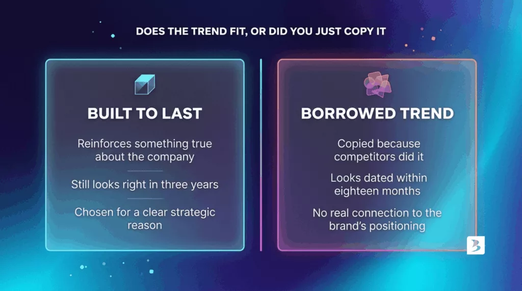
That’s the real question to ask before adopting any trend on this list: does it reinforce something true about your company, or is it just borrowed confidence? A trend that fits your actual positioning will still look right in three years. A trend you adopted because everyone else did tends to look dated the moment the next one arrives.
The fintechs that get this right treat trends as a design vocabulary to draw from selectively, not a checklist to complete. Build from what’s actually true about your company first. Borrow the trend only where it reinforces that truth.
That’s also, honestly, the difference between a logo that ages well and one you’ll be redesigning again in eighteen months, which is a more expensive problem than most founders plan for.
If you’ve read this far wondering where your fintech logo actually sits against these shifts, that’s worth a real conversation rather than another trend list. Brandframer builds complete fintech identity systems, logo, color, typography, and brand guidelines, in 48 hours, for a fixed price, with ten years and thousands of projects behind the process. You don’t need to guess which trend fits your brand. You need someone who’s already run this exact decision for companies at your stage. Check logo design packages built for exactly this, and let’s frame your fintech brand for where it’s actually headed, not where the trend cycle happens to be this quarter.

