
Dentist logo design: the styles that build patient trust
 Jul 24,2026
A new patient decides whether to trust a dental practice before they ever sit in the chair. Half of that decision happens on the website, the sign out front, or the business card a friend handed them. A weak dentist logo, a stock tooth clipart with a drop shadow, quietly tells people this practice cuts corners. That impression is hard to undo once someone’s in the waiting room.
This guide walks through the styles that actually work for dental practices, the symbols worth using and the ones to retire, color choices that read as clean rather than cold, and what a professional dentist logo should realistically cost. By the end you’ll have a framework for choosing the right direction instead of scrolling through stock sites hoping something clicks.
What makes a dentist logo actually work?
A good dentist logo has to do three jobs at once. It needs to signal cleanliness and competence, feel approachable enough that a nervous patient doesn’t tense up looking at it, and stay legible at the size of a favicon or a sign bolted to a strip mall storefront. Most dentist logos fail on that third point. A detailed illustration of a molar with shading looks fine on a business card and turns into a smudge on Instagram.
Trust, in this category, is mostly conveyed through restraint. Clean lines, a confident wordmark, and a mark that doesn’t try too hard tend to outperform anything cartoonish or overly literal. Think about the difference between a dental practice that looks like a boutique clinic and one that looks like it’s advertising a kids’ birthday party. Both might be well designed. Only one signals “board certified.”
Brandframer has built identity systems for dental and healthcare practices across the US, and the pattern holds every time: the practices that get the most referrals usually have the simplest, most confident visual identity. Not the loudest one.
What are the main dentist logo styles?
Most dental practice logos fall into a handful of recognizable styles, and knowing them makes it much easier to brief a designer or judge concepts when they land in your inbox.
Minimalist wordmark or icon: a clean typeface, sometimes paired with a single abstract shape (a simplified tooth outline, a subtle smile curve). This is the safest and most durable choice for a practice that wants to look established rather than trendy.
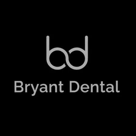
Monogram: initials of the practice or the dentist’s name, built into a tight, symmetrical mark. Works especially well for solo practitioners or family-owned practices where the name itself is the brand.
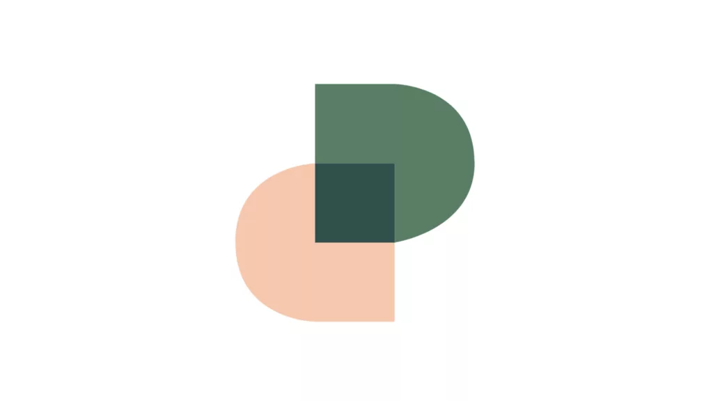
Abstract symbol: a geometric shape that hints at a tooth, a smile, or a shield without illustrating it literally. This is where a lot of the strongest modern dental logos live, since it reads as premium without tipping into cartoonish.
Friendly mascot or illustrative mark: a softened tooth character or smiling icon. This works well specifically for pediatric dentistry, where approachability matters more than gravitas, and works poorly for almost everyone else.
Badge or emblem: a circular or shield-shaped mark enclosing the practice name or icon. In theory it signals trust and permanence, the same logic behind seals on old family businesses. In practice, it’s the least chosen style right now among practices investing seriously in their image. Search through current, well-regarded dental brands in the US and you’ll find plenty of minimalist marks, abstract symbols, and monograms. Badges mostly show up in generic template libraries, not in identities built for a specific practice.
That doesn’t make it a bad style on paper. It makes it a style that needs a genuine reason to exist rather than a default “trustworthy” choice. A badge can still work well for a multi-generation family practice that wants to lean into its history, or a specialty clinic drawing on a heritage or military-adjacent aesthetic on purpose. Outside of that kind of specific story, a badge tends to read as dated rather than established.
Once you know which lane fits your patient base, the rest of the decision gets a lot easier. A pediatric practice and a cosmetic dentistry studio should not be choosing between the same two logo concepts. Speed helps here too. Brandframer delivers a full identity system, logo, palette, typography, and guidelines, in 48 hours, so you can see concepts across several of these styles before committing to one.
What symbols show up in dental branding, and which to avoid?
The tooth is the obvious symbol, and it’s not wrong. It’s just overused in its literal form. A fully rendered, anatomically shaded tooth reads as clip art almost immediately, mostly because thousands of stock logos use the exact same reference.
The smile curve, a simple arc suggesting a smile without drawing teeth, tends to age better. It’s soft enough to feel warm and abstract enough to avoid the stock-art problem. The cross or plus sign borrowed from general healthcare branding works for multi-specialty clinics but can feel generic for a dentist-specific practice. Shields and crests suggest trust and heritage, which is why they show up so often in badge-style marks for established or multi-location practices.
What to avoid: literal X-ray imagery (unsettling to a nervous patient), dental tools rendered in detail (drill and mirror iconography reads clinical in the wrong way), and anything resembling a cartoon tooth with a face, unless the practice is explicitly pediatric. That last one is the single most common mistake in this category.
What colors work best for a dental logo?
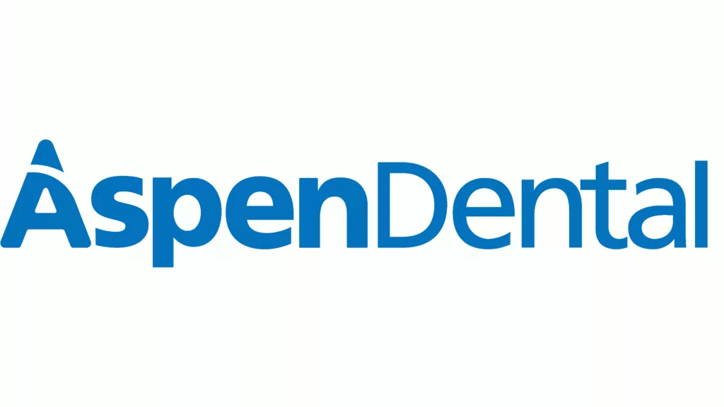
Blue dominates dental branding for a reason. It reads as clean, clinical, and calm, which is exactly the emotional register a nervous patient needs, and it’s the color nationwide brands like Aspen Dental lean on precisely because it scales across dozens of locations without needing explanation. Teal and mint green are close seconds, borrowing the same trust signal while feeling slightly warmer.
White space matters as much as the color itself. A dental logo with too much color feels busy in a way that undercuts the cleanliness message the whole category is trying to send. The strongest dental identities usually use one primary color plus a neutral, not a full palette.
There’s a real pattern worth naming here, and it’s broader than just “luxury practices go gold.” Boutique-style brands like Grand Street Dental and The Gleamery deliberately skip blue altogether, leaning into warm neutrals, ivory, and black to signal “this doesn’t feel like a dental office” rather than “this is a trustworthy dental office.” It’s less about looking expensive and more about looking un-clinical on purpose. That only works if the rest of the experience backs it up. A boutique palette on a practice that still runs like a standard clinic creates a mismatch patients notice fast.
Getting this balance right across a full identity system, not just the mark itself, is where a lot of DIY logos fall apart. How professional identity design services structure this work shows what actually gets delivered when it’s done properly, palette, typography, and usage rules included, not just a single file.
How much does a professional dentist logo cost?
Pricing in this category swings wildly depending on who’s doing the work. A freelance marketplace logo can run anywhere from $50 to $500 with no brand system attached, just a single file and good luck figuring out the color codes later. A traditional branding agency, meanwhile, can easily charge five figures and take six to eight weeks for what amounts to a logo and a style guide.
Neither extreme makes sense for most practices. The cheap option usually means no strategy, no alternate logo versions for different applications, and no support once the file lands in your inbox. The expensive option means paying agency overhead for a timeline that has nothing to do with the actual design work.
Brandframer sits in between on price and ahead on speed. Basic runs $280, Premium is $480, and BrandFramer 360 is $987 for a full identity system, delivered in 48 hours regardless of tier. No six-week discovery phase, no committee of account managers between you and the work. For a full breakdown of what changes between tiers, logo design pricing across service levels lays out exactly what’s included at each price point.
What mistakes sink most dental logos?
The most common failure is trying to say too much in one mark. A logo that combines a tooth, a cross, a heartbeat line, and the practice name in a script font is not a brand identity, it’s a mood board that never got edited down. The best dental logos usually commit to one idea and execute it cleanly.
The second mistake is choosing a typeface that fights the tone of the practice. A heavy, aggressive font on a family dentistry logo reads wrong. A delicate script on an oral surgery practice undersells the expertise. Typography carries more emotional weight in healthcare branding than most people expect going in.
And the honest caveat here: not every practice needs a from-scratch identity overhaul. A well-established practice with strong word-of-mouth and a dated but recognizable mark might get more value from a light refresh than a full rebuild. Ripping out twenty years of local recognition for a trendier logo can cost more in lost brand memory than it gains in polish. If that’s the situation, a lighter refresh path is usually the smarter move.
How to choose the right dentist logo for your practice?
Start with the patient, not the aesthetic. A pediatric practice, a cosmetic studio, and a family clinic in a strip mall are selling three different experiences, and the logo should reflect that before it reflects personal taste. Write down the three words you want a new patient to feel looking at your sign. That list, more than any mood board, should drive the style decision.
From there, test legibility before anything else. Shrink the concept down to a 32-pixel favicon and picture it on a small sign. If it turns to mush, it fails regardless of how good it looks at full size on a screen. This single test eliminates more bad dental logos than any amount of design theory.
Compare that instinct against how other professional service categories approach the same problem. How law firms handle trust-driven logo design and how restaurants build approachable marks both wrestle with the same tension between authority and warmth that dental branding does, just in different registers.
Getting this right on your own is possible. Getting it right in 48 hours, with a full system built around your specific patient base instead of a generic dental template, is what Brandframer exists for. If your current logo is costing you first impressions before a patient even calls, that’s a fixable problem, and it doesn’t have to take six weeks or six figures to fix.

