
Fintech Brand Strategy: A Founder’s Framework
 Jul 20,2026
Money is emotional, and fintech asks people to trust software with it. That’s the entire problem a fintech brand strategy has to solve before a single feature ships. A founder can have the best underwriting model in the category, but if the brand reads as generic or, worse, sketchy, nobody hands over their account number.
This article breaks down what a real fintech brand strategy includes, why it behaves differently than branding for a SaaS tool or a coffee shop, and how to decide whether to build it yourself or bring in someone who’s done it a hundred times. No fluff about “authenticity” or “storytelling.” Just the framework.
What is fintech brand strategy, and how is it different from branding?
Fintech brand strategy is the decision layer that sits above your logo and color palette: it defines how your company positions itself, talks, and behaves across every regulated and unregulated touchpoint, from the app’s onboarding copy to the investor deck. Branding is what people see. Strategy is why it’s built that way.
Most founders confuse the two because agencies sell them as one bundle. They’re not. A visual identity without a strategy behind it is decoration. A brand strategy without a strong visual execution stays invisible, no matter how sharp the positioning document is. You need both, in that order: strategy first, then the system that expresses it.
Why does brand strategy matter more in fintech than in other industries?
Fintech brand strategy matters more because it has to build trust with someone’s money, not just their attention, and trust is the one thing a founder can’t fake into existence. A DTC brand can win on a nice unboxing experience. A fintech brand loses the room the second it feels unpolished, because unpolished reads as unsafe.
Consumers and business owners have been burned by banks, scammed by apps, and buried in fine print. They arrive skeptical by default. Your brand strategy has to counter that skepticism before your product even gets a chance to prove itself, which means every visual and verbal choice is doing double duty: differentiation and reassurance at the same time.
That’s a harder brief than most industries face. It’s also why founders who treat this as an afterthought tend to burn cash reacquiring users who bounced at signup. If you want a system built for that exact pressure in 48 hours instead of the usual six-week agency runway, that’s the entire reason Brandframer exists.

What are the core components of a fintech brand strategy?
A working fintech brand strategy has five core components: positioning, verbal identity, visual identity, brand architecture, and governance. Skipping any one of them shows up later as inconsistency.
- Positioning is the specific claim you own in the market, stated in a sentence a competitor couldn’t say with a straight face.
- Verbal identity covers tone of voice, terminology rules, and how you explain complex financial mechanics without sounding like a prospectus.
- Visual identity is the logo, color system, typography, and iconography, built to work at app-icon size and on a pitch deck slide with equal clarity.
- Brand architecture governs how you name products, tiers, or partner integrations under one house brand, which matters more here than in most categories.
- Governance is the guidelines document that keeps a support team’s tone consistent with your Series A pitch.
A properly scoped brand identity package covers all five, not just the logo file. Getting this system right the first time is faster than fixing it after launch, which is the whole value case for doing it properly instead of assembling it from three different freelancers.
How do regulatory and compliance constraints shape fintech branding?
They shape almost everything, and most branding guides skip this entirely. Financial services trademarks get contested more often than trademarks in other categories, because the name space is crowded and the USPTO scrutinizes anything that sounds like it’s implying a banking charter you don’t have.
Claims language is another minefield. Words like “guaranteed,” “insured,” or “risk-free” carry regulatory weight in financial marketing that they simply don’t carry for a project management app. Your brand voice guidelines need to bake in what your compliance team will and won’t approve, so your marketing team isn’t rewriting headlines the night before a launch.
Here’s the honest nuance: none of this means your brand has to sound like a disclosure form. The best fintech brands write clear, human copy that still passes legal review, because the constraint gets designed into the voice from day one instead of bolted on afterward. That’s a strategy problem, not a copywriting problem, and it’s exactly where a generalist agency without fintech reps tends to fall short.
What can founders learn from strong fintech brand strategies?
The strongest fintech brands treat simplicity as a trust signal rather than a design trend, and each one commits to a single emotional territory instead of trying to cover all of them at once. Mercury built its entire identity around looking less like a bank and more like the operating tool a technical founder already trusts, clean typefaces, restrained color, zero stock-photo banker imagery.
Ramp leaned the opposite direction on tone: fast, a little irreverent, built for founders who want savings numbers, not reassurance. Chime went further into approachability, using warm color and plain language to serve a customer legacy banks had spent decades alienating with fees and jargon.
The mistake founders make most often isn’t picking the wrong agency. It’s picking an agency scoped for a problem three sizes bigger than the one they actually have, then paying enterprise rates and enterprise timelines for what should’ve been a two-week fix. If you’re still fuzzy on what you’re actually buying before you get on a call, our breakdown of what brand identity actually means and why it matters is worth reading first.
What is fintech style, and how do you choose a visual direction?
Fintech style generally means clean grid-based layouts, restrained typography, and color systems that trade the traditional navy-and-gold of legacy finance for sharper, more contemporary palettes, usually anchored by one confident accent color instead of a rainbow of features.
But style isn’t a template you copy. It’s a decision that follows from your positioning. A brand built around speed and youth can afford bold color and playful micro-interactions. A brand serving CFOs and treasury teams needs more restraint, because a flashy visual system undercuts credibility with that audience faster than a plain one ever would.
Ask yourself who actually approves the purchase, not just who uses the product. That answer usually settles the visual direction argument before it starts.
Should a fintech founder build brand strategy in-house or bring in a specialist?
If you have a designer on staff who’s shipped a fintech brand before, in-house can work, but that’s a narrow case. Most early-stage teams don’t have that person, and hiring one full-time before you’ve found product-market fit is a bad use of runway.
Freelancers are cheaper than agencies but inconsistent: you’re betting on one person’s availability, taste, and ability to think strategically rather than just execute a logo. Full-service branding agencies solve the consistency problem but usually run six to twelve weeks and price accordingly, which is fine if you’re not racing a raise.
The middle path, and the one most fundraising-stage founders actually need, is a specialist studio that treats brand identity as a defined process rather than an open-ended creative engagement. That’s the gap Brandframer was built to close: a decade of running this exact process for founders in every industry, including fintech, without the agency runway. You can see how that compares to hiring for the role directly in our piece on who develops brand identity for SaaS companies, since the buy-versus-build logic is nearly identical.

How much does a fintech brand strategy cost, and how fast can you move?
Pricing in this category ranges from a few hundred dollars for a bare logo file to well into six figures for enterprise rebrands with full research phases. Neither end serves a founder who needs something credible before a demo day or a fundraise next month.
Brandframer runs three fixed tiers instead: Basic at $280 for founders who need a real, professionally built identity fast; Premium at $480 for teams that need a fuller system including brand guidelines; and BrandFramer 360 at $987 for founders who want the complete package, positioning included. All three ship in 48 hours, not weeks, because the process is internal and repeatable rather than reinvented on every project.
Speed matters more than most founders admit until they’re the ones stuck waiting on round three of logo revisions with a term sheet sitting in their inbox. Isn’t that exactly the moment brand strategy stops being a nice-to-have and becomes a blocker?
Build the brand strategy before you need it!
A fintech brand strategy isn’t a deliverable you check off once and forget. It’s the decision framework that keeps every future hire, every pitch deck, and every customer touchpoint pulling in the same direction, especially once you’re moving too fast to relitigate tone of voice in every meeting.
Get the positioning, the voice rules, and the visual system locked early, and every dollar you spend on growth compounds instead of fighting an inconsistent brand. Get it wrong, or skip it, and you’ll be rebuilding it later at a worse time, usually right before a raise or a launch you can’t delay.
Brandframer builds that full system, positioning through guidelines, in 48 hours, across three fixed-price tiers, backed by ten years and thousands of projects across every industry including fintech. If you’re staring down a launch date and still don’t have a brand that matches the product you built, that’s the whole reason to start the process today instead of next quarter.
Standout examples of fintech brand identity
handful of fintech brands have built visual systems distinct enough to study on their own merits, each solving a different trust problem for a different audience.
Klarna
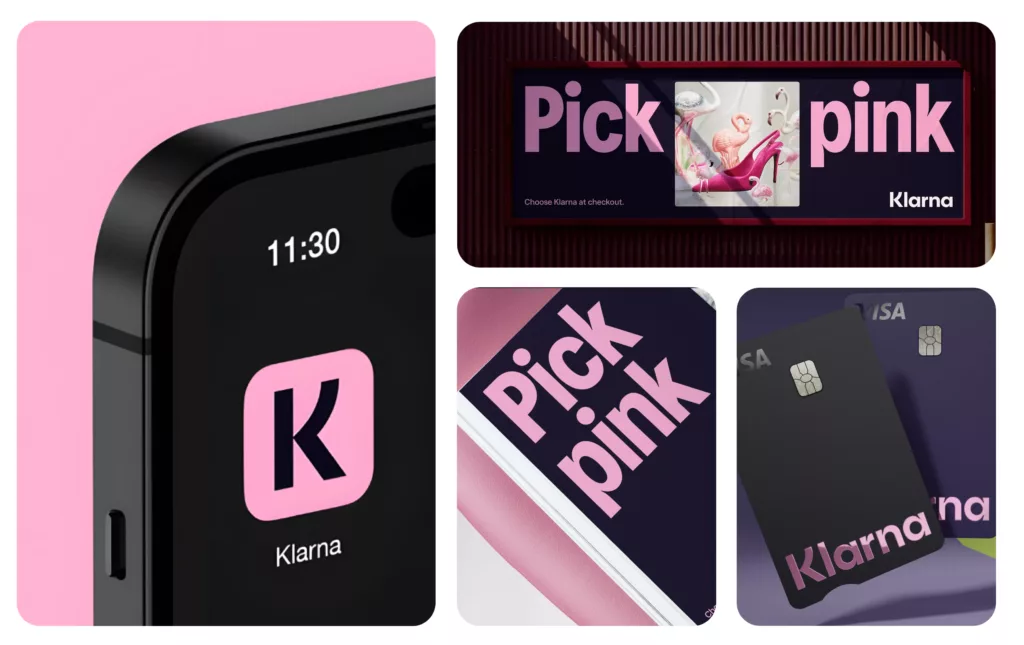
Klarna leans into a soft pastel palette and playful typography, a deliberate choice to make buy-now-pay-later feel approachable instead of anxiety-inducing, since the product itself carries enough built-in skepticism without a cold, corporate visual system on top of it.
Stripe
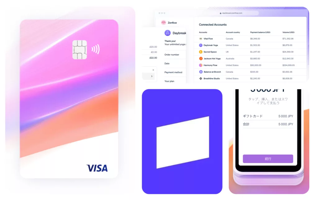
Stripe sits at the opposite end of the spectrum: quiet, almost editorial, built to reassure two very different audiences (developers integrating an API and CFOs signing off on the contract) with the same restrained visual language. Its brand doesn’t shout, and that restraint is the entire strategy.
Wise
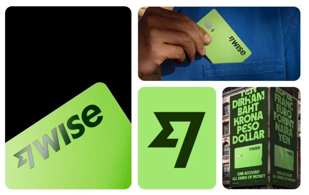
Wise built its identity around one idea: no hidden fees, ever. The bright, flat colors and blunt typography leave no room for ambiguity, which mirrors the product’s whole pitch. If you’re transferring money internationally, the brand itself is doing the work of proving there’s nothing to hide.
Coinbase
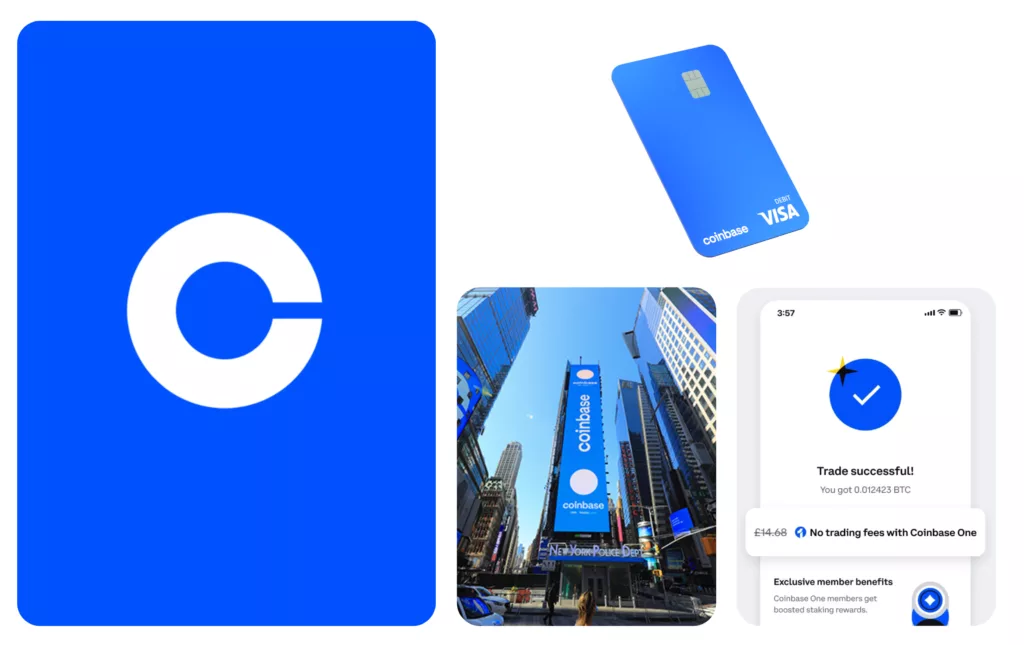
Coinbase shows what it looks like to make a historically distrusted category, crypto, feel safe for a mainstream audience: clean blues, minimal iconography, nothing that reads as speculative or risky, even though the underlying product is exactly that for most users.
Revolut
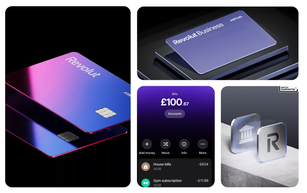
Revolut takes a different problem entirely: how do you visually organize a dozen financial products, cards, crypto, stock trading, currency exchange, under one coherent identity without the whole system collapsing into noise. Its answer is a bold, gradient-heavy palette that ties everything together at a glance.

