
When to do a logo redesign (and how to get it right)?
 Jul 16,2026
A logo redesign is one of those decisions founders sit on for way too long. You know something feels off every time you send a pitch deck or slap your logo on a hoodie, but you keep telling yourself it’s not the priority this quarter. It rarely is, until the moment it suddenly is: a new round, a new market, a competitor who just rebranded and made yours look five years older overnight.
This guide walks through when a logo redesign actually makes sense, how the process works step by step, what separates it from a simple refresh, and what it should cost you in 2026. No fluff, no theory you can’t use tomorrow morning.
What actually counts as a logo redesign?
A logo redesign means rebuilding your mark from the ground up: new shapes, new typography, sometimes a new color system entirely. It’s different from a refresh, which keeps your existing foundation and just sharpens it.
Here’s the distinction that matters in practice. If your logo still represents who you are but looks dated or slightly amateurish, that’s a refresh. If your logo no longer represents the business you’ve become, that’s a redesign. Confusing the two is how founders end up paying for a full identity overhaul when a font swap and a tighter color palette would’ve done the job, or the opposite: patching a logo that fundamentally doesn’t work anymore.
Getting this distinction right also affects how the rest of your visual identity holds up. A strong mark follows a handful of design fundamentals regardless of style, and it’s worth understanding those core logo design principles before you brief anyone on a redesign, whether that’s an agency or your own team.
If you already know a refresh won’t cut it and you’re past the “maybe” stage, there’s no reason to spend six weeks in discovery workshops to get there. Brandframer runs a full redesign, logo, color system, typography, and brand guidelines, in 48 hours, because a founder who’s already made the decision doesn’t need to be sold on it again.
How do you redesign a logo, step by step?
Redesigning a logo starts with defining why you’re changing it, not with opening a design tool. Skip that step and you’ll end up with something that looks different but doesn’t actually fix the problem.
The process generally moves through a few stages. First, you get clear on your reason for changing: is it growth, a shift in positioning, a name change, or simply that the logo hasn’t aged well? Then you look at what to keep. Most successful redesigns preserve at least one recognizable element, a color, a shape, a distinctive letterform, so existing customers don’t feel like the brand vanished overnight.
From there, the work moves into exploration: sketching directions, testing typography, building out a handful of real concepts rather than one “safe” option. And finally, you test the finalists across the places your logo actually lives, a website header, a business card, a favicon at 16 pixels, before locking anything in. A logo that only looks good on a slide deck isn’t finished.
Founders who try to run this whole sequence solo often lose weeks second-guessing themselves between steps three and four. That’s the exact gap Brandframer’s fixed 48-hour process is built to close: the strategy, the exploration, and the testing happen inside one structured sprint instead of dragging across a month of back-and-forth emails.
What is rebranding, and how is it different from a logo redesign?
Rebranding is broader than a logo redesign. It covers your name, your positioning, your messaging, and often your entire visual system, while a logo redesign is just one piece of that larger shift.
Think of it this way: you can redesign your logo without touching your brand strategy at all, if the only problem is that the mark looks dated. But you can’t really rebrand without redesigning the logo, because the logo is the most visible symbol of everything else that’s changing underneath it. Companies that pivot their product, merge with another business, or reposition for a completely different customer usually need the full rebrand, not just a new mark.
Not every business needs to go that far, and that’s worth saying plainly. If your product, your customer, and your positioning haven’t changed, a logo redesign alone is probably the right call, and spending the budget on a full rebrand would be solving a problem you don’t have.
Signs your logo actually needs a redesign
Some signs are obvious. Others are the kind founders rationalize away for a year too long.
The clearest one: you’re embarrassed to hand someone your business card. If you hesitate before sharing your logo with a new investor or a potential hire, that hesitation is data. Growth is another trigger. A logo built for a single product doesn’t always stretch to cover the three others you’ve launched since.
Competitive pressure matters too. When a direct competitor redesigns and suddenly makes your identity look like it hasn’t been touched since the seed round, that’s not vanity, that’s a market signal. And there’s a technical version of this problem: a mark that was designed as a full illustration doesn’t shrink down into a clean app icon or favicon. If your symbol turns into a blurry smudge at small sizes, the issue isn’t your camera roll, it’s the mark itself. Understanding the difference between a brandmark and a full logo lockup helps explain why some marks scale cleanly across formats and others fall apart the moment they leave a business card.
None of these signs mean you’re starting from zero, either. After ten years and thousands of projects across nearly every industry, the pattern holds up: the businesses that wait too long to act on these signals almost always spend more fixing the confusion later than they would have spent addressing it early.
What do successful logo redesigns actually look like?
The best redesigns don’t reinvent a brand from scratch. They fix a specific, identifiable problem while keeping the thread that made people recognize the company in the first place.
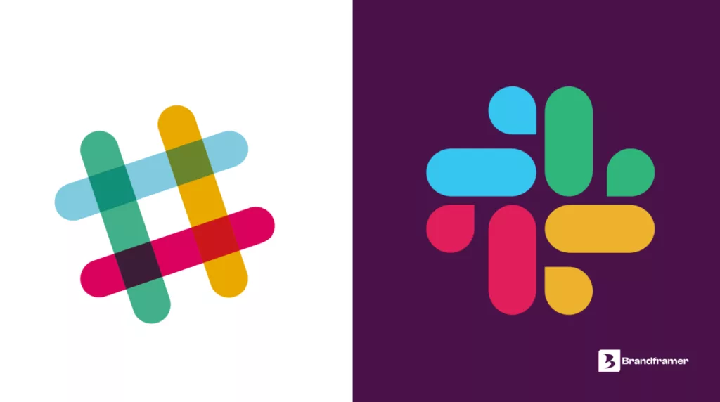
Slack is a good example of the “digital compatibility” problem in action. Its original hashtag-style mark looked fine on a desktop app icon but broke down at small sizes and across the range of platforms Slack had grown into. The redesign simplified the shape and standardized the colors so the mark would hold up whether it showed up on a phone screen, a browser tab, or a conference banner.
Dropbox redesigned when the business itself outgrew the logo, not before. What started as a single file-storage product expanded into a broader suite of tools, and the old mark (a literal open box) no longer represented what the company actually did. The new identity moved away from the literal icon toward a more flexible system that could stretch across products without looking like it belonged to a different company each time.
Instagram is the clearest case of a redesign driven by legibility, not boredom. The original photorealistic camera icon looked polished on a large screen and turned into a muddy smear at app-icon size, which is the exact size most users actually see it at. The flattened, simplified icon that replaced it was a direct response to how and where the logo actually gets used, not a stylistic whim.
None of these companies changed their logo because someone got tired of looking at it. Each redesign traced back to a specific, nameable reason: the mark stopped working at the sizes people actually saw it, or the business had moved past what the old symbol could represent. That’s the same test worth applying before touching your own.
If your reason for redesigning sounds more like “I found something we like better” than “here’s the specific thing that stopped working,” it’s worth slowing down and naming the actual problem first. A redesign built on a clear reason tends to last years. One built on a mood board rarely lasts past the next rebrand cycle, which tends to arrive faster than founders expect.
Can AI redesign an existing logo?
AI tools can generate logo variations fast, and for a founder testing early directions, that speed is genuinely useful. What they’re much weaker at is judgment: knowing which direction actually fits your positioning, your industry, and the specific way your customers will encounter the mark.
Here’s the honest limitation, and it’s worth saying instead of glossing over it. An AI tool has no context on your last funding round, your competitor’s recent rebrand, or the fact that your customer base skews toward a specific aesthetic sensibility that a generic model has never seen. It can produce a hundred logo options in a minute. It can’t tell you which one will still make sense in eighteen months, or which one will fail the moment someone tries to embroider it on a hat.
That’s not an argument against using AI anywhere in the process. It’s an argument for using it as a tool inside a structured process, not as a replacement for one. A designer who understands your brief can use AI-assisted exploration to move faster through early concepts and still apply the judgment that decides what actually ships.
What does it cost to redesign a logo in 2026?
Logo redesign pricing swings wildly depending on who’s doing the work: a few hundred dollars for a template-based tool, low five figures for a traditional branding agency running a multi-month engagement.
The gap in between those two extremes is where most founders get stuck. Sub-$250 options are essentially templates with your name typed in, fine for a placeholder, not something you’d want on a Series A pitch deck. Traditional agencies, on the other hand, often charge for months of process you didn’t ask for: workshops, stakeholder interviews, endless rounds of “moodboarding” before a single concept appears.
Brandframer sits in the category that actually delivers a real design process without the agency timeline. The Basic plan starts at $280 for a complete logo redesign. Premium runs $480 and adds a broader identity system. BrandFramer 360 is $987 for founders who want the full brand system, guidelines included, delivered in the same 48-hour window. If you want a fuller breakdown of how pricing typically maps to what you actually get, this guide on logo design pricing covers the tiers in more depth.
Redesigned your logo but not sure yet if your whole visual identity needs the same treatment? That’s a fair question to sit with before spending more than you need to, and it’s usually answered in the first conversation, not after you’ve already committed.
Common logo redesign mistakes that cost you recognition
Most logo redesign failures aren’t design failures. They’re process failures that happen before anyone opens a design file.
Changing too much at once is the most common one. Founders who scrap every recognizable element (color, shape, name treatment) end up with a logo that tests well internally and confuses everyone who already knew the brand. Skipping the “why” is another. A redesign done because a founder is personally bored with the old logo, rather than because the business has actually changed, tends to produce something that looks new without solving anything real.
Then there’s the mistake of never testing before launch. A logo that only exists as a polished mockup on a laptop screen hasn’t actually been tested. Does it hold up printed small on a coffee cup? Does it still read clearly as a grayscale favicon? If nobody’s checked, you’re launching blind.
And copying whatever’s trending in your industry that month is its own trap. A distinctive mark ages better than a fashionable one, even if the fashionable one photographs better on day one.
Getting your redesign right, without the six-week detour
A logo redesign only works when it’s grounded in a real reason, built by someone who understands both the design fundamentals and your specific market, and tested before it goes anywhere near your customers. Skip any one of those and you end up redesigning again in eighteen months, which is a more expensive mistake than doing it right the first time.
If you already know your current logo isn’t carrying your business the way it needs to, the fastest path forward isn’t another round of internal debate. Brandframer has run this exact process across thousands of projects over the past ten years, and delivers a complete redesign, logo, brand guidelines, and everything in between, in 48 hours flat. Consider this your sign to stop redesigning the decision and start redesigning the logo.

