
How to design a charity logo that builds trust instantly?
 Jul 22,2026
A donor scrolling nonprofits at 11pm doesn’t read your mission statement first. They see your logo, and in half a second they’ve already decided if you look credible or amateur. That snap judgment happens before a single word of copy gets read, which is exactly why charity logo design carries more weight than most founders and executive directors expect.
Get it right and your mark becomes shorthand for the trust you’re asking people to place in you with their money. Get it wrong and you’re fighting an uphill battle every time someone lands on your site. This guide walks through the elements that actually matter, the colors and symbols that work (and the ones that don’t anymore), and what it realistically costs to get a logo that holds up.
What makes a charity logo trustworthy at first glance?
The key elements to consider are simplicity, a clear symbolic idea, color choice, typography, and how the mark holds up at small sizes. Miss any one of these and the logo undermines the trust you’re trying to build.
Simplicity comes first because a cluttered mark reads as unprofessional, and unprofessional reads as unreliable to a donor deciding where to send money. The symbol needs to carry one idea, not five. A hand, a heart, a tree, a circle, something a person can recognize in the time it takes to glance at a Facebook post. Typography should feel warm but not childish, and legible at the size of a favicon, because that’s often the smallest place your logo will ever appear.
Color and scalability round it out, and we’ll get into both below. But the honest nuance here: a logo can nail every one of these elements and still fail if it doesn’t reflect what the organization actually does. A generic “helping hands” mark on a charity focused on clean water research says nothing specific, and specificity is part of what makes a nonprofit feel real rather than generic.
Brandframer builds full identity systems, not just a symbol, so the mark you get is tested at every size before it ships. If you want a second opinion on whether your current concepts hold up, our logo design principles breakdown is worth a read before you commit to a direction.
How do you choose the right colors for a charity logo?
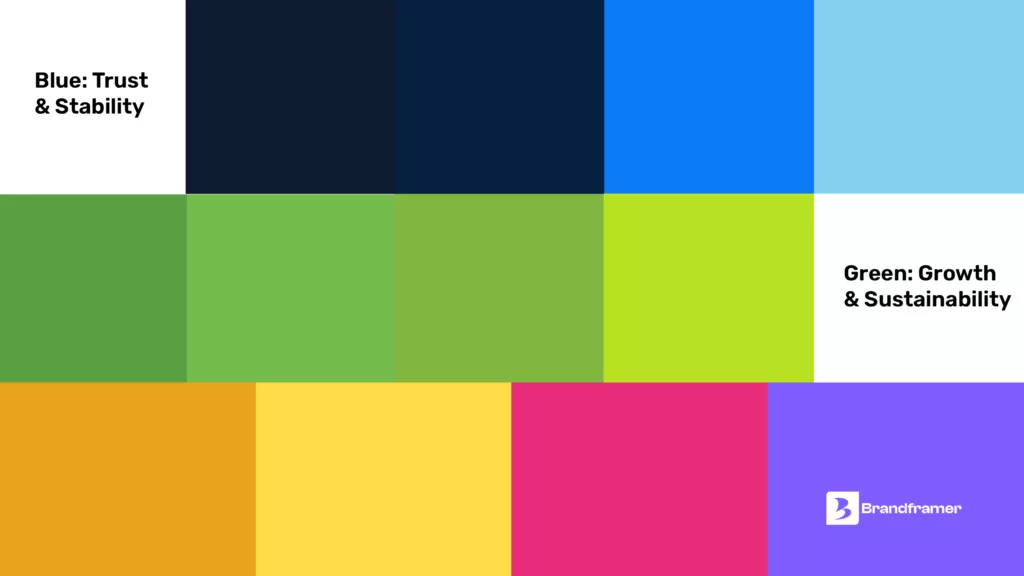
Choose colors based on the emotional register of your mission first, then adjust for accessibility and print limitations. Blue tends to signal trust and stability, which is why it shows up across health and disaster relief organizations. A free clinic serving a low-income community, for instance, leans on a steady navy blue specifically because it needs to read as clinical and dependable before anyone even reads the tagline. Green signals growth and sustainability, a natural fit for environmental and conservation causes. A regional land trust protecting farmland might build its entire palette around a deep forest green, avoiding the brighter “eco” greens that read more like a recycling symbol than an actual place.
Warm tones like orange and coral read as approachable and human, common in community and youth-focused charities. A youth mentorship program working with teenagers in an urban district might pick a warm coral over a corporate blue precisely because the audience needs to feel invited in, not processed through a system.
Here’s the part most founders skip: your color needs to survive being printed in a single color for a t-shirt, embroidered on a volunteer vest, and displayed on a black and white fax cover sheet for some grant application nobody thought about in 2026. If your logo only works as a full-color gradient, it’s going to fail you in half the places it actually needs to show up.
And don’t chase a color just because a bigger organization in your space uses it. Standing out matters as much as fitting in, especially in crowded categories like animal welfare or youth mentorship where every third logo leans on the same blue and green palette.
Ready to lock in a palette that actually works across every material you’ll need? A Brandframer identity system comes with a full color and usage guide built in, so you’re not guessing which shade of blue to use on a grant proposal versus a website banner.
What symbol works best for a charity or nonprofit?
The most common symbols for charity are hands, hearts, and circular or interlocking shapes that suggest unity and support. There’s no single correct answer, but there is a wrong path: reaching for the exact same heart-and-hands combination every other nonprofit in your category already uses.
Scroll through any stock logo site and you’ll see the pattern immediately, dozens of near-identical marks built from the same three visual ideas. That’s the trap. A symbol works when it ties back to something specific about your mission, not when it’s generically “charitable.” A literacy nonprofit built around an open book silhouette says more than another pair of cupped hands ever could. A river conservation group might skip the tree-and-leaf cliché entirely and build its mark around a single flowing line, something that only makes sense once you know what the organization does, which is exactly the point.
Is a heart or a hand automatically wrong? Not at all, plenty of strong logos use them well. The difference is execution and specificity, not the symbol itself. A hunger relief nonprofit using a hand doesn’t have to look like every other hand logo if the hand is holding something specific to the mission, like a single wheat stalk, instead of floating alone in a circle.
Scroll through any stock logo site and you’ll see the pattern immediately, dozens of near-identical marks built from the same three visual ideas. That’s the trap. A symbol works when it ties back to something specific about your mission, not when it’s generically “charitable.” A literacy nonprofit built around an open book silhouette says more than another pair of cupped hands ever could.
Is a heart or a hand automatically wrong? Not at all, plenty of strong logos use them well. The difference is execution and specificity, not the symbol itself.
What do the most recognizable charity logos get right?
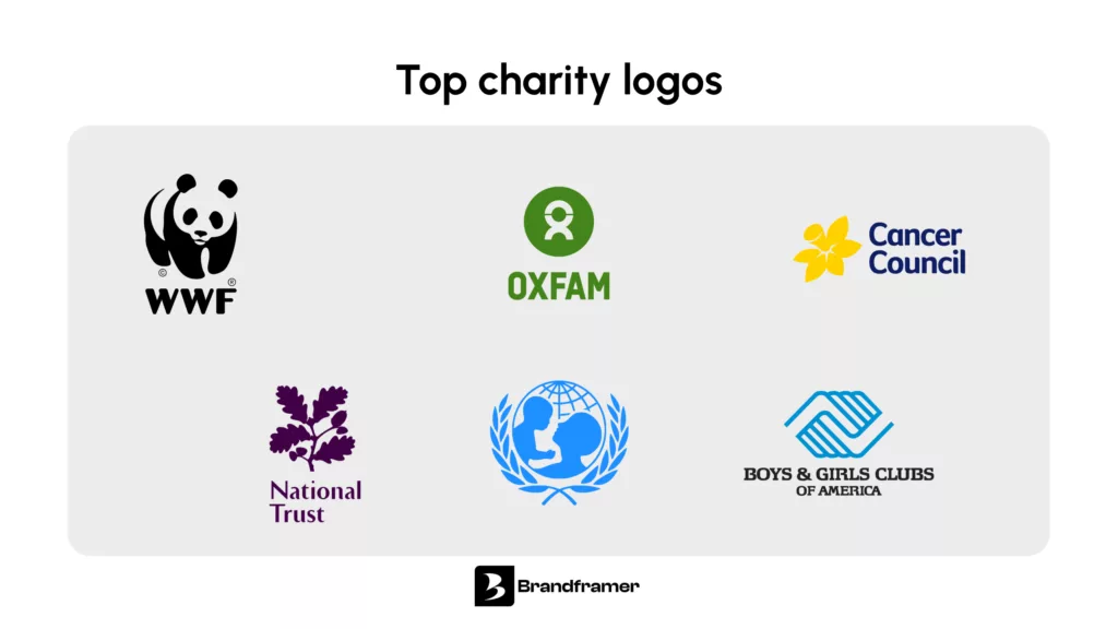
The strongest charity logos share one trait: they reduce to a single, unmistakable shape. The Red Cross works because it’s one geometric mark that reads instantly at any size, from a lapel pin to a hospital wall. The WWF panda works because it’s a silhouette, meaning it prints in one color, embroiders cleanly, and survives being photocopied a hundred times without losing legibility.
UNICEF pairs a simple globe motif with tight, confident typography, proof that you don’t always need an elaborate symbol if the wordmark itself is doing solid work. What ties all three together isn’t budget or fame, it’s restraint. Each one resisted the urge to cram a mission statement into a logo.
That’s the standard worth aiming for regardless of your organization’s size. A five-person nonprofit and a hundred-million-dollar foundation should both be judged by the same test: does the mark still work shrunk down to sixteen pixels?
Can AI tools like ChatGPT actually design a charity logo?
ChatGPT and similar tools can generate logo-style images, but they can’t produce a usable logo system. What you get is a flat image file, not layered, editable vector artwork, and definitely not a coordinated set of colors, typography, and usage rules that scale across a website, a donation form, and a printed annual report.
There’s also a quieter risk. AI image generators are trained on existing visual material, and outputs can land closer to existing marks than founders realize, which is a real problem when your logo needs to be legally distinct enough to trademark and defend. For a placeholder to show a board member during a brainstorm, sure, it can spark ideas. For anything a nonprofit plans to put on a donation page and ask people to trust with their credit card, it’s not built for the job.
This is where the decision usually comes down to speed versus durability. Brandframer delivers a complete, board-ready identity system in 48 hours, at a fraction of what a traditional agency charges and with none of the AI-generated uncertainty.
How do you design a logo for a nonprofit step by step?
Designing a nonprofit logo starts with defining the mission in one sentence, then translating that sentence into visual concepts before a single color gets chosen. Skip the mission step and you end up with a pretty logo that says nothing about what your organization actually does.
Picture a regional food bank going through this process. The one-sentence mission might be “getting fresh food to families before it goes to waste.” That sentence points toward concepts built around movement and freshness rather than a generic donation-box symbol, which is a very different starting point than most food banks land on if they skip straight to sketching.
From there, the process moves through concept sketching around one strong central idea, testing that concept in black and white and at small sizes, gathering feedback from board members or key stakeholders, and finalizing the full file set: vector formats, color variations, and a one-color version for print and embroidery. Founders who skip the small-size test are usually the ones who end up redesigning within a year, because a logo that looks great on a laptop screen and falls apart on a mobile favicon is a logo that needs fixing.
Once the mark is finalized, don’t stop there. A logo without documented usage rules tends to drift over time, one board member picks a slightly different blue for the newsletter, another stretches the wordmark on a banner.
How much should a nonprofit budget for logo design?
Nonprofit logo design typically runs anywhere from under $100 for a template-based DIY tool to several thousand dollars for a full agency engagement, with most quality outcomes landing well below what traditional agencies charge. A template tool might be fine for validating an idea before you’ve registered as a 501(c)(3). But once you’re asking donors for real money, a generic template mark works against you.
Brandframer’s fixed pricing sits in between those two extremes without the agency markup or the multi-week timeline. Basic starts at $280, Premium at $480, and BrandFramer 360, our full identity system with the most brand assets, comes in at $987. All three deliver in 48 hours, built from a decade of experience across thousands of projects, including plenty in the nonprofit and community space.
If budget is the main thing holding your board back from moving forward, our branding cost breakdown lays out exactly what you’re paying for at each price point, so the decision is easier to make in your next board meeting.
Build a logo your donors trust before you’ve said a word
A charity logo isn’t decoration. It’s the first signal a donor gets about whether your organization is credible, organized, and worth their money. Every choice covered here, the symbol, the color, the typography, the scalability, feeds into that first impression, and a generic mark built from stock heart-and-hand clipart works against every fundraising effort that follows it.
Brandframer builds complete nonprofit identity systems in 48 hours, tested at every size, backed by ten years and thousands of completed projects across every industry including nonprofit and community organizations. Ready to give your next campaign a logo people trust on sight? Start your Brandframer identity system today and have it in hand before your next board meeting.
