
Bakery logo design: a complete guide for founders
 Jul 22,2026
A bakery logo has one job most people underestimate. It has to make someone want a croissant before they’ve smelled it, seen the case, or read a single review. That’s a lot of pressure for a small mark on a sign, a box, or an Instagram grid.
Most guides to bakery logo design skip straight to font pairings and color palettes. Fair enough, those matter. But they matter less than getting the fundamentals right first: who the logo needs to convince, what it needs to say in half a second, and how it holds up printed on a paper bag versus displayed on a storefront window at 7am. This guide covers both, the craft and the strategy, so you walk away with a logo that actually earns its place on the box.
What makes a bakery logo actually work?
A bakery logo works when it does two things at once. It signals “bakery” instantly, through shape, warmth, or texture, and it says something specific about your bakery that a competitor three blocks away can’t claim. Generic wheat sprigs and rolling pin icons check the first box. They fail completely at the second.
Think about the difference between a logo that says “artisan sourdough, small batch, minimal ingredients” and one that says “bright, fast, affordable, made for a Tuesday morning coffee run.” Same industry, completely different visual language. The typography, the color, even the amount of negative space all shift depending on which bakery you actually are.
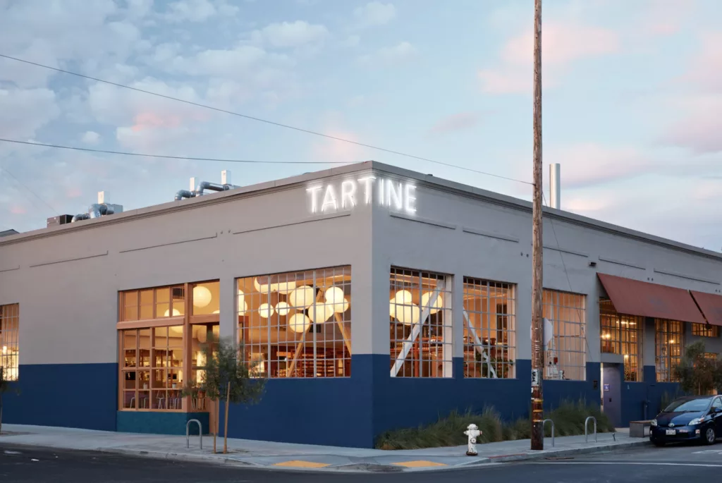
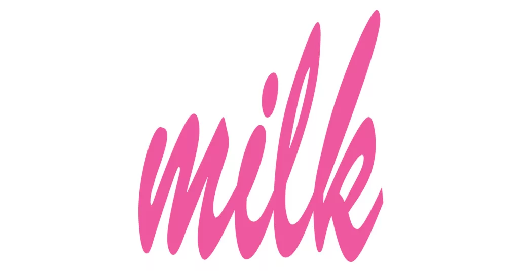
Tartine Bakery in San Francisco, pictured above, is a clean example of the first: a black sans-serif wordmark, no icon, no ornament, built entirely on typographic confidence. Milk Bar sits closer to the second, a stripped-back wordmark too, but with a playful, energetic personality that reads as fast and fun rather than precious. Same basic format, a wordmark with no symbol, and two completely different results, because the letterforms and spacing are doing different jobs.
This is where a lot of DIY attempts fall apart. Someone picks a nice-looking template because it photographs well, without asking whether it matches the actual business underneath it. A strong brandmark follows a handful of consistent principles, covered in our guide to logo design principles, that apply whether you’re a wedding cake studio or a neighborhood bagel shop.
We’ve built brand identities across thousands of projects in every category imaginable, bakeries included, and the ones that hold up long term are never the prettiest logo in isolation. They’re the ones built around a clear read of who the business actually serves.
How do you design a bakery logo step by step?
Strip away the jargon and the process comes down to four decisions made in order. Skip the order and you end up redesigning later, usually right when you can least afford the distraction.
First, define the positioning. Are you premium and small batch, or high volume and accessible? This single decision drives every visual choice that follows, so nail it before opening any design software.
Then choose the logo type. A wordmark built around your bakery’s name works well when the name itself is distinctive. A brandmark, an icon or symbol paired with the name, works better when you’re planning to expand into packaging, merchandise, or multiple locations where a compact mark travels easier than a full name.
Next comes typeface selection, and this is where most home bakers and small businesses go wrong. A script font might feel warm and handmade, but if it’s illegible at the size of a coffee cup sleeve, it’s not doing its job. Legibility at small sizes beats charm every time.
Finally, color and finishing details: the palette, the texture (if any), and how the mark performs in black and white, since you’ll need it that way for invoices, stamps, and simple packaging. Isn’t it strange how often that last part gets skipped, only to become a problem the week before a print order?
Most agencies stretch this four-step process across two or three weeks of back and forth. Brandframer runs the full sequence, positioning through final files, in 48 hours flat, because a bakery opening in six weeks doesn’t have six weeks to spend on a logo.
What are the best bakery logo styles right now?
Three styles currently dominate strong bakery branding, and each serves a different kind of business. Knowing which one fits before you start sketching saves a lot of wasted iterations.
Minimalist wordmarks, clean type with maybe one small graphic accent, are having a real moment. They photograph well on Instagram, scale down to a favicon without losing detail, and read as modern rather than kitschy. Tartine’s logo is the reference point here: black sans-serif type, no supporting graphic, letting the name alone carry the whole brand. If your bakery leans toward specialty coffee, natural wine pairings, or a design-forward interior, this is usually the right lane. Our breakdown of logo design principles covers why restraint tends to outperform decoration for younger, digitally native brands.
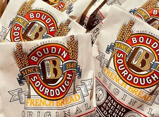
Illustrated emblems, a badge-style mark with a small icon inside a circle or shield, work well for bakeries leaning into nostalgia or a specific heritage story. Think old-world bakeries, family recipes passed down, that kind of narrative. Boudin Bakery, the historic San Francisco sourdough institution, leans into this with a badge-style mark built around bold red and white, a color choice that signals heritage and tradition instantly. The style carries warmth that a stripped-down wordmark simply can’t.
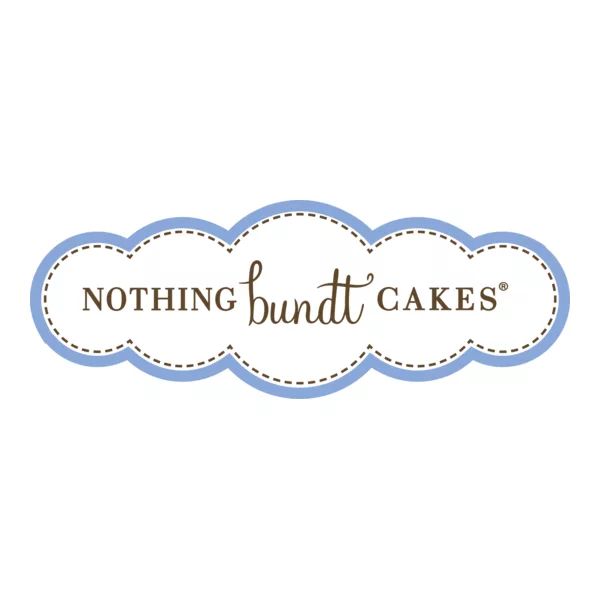
And script-based logotypes still have a place, particularly for cake shops and dessert-focused bakeries where an elegant, handwritten feel matches the product. Nothing Bundt Cakes built its entire identity around a friendly, rounded script that leans hard into homemade charm, which works because the product itself reads as comfort food. The catch is legibility, which is why script styles need a backup sans-serif version for anywhere small type is required.
If your bakery sits closer to the café or full-service restaurant end of the spectrum, it’s worth looking at our guide to restaurant logo design as well, since the same audience-first logic applies with a slightly different set of constraints.
Should a bakery logo be a wordmark or a symbol?
Start with your name. If it’s short, memorable, and easy to say out loud (think “Levain” or “Flour Child”), a wordmark alone often outperforms a symbol, because it does double duty as branding and signage without needing a second element to carry meaning.
If your name is longer, more generic, or shared with other businesses in your area, a symbol earns its place. It gives you something compact for social avatars, packaging stickers, and app icons where a full name won’t fit legibly.
There’s no universally correct answer here, and that’s the honest part most guides skip. A tiny home bakery selling through farmers markets and local delivery apps rarely needs a standalone symbol yet. A wordmark alone, well typeset, does the job and keeps costs down. The symbol becomes worth the investment once you’re thinking about a second location, packaging lines, or wholesale accounts.
Not sure which category you fall into? That’s normal at the early stage, and it’s part of what a proper discovery process is supposed to sort out before any design work starts.
What bakery logo mistakes cost you customers?
The most expensive mistake isn’t a bad font choice. It’s a logo that doesn’t hold up once it leaves the screen. A mark that looks great as a 2000-pixel PNG can turn into mush on a small pastry box sticker or a hand-stamped bag, and that’s exactly where a lot of DIY logos fall apart in the first month.
Overcomplicated icons are the second most common issue. Wheat stalks, rolling pins, croissants, and ovens all crammed into one badge might feel thorough, but a logo needs to work as a silhouette at thumbnail size. If it’s unrecognizable shrunk down to app-icon dimensions, it’s too busy.
Then there’s the trend-chasing trap: picking a font or color combination because it’s popular on Pinterest this month, without asking whether it fits your specific bakery. Trends age fast. A logo built purely to look current now often looks dated within two years, right around the time you’re trying to raise prices or open a second spot.
Getting it right the first time avoids a costly do-over down the line. Brandframer builds every identity to hold up across every surface it’ll actually touch, so nothing about your bakery’s branding ends up half-baked.
How much does a professional bakery logo cost?
Pricing in this industry is genuinely all over the map. Freelance platforms list bakery logos anywhere from $50 to $500, agencies routinely charge $3,000 to $10,000 for a full identity system, and DIY tools are free but come with no strategy, no guidance, and a result that looks like everyone else’s free template.
Brandframer runs three fixed tiers instead: Basic at $280 for a clean logo package, Premium at $480 for a fuller identity system, and BrandFramer 360 at $987 for the complete brand system including guidelines. No hourly billing, no scope creep, no surprise invoice halfway through. You know the number before you start, which matters a lot when you’re already juggling a lease, equipment, and a supplier list.
For more context on how these numbers stack up against the wider market, our guide on logo design pricing breaks down what you’re actually paying for at each price point, and where corners typically get cut.
Value here isn’t about the cheapest option. It’s about paying once for something that doesn’t need replacing in eighteen months.
DIY, freelancer, or agency: how do you choose?
Honest answer first: if you’re testing a home bakery concept before committing real money, a free tool is a perfectly reasonable place to start. Nobody needs a $987 identity system to sell six dozen cookies at a Saturday market and see if the idea has legs.
But the moment you’re signing a lease, ordering packaging in bulk, or putting your name on a storefront, the calculation changes. A freelancer can work, though quality and turnaround vary enormously and you’re often managing the process yourself: briefing, revisions, file delivery, all on your own timeline. A traditional agency delivers more polish but usually takes weeks and charges accordingly.
The gap Brandframer fills sits between those two options: agency-level output, a defined process built on ten years and thousands of completed projects, fixed pricing so there’s no ambiguity, and full delivery in 48 hours instead of weeks. For a founder trying to open on schedule, that timeline difference alone is often the deciding factor.
Getting your bakery logo right from day one
A bakery logo carries more weight than most founders expect going in. It shows up on the sign, the boxes, the delivery app listing, and every social post from here forward, so it’s worth treating as a real decision rather than an afterthought squeezed in between supplier calls.
The businesses that get this right start with positioning, choose a style that matches who they actually are rather than what’s trending, and invest early enough that the branding doesn’t need a costly redo six months after opening. That’s the whole framework covered here: what makes a logo work, how to build one properly, and what it should reasonably cost.
If you’d rather skip the trial and error, Brandframer builds a complete bakery brand identity, logo, color palette, typography, and guidelines, in 48 hours for a fixed price starting at $280. Start with the plan that fits your stage, and have a logo ready before your next supplier meeting.

