
Product Hunt Launch Checklist: Visual Assets You Need (48hr Design)
 Jul 15,2026
A good Product Hunt launch runs on two engines: strategy and visuals. Timing, community mobilization, how fast you respond to comments, all of that matters, and there’s plenty written about it already. This article isn’t about that.
This is about the part founders tend to underestimate until 48 hours before launch day: the actual visual assets sitting on your Product Hunt page. Your gallery, your thumbnail, your demo GIF, the banner you post to announce it. Get the strategy right and show up with a blurry logo and a stretched screenshot, and you’ve handed away votes you already earned.
Here’s the full checklist, with the exact specs Product Hunt expects.
What logo or app icon do you need for Product Hunt?
Your thumbnail is a square image, and Product Hunt recommends 240×240 px. This is the icon that shows up next to your product name in every feed, every list, every notification. It needs to read clearly at a tiny size, which rules out anything with fine detail, small text, or a wordmark that only works at full scale.
A logo built for a website header often falls apart at 240×240. Founders launching with a logo that was never designed to scale down usually find that out the hard way, on launch morning, with no time left to fix it. If your current mark is more decorative than functional, it’s worth reading up on what actually makes a logo hold up at small sizes before you’re stress-testing it in a Figma export at 11pm.
What gallery images do you need and what size should they be?
Product Hunt requires at least two gallery images before the gallery becomes visible, and the recommended dimensions are 1270×760 px, a 1.67:1 ratio. Anything off that ratio gets padded with gray bars, which looks unfinished next to launches that got it right.
Four to six images is a solid target. Fewer than that and your product looks thin. More than that and you risk a weak sixth or seventh image dragging down an otherwise strong set. Each image should show a different moment: what the product does, the core output, one or two specific features, and a before/after or workflow summary if that fits your product. Showing the same screen twice, just cropped differently, wastes a slot.
The first gallery image works the hardest. It shows up in the carousel, in social shares, and in most embeds, so it functions less like a screenshot and more like a launch poster. Keep files under Product Hunt’s size limit, use PNG for static shots, and reserve GIF for anything that genuinely needs motion to explain itself.
Brandframer builds full gallery sets, sized and framed correctly, delivered inside the 48 hours before your launch date. No back and forth on dimensions, no last-minute resizing panic. Start with the Basic plan → if your gallery needs are straightforward, or step up to Premium for a fuller asset set across gallery, thumbnail, and social.
Do you need a demo GIF or thumbnail animation?
You don’t need one, but it helps for certain products. GIFs are popular for the thumbnail specifically because they animate on hover, though note that they aren’t tied to success on their own. Less than a third of past Products of the Day used an animated thumbnail, so treat this as optional polish, not a requirement.
Where a GIF actually earns its place is showing a micro-interaction that’s hard to describe in words: a filtering mechanism, a state change, something that only makes sense in motion. If your product’s value lives in a static end state, a dashboard, a finished report, a generated design, a clean static image usually beats a looping animation. Motion without payoff just gives the eye something to track for no reason.
If you do animate the thumbnail, make sure the first frame stands on its own. GIFs don’t autoplay everywhere, so whatever shows before hover needs to work as a still image too.
What social banner do you need to announce your launch?
Your gallery lives on Product Hunt. Your banner lives everywhere else, X, LinkedIn, your own landing page, wherever you’re telling people “we’re live today.” This is a separate asset from your gallery images, and treating it as an afterthought (a gallery screenshot with text slapped on) is one of the more common last-minute mistakes.
A standard social share size (1200×630 px) covers most platforms cleanly. Keep the same color palette and logo placement as your gallery and thumbnail. When all your launch assets share a visual identity, from thumbnail to gallery to banner, the whole page reads as prepared rather than assembled overnight. That consistency is exactly what a real brand identity package is supposed to deliver, and it’s the difference visitors register even if they can’t name why.
Do you need a “Featured on Product Hunt” badge?
If you plan to keep the badge on your site after launch, or you’re pre-announcing your launch date on your homepage, you’ll want it sized to sit cleanly in a header or footer without fighting your existing layout. This is a small asset, but it’s one people forget to plan for until launch day is already underway and someone asks where the badge lives on the site.
Here’s the one honest limitation worth naming: a badge and a polished gallery won’t rescue a product page with no clear value proposition above the fold. Visual assets earn attention. They don’t replace a reason to care. If your homepage copy isn’t doing that job yet, that’s worth fixing before launch day, not after.
Ready before launch day, not after
This is the part where most self-serve tools stop being useful. Template generators are fine if you have the time and the design instinct to make every asset feel like it belongs together, thumbnail, gallery, banner, badge, all sharing one visual language. Most founders launching a SaaS product don’t have that time in the final week, and a mismatched set of assets is more noticeable than people expect.
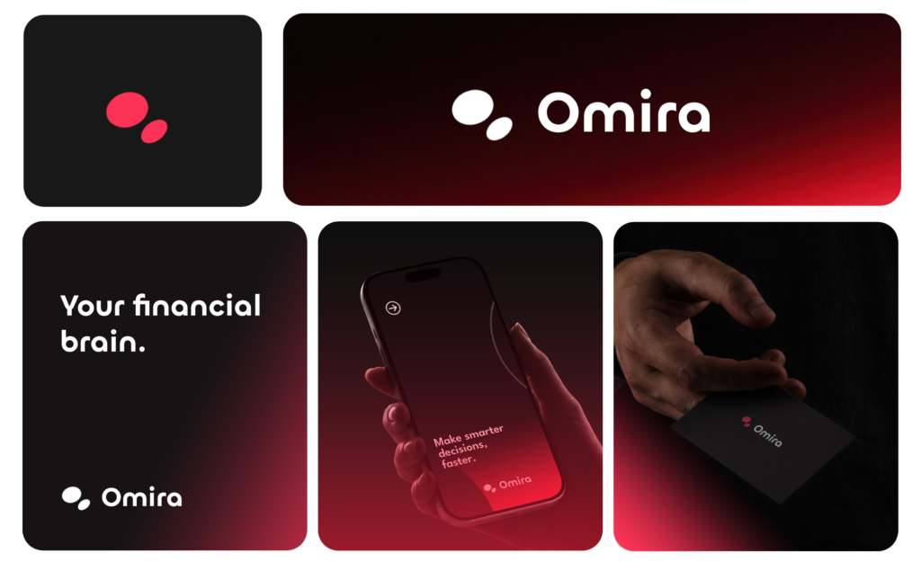
Brandframer doesn’t hand you a generator and wish you luck. We design the full set (thumbnail, gallery images, banner, badge) as a matching system, delivered in 48 hours, so it’s ready before your launch date instead of scrambled together the night before. Pricing runs across three fixed tiers, and for a launch-specific asset set, most founders land on Basic or Premium depending on how many gallery images and platforms you’re covering. No hourly billing, no scope creep, just a finished set on a deadline you actually control.
What about launch strategy, timing, and community?
Worth saying plainly: this article stays in its lane. When to launch, how to build a community ahead of time, how to work the comments in real time on launch day, that’s a different discipline, and there’s good independent research and founder writeups covering it if you go looking. We design what people see. We don’t run your launch calendar.
Get your launch visuals ready
A Product Hunt launch gives you one shot at a first impression, and most of that impression is visual before anyone reads a word of your description. The thumbnail, the gallery, the banner, they’re not decoration bolted onto a good strategy. They’re the reason someone stops scrolling long enough for your strategy to matter at all.
If your launch date is set and your visual assets aren’t, that’s a fixable problem, fast. Book a slot with Brandframer and we’ll have your full launch asset set designed and ready inside 48 hours, sized correctly, on brand, and done before the countdown starts.

