
Visual identity vs brand identity: what’s the real difference?
 Jul 16,2026
Founders throw these two terms around like they mean the same thing. They don’t, and mixing them up is how you end up hiring a designer when you actually need a strategist, or paying for a full brand identity project when a logo refresh would’ve done the job.
Here’s the short version: visual identity is what people see. Brand identity is everything that makes them feel a certain way about what they see. Your logo, colors, and typography are visual identity. Your positioning, personality, and the promise behind your product are brand identity. One lives on the surface. The other lives underneath it and shapes what the surface looks like in the first place.
Get this distinction wrong early and you’ll either overpay for strategy work you don’t need yet, or underpay for visual work that has no strategic backbone to stand on. Let’s sort out exactly where the line sits.
What is the difference between visual identity and brand identity?
Visual identity is the subset of brand identity that you can literally point at: the logo, the color palette, the typography, the imagery style. Brand identity is the full system, strategy, personality, voice, and positioning included, that determines what those visuals are supposed to communicate in the first place.
Think of it this way. Brand identity answers “who are we and why should anyone care?” Visual identity answers “what does that look like on a business card?” You need the first answer before the second one means anything. A logo with no strategic reasoning behind it is just a pretty shape.
This matters more than it sounds like it should, because a lot of founders shop for a “brand identity package” and really just want a logo and some brand guidelines. That’s not wrong. It’s just worth naming accurately so you know what you’re buying and what you’re not.
What visual identity actually includes?
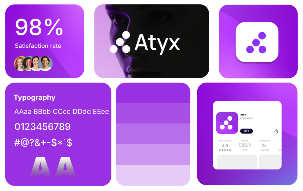
Visual identity is the tactile, reproducible part of your brand. It’s what a designer hands you as files.
That starts with your logo system: the primary mark, alternate lockups for different aspect ratios, and a simplified icon version for small applications like favicons or app tiles. From there you’ve got your color palette (with exact values for print, web, and everything in between), your typography choices for headlines and body copy, and a set of imagery and graphic guidelines that keep everything from social posts to pitch decks looking like they came from the same company.
None of this requires you to know why your brand exists. It just requires knowing what it should look like once someone else has figured that part out. If you’re still fuzzy on the logo fundamentals, our guide on logo design principles breaks down what actually makes a mark work versus what just looks nice in isolation.
Need this piece sorted fast? Brandframer delivers a complete visual identity system (logo, palette, type, guidelines) in 48 hours, which is usually faster than most agencies take to schedule the kickoff call.
What brand identity covers beyond the visuals?
Brand identity is the strategic layer that visual identity is supposed to express. It includes your positioning (who you serve and why you’re the right choice over the alternatives), your brand personality (are you the confident expert or the scrappy underdog?), and your messaging (what you actually say, in what tone, to whom).
This is the part that doesn’t show up as a file you can open in Illustrator. It shows up in how your sales page reads, how your founder talks on a podcast, and how your product onboarding feels. A strong brand identity gives every one of those touchpoints a consistent throughline, even when they’re built by completely different people on completely different days.
And here’s the honest nuance: strategy without visual execution is just a slide deck nobody looks at again. You can nail your positioning statement and still lose the room if your actual brand materials look like they were built in an afternoon. The two halves need each other. Neither one wins alone.
Founders who’ve done this a few times tend to build both pieces together rather than bolting visuals onto strategy months later. cisions that show up later in design.

What is a visual identity example?
A visual identity example is any consistent set of logo, color, and typography choices applied across a brand’s touchpoints, from the app icon to the shipping box. Coffee brands are an easy reference point here: a company that commits to one signature color across every cup, bag, and storefront makes itself instantly recognizable in a category crowded with browns and beiges.
That’s the whole point of visual identity done well. It’s not about being the most elaborate design in the room. It’s about being the most consistent one, so that recognition builds every time someone sees even a fragment of it, a color, a wordmark, an icon, without needing the full logo in front of them.
The mistake founders make here is treating visual identity as a one-time deliverable rather than a system that has to survive contact with fifty different applications: your website, your email signature, your investor deck, your Twitter avatar. If it only looks good on the one mockup your designer sent you, it’s not really a system yet.
Is a brand the same thing as a visual identity?
No. A brand is the sum of everything people believe and feel about your company, built from every interaction they’ve had with it. Visual identity is one input into that belief, but it’s far from the only one.
You could have a flawless logo and still have a weak brand if your product is inconsistent, your customer support is slow, or your messaging contradicts itself across channels. Conversely, some genuinely strong brands run on visual identities that are almost aggressively plain, because the strategy and the experience are doing the heavy lifting instead.
So if you’re asking “do we have a brand?” the answer isn’t found by looking at your logo file. It’s found by asking what a stranger would say about your company after one interaction with it. That’s brand. The visuals are just the costume it wears while making that impression.
Not sure whether your current setup even qualifies as a real identity system yet, versus a logo someone made you in an afternoon? A brand identity package built with actual strategy behind it is the difference between a costume and a character.
What is the difference between brand guidelines and a visual identity system?
A visual identity system is the set of assets themselves, logo files, color codes, type files. Brand guidelines are the rulebook that tells people how to use those assets correctly, including what not to do with them.
Guidelines typically cover logo clear space and minimum sizing, approved and forbidden color combinations, typography hierarchy for headlines versus body text, and often tone-of-voice notes if the guidelines extend into brand identity territory rather than staying purely visual. Without this document, every freelancer, agency, and new hire who touches your brand will interpret it slightly differently, and six months later your logo is stretched, your colors are off-brand, and nobody remembers why.
This is also where budget conversations tend to clarify fast. A basic logo package without a real guidelines document is one price point. A full system with documented rules, rationale, and application examples is another. Worth knowing which one you’re actually paying for before you sign anything.
Which one do you actually need right now?
If your positioning is solid, your messaging works, and customers already understand what you do and why you’re different, but your visuals feel like they’re holding you back in rooms where first impressions matter (investor meetings, retail shelves, App Store listings), you need a visual identity refresh. That’s a scoped, fast project.
If you’re still figuring out who you’re for, what makes you different, and why anyone should pick you over the ten other options in your category, visual polish won’t fix that. You need the strategic layer first, and visuals need to follow from it, not the other way around.
Most early-stage founders actually need both at once, because there’s no existing brand equity to preserve and no reason to sequence the work across two separate engagements. That’s the case where getting it built together, strategy and execution in the same pass, saves you both time and the awkward handoff between two different vendors who never talk to each other.
Brandframer has built full identity systems, logo through guidelines, for thousands of founders across every industry over the past ten years, which means the process is fast because it’s been run enough times to know exactly where the time actually goes.
Get the identity that actually matches your brand
Visual identity and brand identity aren’t competing priorities. They’re sequential ones: strategy defines what your brand should stand for, and visual identity is how that gets translated into something a customer can actually recognize at a hundred feet.
Skip the strategy and you get a pretty logo attached to nothing. Skip the execution and you get a positioning document nobody outside your team will ever see. Founders who get this right treat both as one project, not two.
Brandframer builds complete identity systems, logo, color, typography, and the guidelines to back it all up, across three fixed-price tiers ($280 Basic, $480 Premium, $987 BrandFramer 360), delivered in 48 hours. If your brand’s visuals still don’t match what your company has actually become, that’s worth fixing before your next pitch, not after it.

