
Restaurant logo design: what actually works and what to avoid?
 Jul 20,2026
A restaurant logo has about two seconds to do its job. Someone scrolls past it on a delivery app, spots it on a storefront sign, or glances at it on a menu, and in that instant it has to say something about the food, the price point, and the experience waiting inside. Most restaurant logos fail at this, not because the owner has bad taste, but because they picked a template that looked fine in isolation and never tested it in the real world.
This guide covers what makes a restaurant logo actually work, the design decisions that matter most, and how to avoid the mistakes that quietly cost restaurants business before a single dish gets ordered.
What makes a restaurant logo actually work?
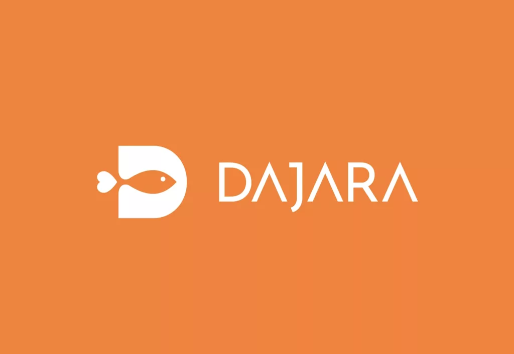
A strong restaurant logo works because it makes an instant, accurate promise about what’s inside, and then the food and service deliver on it. A fine dining logo that looks like a fast-casual chain creates a mismatch before the customer even sits down, and mismatches like that erode trust fast.
The best restaurant logos aren’t the most decorated ones. They’re the ones that stay legible at every size, from a 32-pixel app icon to a hand-painted storefront sign, without losing what makes them recognizable. That constraint alone rules out a lot of the overly detailed, illustration-heavy logos that dominate template marketplaces.
Consistency matters more than cleverness here. A logo that looks slightly different on the menu, the to-go bags, and the Instagram profile reads as unfinished, even if each individual version looks fine on its own.
What should a restaurant logo actually communicate?
Before any font or color gets picked, a restaurant logo needs to answer three questions: what cuisine, what price point, and what atmosphere. Skip this step and you end up with a logo that’s technically attractive but says nothing specific about the business behind it.
Cuisine and region often show up through subtle visual cues rather than literal imagery, a sans-serif with rounded terminals reads differently than a script typeface, and neither has to include an actual dish to communicate genre. Price point shows up through restraint: high-end restaurants tend to use less color, less ornamentation, and more negative space, while casual and fast-casual brands can afford bolder color and playful marks.
Atmosphere is the hardest of the three to nail, and it’s where most DIY attempts fall apart. A cozy neighborhood bistro and a high-energy sports bar might serve similar food, but nothing about their logos should look interchangeable. Getting this right is really a question of logo design principles applied to a specific, food-service context, not a separate skillset.
What colors and fonts work best for restaurant logos?
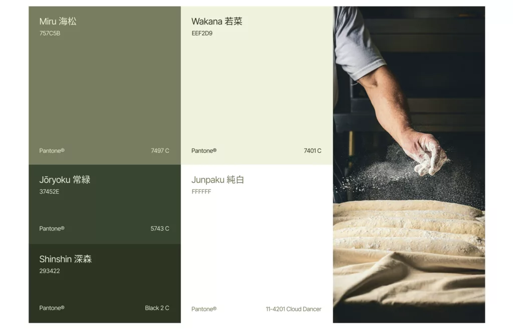
Color in restaurant branding carries more functional weight than in most industries, since it has to work under kitchen lighting, on a printed menu, and on a phone screen, often within the same hour. Warm reds and oranges tend to read as appetite-stimulating and are common in casual and fast-casual spaces, while deep greens and muted earth tones lean toward health-forward or farm-to-table positioning.
Typography carries just as much signal. Script fonts can work beautifully for an upscale Italian restaurant and look completely out of place on a taco truck. Bold, geometric sans-serifs read as modern and efficient, which fits fast-casual concepts far better than fine dining.
Here’s the one nuance worth being honest about: there’s no universal “correct” palette for a given cuisine. Plenty of successful modern restaurants deliberately break the expected color rules to stand out in a crowded market. The point isn’t to follow a formula, it’s to make an intentional choice and commit to it everywhere the brand shows up.
Should a restaurant logo include food imagery or stay abstract?
It depends entirely on how crowded the category already is. In a market saturated with pizza slices and chef hats, an abstract or typographic mark often stands out precisely because it doesn’t reach for the obvious visual cliché.
Food imagery still works well for casual, family-friendly, or highly specific cuisine concepts, where clarity matters more than differentiation, think a taco icon for a taqueria that wants to be instantly understood from across a parking lot. But the more literal the imagery gets, the faster a logo starts to look dated once design trends shift.
A wordmark or a simple abstract symbol tends to age better and translates more cleanly across packaging, signage, and digital platforms. If you’re weighing that tradeoff, it helps to understand the broader mechanics of what goes into a complete brand identity package, since the logo is only one piece of a system that has to work together.
How much should a restaurant spend on a logo?
Pricing in restaurant logo design spans an enormous range, from free DIY templates to five-figure agency engagements, and neither extreme serves most independent restaurant owners well. A free template logo is legally risky (thousands of other businesses may be using variations of the same template) and rarely holds up once it’s printed at storefront scale.
On the other end, a full agency engagement with weeks of discovery workshops is overkill for a single-location restaurant that needs to open on schedule. Most independent restaurants land in a middle range that gets them a real, ownable identity without the enterprise timeline or price tag. You can see how that range breaks down in more detail in our guide to logo design pricing.
Brandframer runs three fixed tiers built for exactly this kind of timeline pressure: Basic at $280, Premium at $480, and BrandFramer 360 at $987, all delivered in 48 hours. For a restaurant racing toward an opening date, that speed often matters as much as the price.
DIY logo maker or professional designer, which is right for a restaurant?
DIY logo makers are fast and cheap, and for a very early-stage pop-up or a temporary concept, that tradeoff might make sense. But most DIY tools generate logos from a shared library of shapes and icons, which means your “unique” logo is statistically likely to resemble someone else’s, sometimes a direct competitor’s.
A professional designer avoids that overlap and builds something considered from the ground up: legible at sign scale, distinct from nearby competitors, and consistent across every surface where the brand shows up. The honest tradeoff is turnaround time. Traditional design agencies can take four to eight weeks, which is a long runway for an owner juggling a lease, a build-out, and a hiring timeline all at once.
That gap between “too slow” and “too generic” is exactly why fixed-scope, fast-turnaround studios exist. A restaurant that needs a real logo without the agency runway or the template risk has a narrower set of options than it might expect, and Brandframer’s whole process was built around exactly that narrow window.
How fast can a restaurant get a professional logo?
With the right process, a full brand identity, not just a logo file, can be ready in 48 hours. That timeline isn’t a rushed compromise. It’s what happens when a studio has run the same process thousands of times and cut out the unnecessary back-and-forth that pads out a typical agency timeline.
For a restaurant on a lease deadline or a soft-opening date already announced, that speed changes what’s actually possible. It’s the difference between opening with a logo you’re proud of and opening with a placeholder you meant to fix later and never did.
Get a restaurant logo that earns its seat at the table
A restaurant logo isn’t decoration, it’s the first promise a customer sees before they ever taste the food. Get the cuisine, price point, and atmosphere signals right, keep it legible at every size, and stay consistent across every surface it touches, and the logo starts doing real work for the business instead of just sitting on the door.
Brandframer builds that complete system, logo, color palette, typography, and brand guidelines, in 48 hours, across three fixed-price tiers, backed by ten years of experience and thousands of projects across every food and hospitality category.
