
Skincare logo design: a founder’s guide to standing out
 Jul 26,2026
Open ten skincare logos right now and count how many use a thin serif font next to a single line drawing of a leaf. That’s not a coincidence. It’s the default, and defaults are what founders end up with when they skip the strategy and go straight to Canva.
A skincare logo does more than sit on a bottle. It’s the first signal a buyer reads before they trust your ingredients list, your price point, or your claims. Get it right and it earns a second look on a crowded shelf or a scrolling feed. Get it wrong and you blend into a sea of near identical botanical wordmarks that all promise the same “clean, natural glow.”
A skincare logo doesn’t work in isolation, either. It’s one piece of a larger beauty branding system that includes your color palette, packaging, and voice, and getting the logo right only pays off if the rest of that system backs it up.
This guide breaks down what makes a skincare logo actually work, the real style categories founders choose from, why so many end up looking the same, and what it costs to get one built properly. No stock templates, no filler.
What makes a skincare logo actually work?
A working skincare logo does three things at once. It signals the category (skin, beauty, wellness) without relying on the same three visual clichés everyone else uses. It communicates a specific positioning, whether that’s clinical and results driven or soft and ritual based. And it holds up at every size, from a 2cm jar cap to a billboard.
Most skincare logos fail on the second point. They’re pretty, but they don’t say anything specific about the brand behind them. A logo for a dermatologist backed acne treatment and a logo for a lavender bath oil should never look interchangeable, yet on Google Images right now, a huge share of them do.
Color and shape choices need to earn their place, not just look nice. Soft curves and pastel palettes suggest gentleness. Sharp geometry and high contrast suggest efficacy and science. Neither is better. What matters is whether the choice matches what the product actually delivers, because a mismatch is what makes a buyer distrust a brand before they’ve even read the label. If you want the full framework behind this kind of decision making, our breakdown of logo design rules covers the principles that apply regardless of industry.
Founders who need this dialed in before a launch date rarely have weeks to iterate with a freelancer. We build complete skincare identity systems in 48 hours, which means you get a positioning driven mark instead of a rushed placeholder, without the six week back and forth most studios require.
What are the main skincare logo styles to choose from?
Skincare logos generally fall into four working categories, and picking the wrong one for your product is one of the fastest ways to confuse a buyer.
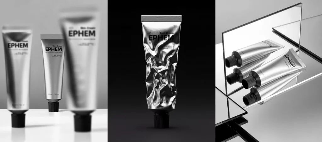
Clinical and derm-inspired logos lean on clean sans serif type, cool color palettes, and minimal ornamentation. Think of the visual language a dermatology office uses: precise, restrained, slightly clinical. This works when the product’s whole pitch is efficacy backed by ingredients or research.
Natural and clean beauty logos are the most saturated category, built around organic shapes, muted greens and earth tones, and botanical illustration. It’s the space where differentiation matters most, because this is exactly where the “generic skincare logo” pattern lives.
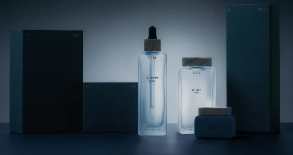
Luxury skincare logos use negative space, refined serif or high contrast typography, and often a monogram or crest-style mark to suggest heritage and price point. If you’re building a premium line, studying luxury logo design principles before you brief a designer will save you from a mark that looks expensive in theory but generic in practice.
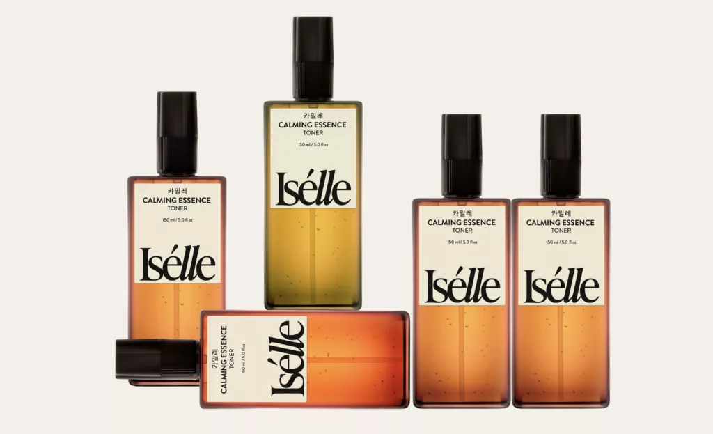
K-beauty and minimalist logos favor playful color, rounded type, and a lighter emotional tone, often skewing younger and more approachable than the other three categories.
None of these categories are mutually exclusive; plenty of strong brands blend two. But you should be able to name which one you’re building toward before a single sketch happens.
Not sure which lane fits your product? That’s the exact question we walk through before we design anything, because a skincare logo built without that clarity is just a nice picture with no strategy behind it.
Why do so many skincare logos end up looking the same?
Here’s the honest part. Search “skincare logo” on Reddit’s design communities and you’ll find founders getting the same feedback over and over: “looks clean but wouldn’t stand out,” “absolutely generic,” “stereotypical.” That’s not harsh criticism. It’s an accurate read of a category that’s converged on one visual formula.
The formula is predictable. Thin serif or handwritten script wordmark, a single-line botanical icon (leaf, flower, or droplet), and a palette pulled from sage green, blush pink, or cream. It’s not a bad look. It’s just no longer a distinctive one, because thousands of brands reached for it at the same time.
Standing out doesn’t mean going loud. Some of the strongest recent skincare identities differentiate through typography choices instead of imagery, through unexpected color pairings instead of the expected palette, or through a mark that skips the botanical icon entirely and lets the wordmark carry the whole brand. The goal isn’t novelty for its own sake. It’s making sure your logo couldn’t be swapped onto a competitor’s bottle without anyone noticing.
This is the gap between a logo that looks fine in isolation and one that actually builds recognition. And it’s the one thing a stock logo generator or a Fiverr gig genuinely can’t solve, because those tools are trained on exactly the patterns you’re trying to avoid.
Wordmark, brandmark, or monogram: what fits a skincare brand?
The format decision comes before the style decision, and it shapes everything downstream.
A wordmark (your brand name, styled) works well when the name itself is short, memorable, and does some of the positioning work on its own. It’s also the most flexible format across packaging, since it doesn’t need a separate icon to carry meaning.
A brandmark (name plus a standalone symbol) gives you more visual flexibility later, since the symbol can be used alone on smaller packaging like a lip balm or a sample sachet where a full wordmark won’t fit legibly.
A monogram works particularly well for luxury and heritage-leaning skincare brands, where two or three initials arranged into a crest-like mark can suggest exclusivity faster than a full name can. If that direction interests you, our guide to monogram logos walks through when the format earns its keep and when it just adds unnecessary complexity.
There’s no universally correct answer here. A DTC brand launching on Instagram with a punchy, ownable name usually leans wordmark. A brand competing on shelf space at Sephora with a longer name usually needs a brandmark for flexibility.
How much does a skincare logo cost?
Pricing in this space is a mess, and that’s by design on most agency websites. Freelance rates on marketplaces run anywhere from $50 to $500 depending on experience, with wildly inconsistent quality and almost no strategic input. Traditional branding agencies charge $3,000 to $15,000 and take four to eight weeks, largely because of process overhead that has nothing to do with the actual design work.
Brandframer runs three fixed tiers instead: Basic at $280, Premium at $480, and BrandFramer 360 at $987 for a complete identity system including logo, color palette, typography, and brand guidelines. No hourly billing, no scope creep, no surprise invoices halfway through revisions.
That pricing structure exists because we’ve built the internal process to skip what slows typical agencies down: endless discovery calls, multi-week mood board cycles, and revision rounds that drag past a founder’s actual deadline. If the full range of what’s included matters to your decision, our logo design packages breakdown lays out exactly what’s in each tier.
How long does it take to design a skincare logo?
Most agencies quote two to six weeks. Some of that time is genuine design work. A lot of it is scheduling gaps, internal review cycles, and a business model built around billable hours rather than delivery speed.
We deliver complete skincare identity systems in 48 hours. That’s not a rushed output. It’s what happens when a decade of process refinement removes the friction that has nothing to do with quality, like waiting three days for a designer’s calendar to open up or sitting through a discovery call that could’ve been a form.
If you’re two weeks from a Product Hunt launch or a funding pitch and you still don’t have a logo, speed isn’t a nice-to-have. It’s the whole game.
What mistakes tank a skincare logo before it launches?
A few patterns show up again and again in skincare logos that don’t work.
The first is chasing the current aesthetic trend instead of the brand’s actual positioning, which is how a clinical acne treatment ends up with the same soft botanical mark as a bath oil brand. The second is designing only for Instagram at full size and never testing the mark at the scale it’ll actually appear on packaging, where fine serif type and delicate line illustrations often disappear entirely.
The third, and probably the most common, is skipping strategy altogether and picking a template because it “looks professional.” A logo that looks professional but says nothing specific about your product is a wasted asset. It photographs fine and does nothing for recall.
The fix isn’t complicated. It’s making sure every visual decision, the typography, the color, the format, ties back to a specific claim about the product, rather than a general vibe of “clean” and “natural” that a hundred other brands are also chasing.
Building a skincare brand from the ground up involves more decisions than just the logo, and it helps to have all of them mapped before you start briefing anyone. Our branding checklist for founders covers the full sequence, from naming through launch assets.
Getting your skincare logo built
A skincare logo built around a clear category, a specific positioning, and a format that fits your product is the difference between a mark that blends in and one that a buyer actually remembers. That takes more than picking a font pairing off Pinterest and calling it done.
If you’re ready to skip the generic leaf-and-serif formula and get something built with actual strategy behind it, Brandframer delivers a complete skincare identity system, logo, color, typography, and guidelines, in 48 hours starting at $280. Ten years and thousands of projects in, we’ve built the process so speed and strategy don’t have to be a tradeoff. Get your brand framed right the first time.

