
What is a monogram logo? The complete guide for founders and brands
 Jun 28,2026
A monogram logo takes the initials of a brand name and turns them into a single, unified mark. Two or three letters, composed with intention, become something more than typography. They become a symbol.
You already know these marks without thinking about it. HBO. LV. IBM. Chanel’s interlocking CC. None of them spell out the full name. None of them need to. That’s exactly the point of a monogram logo: distill a company identity down to its most concentrated visual form, then make that form impossible to forget.
This guide covers what a monogram logo actually is, how it differs from other logo types, when it makes sense for a brand, and what separates a monogram that lasts decades from one that looks like a placeholder. If you’re deciding whether an initials logo is right for your business, or you’re trying to understand what makes the great ones work, this is the article for you.
What does a monogram logo mean?
A monogram logo means a brand has chosen its initials, typically two or three letters, as its primary visual identity. Those letters are designed together into a single composed mark, rather than displayed as separate characters side by side.
The word “monogram” itself comes from the Greek “monos” (single) and “gramma” (letter), though in modern branding it refers to any lettermark where the initials form one cohesive symbol. It’s not just abbreviation. It’s deliberate design: the spacing, the weight of the letterforms, the way one letter interacts with the next, all of it is considered.
What makes a monogram distinct from simply writing out initials is that the letters are treated as a unit. The result should feel like a mark, not an acronym. Think of the difference between typing “LV” in a word processor and looking at the Louis Vuitton monogram. Same letters. Completely different objects.
Brandframer delivers complete brand identity systems in 48 hours, including logo, color palette, typography, and brand guidelines. Plans start at $280. See what’s included at brandframer.com.
What’s the difference between a logo and a monogram?
A logo is any visual mark used to represent a brand. A monogram is a specific type of logo, one built exclusively from letterforms. So every monogram is a logo, but most logos aren’t monograms.
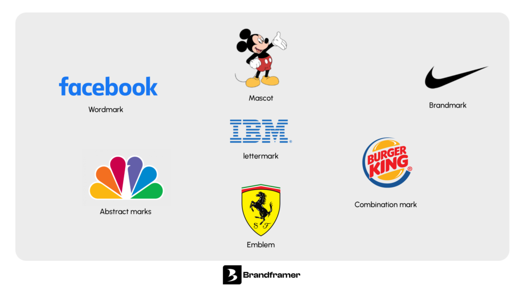
The broader category of logo design principles includes several distinct types: wordmarks use the full company name in a designed typeface, brandmarks use a symbol or icon with no text, combination marks pair a symbol with a wordmark, and lettermarks (another term for monogram logos) use initials only.
The key distinction that matters for founders: a wordmark requires your name to carry the visual weight of the brand. A monogram requires your letters. If your company name is long, complex, difficult to pronounce in multiple languages, or simply doesn’t reduce well to a single typographic treatment, a monogram can solve the problem elegantly. “International Business Machines” becomes IBM. “Home Box Office” becomes HBO. The name doesn’t change. The visual representation becomes something far more portable.
What a monogram can’t do on its own, and this is worth being honest about, is communicate what your business does. A first-time encounter with an unfamiliar monogram tells the viewer nothing about the category, the product, or the personality of the brand. That context has to be built over time, through every other brand touchpoint. Chanel’s CC mark means luxury today because decades of investment made it mean that. At launch, it was just two letters.
What are the 7 types of logos?
Logo design generally breaks into seven distinct types, and understanding where a monogram fits helps clarify when to choose one over the alternatives.
The seven types are:
- wordmarks,
- lettermarks (monograms),
- brandmarks,
- abstract marks,
- combination marks,
- emblems,
- mascot logos.
A wordmark uses the full company name in a custom typeface, think Google or Coca-Cola. A lettermark (which is what a monogram logo is) uses initials only. A brandmark drops the letters entirely in favor of a recognizable symbol, like the Apple apple or the Twitter bird. An abstract mark uses geometric form rather than a recognizable image. A combination mark pairs a symbol with text. An emblem encloses text within a shape, like most university crests or the Harley-Davidson badge. A mascot logo uses a character as the brand’s visual identity.
Most founders choosing between a wordmark vs a brandmark don’t realize the lettermark is often the sharpest middle path: more distinctive than a full-name wordmark, more legible and versatile than a pure symbol, and more scalable than a combination mark across every context where the logo needs to live.
Brandframer has built complete brand identity systems for founders across SaaS, consulting, e-commerce, beauty, professional services… In 48 hours! Starting at $280.
What is the point of a monogram logo?
The point is compression without loss of identity. A monogram takes something complex, a full company name with all its syllables and specificity, and reduces it to a mark that can live anywhere: on a business card, a favicon, an embroidered jacket, a billboard, a slide deck opening a fundraise.
There are three practical reasons founders choose a monogram logo over other logo types.
The first is memorability. Two or three letters, when composed well, are easier for a brain to store and retrieve than a full name. The letterform becomes the trigger. You don’t think “Home Box Office” when you see HBO. The mark has replaced the name entirely in your memory.
The second is scalability. A well-designed monogram holds its clarity at any size. No tagline, no subtext, no supporting illustration needed. It works at 16×16 pixels as a favicon and at ten feet wide on a conference wall. For founders building digital products and physical presence simultaneously, this isn’t a minor consideration.
The third is authority. There’s a reason law firms, financial institutions, luxury fashion houses, and established consulting groups all lean toward lettermark logos. The form carries connotations of restraint and confidence. A brand that doesn’t need to explain itself visually signals that it doesn’t need to explain itself at all.
How does a monogram logo differ from a lettermark?
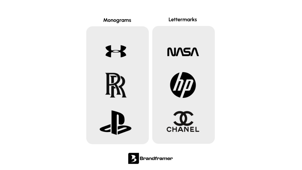
The short answer: they’re the same thing. In professional branding, “monogram logo,” “lettermark logo,” and “initials logo” all refer to the same category of design. The terms are used interchangeably, though “monogram” tends to appear more in luxury and heritage contexts, while “lettermark” is more common in brand strategy and design conversations.
The distinction that does matter is between a stacked monogram (letters arranged vertically), an interlocking monogram (letters woven together so they share space and strokes), and a side-by-side lettermark (initials placed next to each other without overlapping). Each arrangement creates a different visual impression and suits different brand personalities.
Chanel’s CC is an interlocking monogram: the two letters face each other and share visual space, creating symmetry and tension simultaneously. Yves Saint Laurent’s YSL is a stacked monogram with letters overlapping vertically, which reads as structured and fashion-forward. IBM uses a side-by-side horizontal lettermark with horizontal strikethrough lines that give it weight and a sense of technological precision.
The relationship between a wordmark and a brandmark is well documented, but the monogram sits in its own category: letterform as symbol, not just name.
Brandframer’s three plans are built around where you are in your brand journey: $280 if you need the essentials, $480 if you want the full system, $987 if you want brand strategy included. Compare them at brandframer.com.
What makes a strong monogram logo design?
Everything starts with the typeface. The letterforms you choose carry the entire personality of the mark before a single design decision is made about layout or color. A serif typeface with its bracketed terminals and classical proportions signals tradition, authority, and permanence. A geometric sans-serif signals precision, modernity, and clarity. A script or calligraphic letterform signals craft, individuality, and warmth.
The mistake founders make most often is choosing a typeface they like rather than one that serves the brand positioning. A legal advisory firm that uses a casual script monogram is making a visual claim that contradicts its offer. A creative studio that uses a heavy slab serif is doing the same in the other direction. The letterform has to match the brand promise.
After the typeface, composition determines everything. How the letters relate to each other in space, whether they touch, overlap, mirror, or simply coexist, creates the visual logic of the mark. The best monograms have a compositional idea that you can articulate: the LV mark works because the L and V share a diagonal that makes them feel like they were designed to meet. The Gucci GG works because the two letters face each other with perfect symmetry, which creates a sense of balance that reads as luxury.
Negative space deserves more attention than most founders give it. The space between and around the letters is as designed as the letters themselves. When negative space is used deliberately, the mark gains depth. FedEx’s famous hidden arrow lives in negative space. The best monograms often have a visual element that rewards a second look.
And then there is the practical constraint that separates good design from design that actually works: scalability. A monogram that relies on fine detail, thin strokes, or intricate interlocking at small sizes will fall apart at favicon scale. The mark has to be tested at every size it will actually be used before it can be considered finished.
For founders thinking through a complete brand identity package, the monogram logo is typically the anchor, the element everything else is built to support.
When should a founder choose a monogram logo?
A monogram makes the most sense in specific situations, and it’s worth being clear about what those are rather than treating it as a universal solution.
It works well when the company name is long or difficult to render as a wordmark across contexts. “Advanced Micro Devices” becomes AMD. “General Electric” becomes GE. The abbreviation is already how people refer to the company, so the logo follows that natural behavior.
It works well when the brand is positioning in a space where restraint signals quality: professional services, financial products, high-end consumer goods, consulting, legal, architecture. In these categories, a mark that doesn’t over-explain itself carries more authority than one that does.
It works well when the founder’s own name is the brand, particularly in consulting, advisory, or personal-brand-driven businesses. Two initials, composed well, feel personal and professional at the same time.
Where a monogram is harder to make work: very early-stage consumer startups that need their brand name to be immediately legible to strangers, businesses in categories where a symbol or illustration better communicates what they do, and companies whose initials happen to be shared by many others in their market.
The honest answer is that the best logo type for a given brand depends on a combination of naming, category, audience, and aspiration. A monogram isn’t automatically more sophisticated than a wordmark. But when the conditions are right, it’s hard to beat. See the full comparison of logo types and brand identity design services to understand what fits your stage.
The brief history that explains why monograms feel authoritative
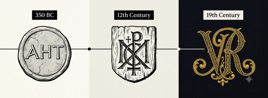
Monograms predate modern branding by roughly 2,300 years. Ancient Greek cities used letter combinations on coins to mark origin and authenticity. Medieval craftsmen carved their initials into their work as a signature of quality. European royalty formalized the practice, using elaborately designed personal cyphers on everything from stationery to silverware to the facades of royal residences.
This history is the reason a well-designed monogram carries connotations that newer logo types simply don’t have access to. When someone sees a lettermark logo, they’re activating associations built up over centuries: craft, ownership, authority, permanence.
Louis Vuitton’s LV monogram was designed in 1896, originally as an anti-counterfeiting measure. The same mark that was meant to protect a luggage business is now one of the most recognized symbols in global commerce. That’s not a coincidence. It’s what happens when a strong lettermark logo is applied consistently over a long enough period of time.
For founders building a brand with longevity in mind, the monogram’s historical weight is a genuine asset, not nostalgia. It communicates that the brand isn’t chasing trends. That it intends to be here in ten years. That’s a useful signal to send to investors, clients, and partners alike.
What to know before commissioning a monogram logo?
Before briefing a designer or starting a creative process, three things are worth settling.
First, be clear on which letters are in play. If the business name is two words, the most obvious choice is the first letter of each. But sometimes a third letter, a middle name or a secondary word, adds compositional possibilities. And occasionally the obvious pairing doesn’t work visually because the letterforms are incompatible. “II” or “HH” are harder to make interesting than “AB” or “MK.”
Second, know where the logo will actually live. A monogram designed primarily for a website header will make different decisions than one designed primarily for embossed stationery or embroidered merchandise. The end use should drive the design brief, not be discovered as a problem after the mark is finalized.
Third, understand that a monogram logo on its own isn’t a brand identity. It’s an anchor. It needs a color palette, a supporting typeface for use in body copy and headlines, a set of brand guidelines that specify how the mark is used in different contexts, and ideally a secondary lockup that includes the full company name for use where the monogram alone won’t be recognized.
A monogram done well is one of the most durable assets a brand can own. Two or three letters, the right typeface, a considered composition: that’s what IBM has carried for sixty years. That’s what Chanel built an empire on. The letters are simple. The thinking behind them doesn’t have to be.
