What is a wordmark? Definition, examples and when to use One
 Jun 13,2026
 A wordmark is your company name turned into the logo itself. No icon, no symbol, no mascot floating beside the text. Just your name, set in a specific typeface, doing all the work of representing your brand.
Think of Coca-Cola’s looping script, Google’s rounded sans-serif, or FedEx’s deceptively simple lettering. None of these brands needed a separate icon to become instantly recognizable. The name, styled a certain way, became the icon.
If you’re a founder trying to decide whether this approach fits your brand, you’re in the right place. We’ll cover what a wordmark actually is, how it differs from related terms you’ve probably seen thrown around, look at examples that show what’s possible, compare it against the other main logo styles, and then walk through a real decision framework. Not “it depends,” but actual criteria you can apply to your own name today.
What exactly is a wordmark?
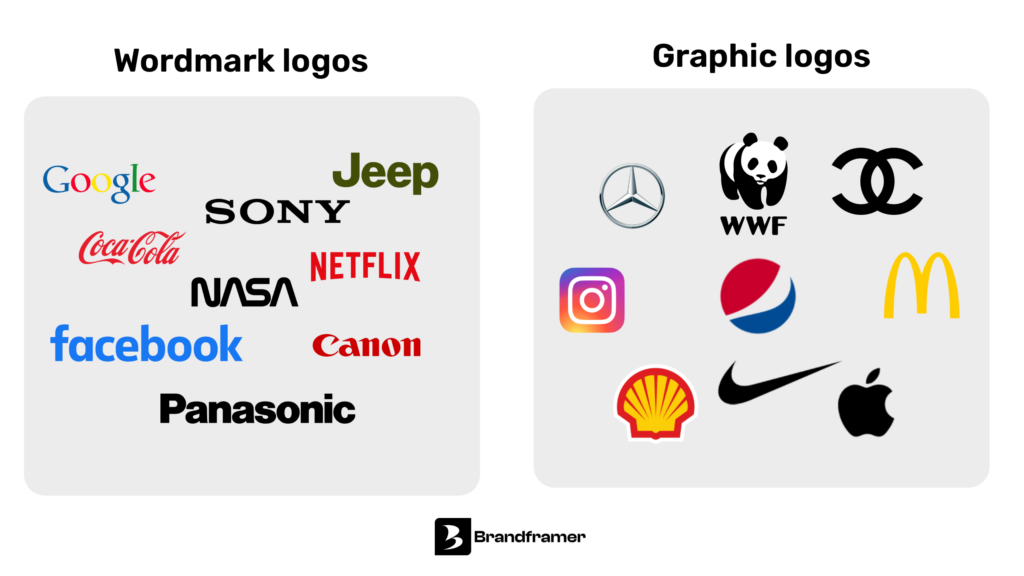
A wordmark, sometimes called a logotype or text logo, is a logo built entirely from typography. The company’s name, in a custom or carefully chosen font, color, and spacing, becomes the visual identity.
This is different from a brandmark (a pure symbol, like Apple’s bitten apple or Twitter’s bird), a lettermark (initials only, like IBM or HBO), and a combination mark (a symbol paired with text, like Adidas with its three stripes next to the wordmark). Among the world’s 250 largest public companies, combination marks are actually the most common approach, but wordmarks alone are still used by a notable group that includes Samsung, Sony, Nestlé, and IBM, all names short and distinctive enough to stand on their own with no symbol at all, with 58 of the 250 largest companies using a pure wordmark
Here’s the part most explainer articles skip: a wordmark and a “word mark” (two words) are not the same thing, even though people use the terms interchangeably online. In graphic design, a wordmark is a stylized typographic logo, complete with font choice, color, and spacing. In trademark law, a “word mark” is a legal protection category that covers the name itself, independent of any specific font or styling. You can trademark the word “Nike” as a word mark and separately trademark the swoosh as a different kind of mark. They’re related concepts that live in completely different worlds, and conflating them is how founders end up confused about what they’re actually protecting. We’ll touch on why that distinction matters later, but for now, this article is about the design choice, not the legal filing.
So why would a brand choose to put everything into the name itself, with no supporting symbol? Because when it works, it’s incredibly efficient. Every time someone sees your name, they’re also seeing your logo. There’s no second asset to build recognition for.
What makes a wordmark work (or fall flat) ?
A wordmark lives or dies on three things: the typeface, the spacing, and the color. That’s it. There’s no icon to lean on if the typography is weak.
The typeface does most of the heavy lifting, and the data backs this up more than most founders expect. Logos that combine both text and image are only about 6% more memorable than text-only logos according to research from the University of Iowa, which means a well-executed wordmark isn’t leaving much recognition on the table by skipping a symbol. The font isn’t decoration. It’s nearly the entire message.
There’s also a clear pattern in what actually gets chosen at scale. Sans serif fonts are used by over three-quarters of Fortune 500 companies, and the gap is even wider among the very largest global firms, where 71.6% of the world’s top 250 companies use sans serif typefaces. That’s not an accident or a fad. A geometric sans-serif feels modern and approachable, which is part of why Google’s custom “Product Sans” font reads as friendly rather than corporate. A high-contrast serif, the kind Vogue uses, signals authority and editorial weight before you’ve read a single word, and serif fonts remain the choice for a smaller but meaningful group, around 22% of the world’s top 250 companies, including brands like Rolex and Prada. A flowing script, like Disney’s signature-style logo, feels personal and a little nostalgic.
Capitalization is the other variable that quietly shapes how a wordmark feels, and it’s far more deliberate across major brands than most founders assume, with all-caps being the most common choice at 47% of Fortune 500 logos, followed by title case at 33%. All caps tends to read as bold and authoritative. Lowercase, used by a small minority, tends to feel more casual and approachable, which is exactly why brands aiming for a friendlier tone often break from the majority pattern on purpose.
Spacing matters more than people expect. Tight kerning (the space between individual letters) can make a name feel dense and confident. Looser spacing can feel airy and premium. Get it wrong and the logo looks amateurish even with a great font, because the letters fight each other instead of forming a unified shape.
And then there’s the detail almost nobody notices consciously but everyone reacts to: negative space. FedEx is the textbook example. Look closely at the gap between the “E” and the “x” in their logo and you’ll find a perfectly formed arrow. It’s not decorative. It reinforces the company’s entire value proposition (speed, direction, forward motion) without adding a single extra shape to the design. That’s what a wordmark can do when it’s done with intent rather than just picked from a font menu.
Five wordmarks that actually teach you something
Most “famous wordmark examples” lists just name-drop logos without explaining why they work. Here’s what’s actually going on under the hood of five very different approaches.
- Coca-Cola: the Spencerian script font was chosen in 1886 and has barely changed since. It’s proof that a wordmark, done right, doesn’t need to evolve with design trends. It can become so synonymous with the brand that changing it would feel like a betrayal, something Coca-Cola found out the hard way with New Coke. The flowing, connected letterforms feel almost handwritten, which gives a mass-produced product a strange sense of personal warmth.
- Google: a custom sans-serif called Product Sans, geometric and slightly rounded, paired with primary colors that feel playful rather than corporate. The genius here is restraint. A company whose product is “organize all the world’s information” could easily have leaned into something cold and technical. Instead the wordmark feels approachable, almost childlike, which makes an intimidating amount of information feel less intimidating.
- FedEx: at a glance it’s just a bold, clean name in two colors. Look at the gap between the “E” and the “x” and you’ll find a perfectly formed arrow, a small detail that reinforces the company’s entire promise of speed and direction without adding a single extra shape. It’s the best example of how negative space in a wordmark can carry meaning on its own.
- Mailchimp: a quirky, slightly retro serif that feels hand-drawn rather than mechanically perfect. That informality is deliberate. The letterforms have just enough irregularity to signal “friendly small-business tool” rather than “enterprise software,” even before you’ve seen the chimp mascot that usually accompanies it.
- Spotify: the full logo is a combination mark, icon plus name, but the wordmark portion alone, a clean, slightly rounded sans-serif, carries enough personality to stand on its own in contexts where the icon doesn’t fit. The soft corners on the letterforms are the whole trick. They make a company that is, functionally, licensing software for record labels feel human and a little playful.
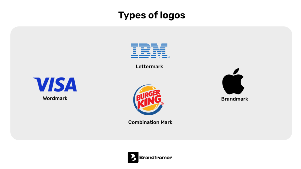
Wordmark vs the other logo types
A wordmark is one of four main approaches to logo design, and the right choice usually comes down to your name and what you need that name to do.
A lettermark uses initials instead of the full name. It’s the move when your name is long or clunky as a full word, the way IBM is easier to carry as three letters than as “International Business Machines.” The tradeoff is that a new business has nothing to anchor recognition to. Customers have to learn what the initials stand for before the lettermark means anything.
A brandmark is a pure symbol with no text at all, like the Apple silhouette or Twitter’s bird. These are extremely powerful, but only once a brand has already built enough recognition that the symbol alone triggers the name in people’s heads. For a new company, a pure symbol is often a tough sell. Nobody knows what it means yet.
A combination mark pairs a symbol with the name, the way Adidas runs its three stripes alongside the wordmark. This gives you flexibility (use them together or separately) and hedges against the rebrand risk we’ll get into below, since the symbol can survive even if the name changes.
A wordmark skips the symbol entirely and puts everything into the name itself. It’s the most direct option, and arguably the most efficient: every time someone sees your name, they’re seeing your logo, with no second asset to build recognition for. The catch is that the name has to be strong enough to carry that weight on its own, which is exactly what the next section is about.
There’s no objectively “best” option here. A law firm with a sharp, short name and a consumer app aiming for a recognizable home-screen icon are solving different problems, and the right logo type follows from that, not from a trend.
If you’re also untangling logo from the bigger picture, our piece on logo vs brand identity.
Is your name strong enough to carry a wordmark?
This is the question that actually matters, and it’s the one most articles dance around. A wordmark puts 100% of your visual identity on your name. If the name isn’t pulling its weight, the logo won’t either.
Run through these honestly.
Is your name short enough to read instantly, even small? A wordmark needs to work as a favicon, a social media avatar, and a tiny mobile header, not just a homepage banner. “Visa” or “Sony” reads instantly at 16 pixels. “International Consolidated Logistics Group” does not, and no amount of clever typography fixes a name that’s fundamentally too long for the format.
Is your name distinctive, or does it blend in? If your name is generic (think “Premium Solutions” or “Global Tech Partners”), a wordmark has nothing to grab onto. The typography can make it look nice, but it can’t make a forgettable name memorable. Compare that to something like “Stripe” or “Notion,” names with a shape and rhythm that a typeface can actually amplify.
Does your industry reward simplicity or signal-richness? Professional services (law, finance, consulting) often lean on wordmarks because a clean, text-based logo projects exactly the kind of understated authority those industries want. A bold sans-serif name says “we don’t need a mascot to be taken seriously.” But if you’re in a category where visual shorthand matters, say, you’re building a consumer app and need an icon that works as a tiny home-screen tile, a pure wordmark might be working against you.
Are you optimistic your name won’t change? This is the honest nuance most founders skip. A wordmark ties your visual identity directly to your current name. If there’s a real chance you’ll rebrand, pivot into a different market under a different name, or merge with another company in the next two or three years, investing heavily in a custom wordmark treatment for a name you might abandon is a real cost. A combination mark, where the symbol can survive a name change even if the wordmark portion gets swapped out, hedges against that risk. If your name feels permanent and you’re confident in it, this concern doesn’t apply to you, and a wordmark is fair game.
If you answered yes to the first three and feel good about the fourth, a wordmark is very likely your best move. If your name is long, generic, or shaky, it’s worth at least considering a combination mark or lettermark instead, where a symbol can pick up some of the slack.
Wordmark vs word mark: why the legal distinction actually matters for founders
Quick return to that distinction from earlier, because it has practical consequences. When you trademark your brand name as a “word mark” (the legal kind), you’re protecting the name itself across any font, color, or styling. That’s broad protection. It means if a competitor uses your name in a different typeface, that’s still potential infringement.
But your wordmark (the design asset) is what customers actually see and remember day to day. You’ll likely want to register both the word mark (the name, legally) and, separately, protect the specific visual treatment of your wordmark logo if it becomes distinctive enough on its own. Most founders only think about one of these, usually the legal one, and treat the design as an afterthought. That’s backwards from how customers experience your brand. They don’t see a trademark filing. They see a wordmark, every day, on every touchpoint.
Frequently asked questions about wordmarks
Can a wordmark be updated over time? Yes, and most long-lasting brands do this quietly every few years. The font gets slightly modernized, the spacing tightens, the weight shifts. Done well, nobody notices the change happening, they just notice the brand feels current. The goal is evolution, not a sudden overhaul that breaks recognition.
Is a wordmark the same as a logotype? Functionally, yes. Both terms describe a logo built entirely from the letters of the company name, styled with a specific typeface, color, and spacing. Some designers use one term over the other out of habit, but you won’t confuse anyone by using either.
Do wordmarks work for SEO and digital marketing? Indirectly, yes. A wordmark is your name, so every time someone sees it, they’re reinforcing brand recall tied directly to something they can type into a search bar. The practical requirement is making sure the file is high-quality and scalable (an SVG, ideally) so it stays crisp whether it’s a tiny favicon or a full-width banner.
Can I use a wordmark if my name is long? You can, but it gets harder. Long names compress awkwardly into small spaces, which is exactly why companies with long legal names often shorten to an acronym or abbreviation for their actual wordmark. If your full name doesn’t fit comfortably on a business card or app icon, that’s a sign to either shorten it for branding purposes or lean toward a combination mark instead.
Does a wordmark cost less than other logo types? Not inherently. The cost comes from the work of getting typography, spacing, and color right, not from whether a symbol is involved. A lazy wordmark (default font, default kerning) looks exactly as cheap as a lazy icon. The simplicity of the format is what makes mistakes so visible, not what makes it easier.
Building a wordmark that actually does its job
A wordmark looks simple from the outside. One font, one name, done. But that simplicity is exactly why it’s hard to get right. There’s no icon to hide behind if the typography is generic, the spacing is off, or the color doesn’t match the feeling you’re trying to create. Every decision is exposed.
That’s also what makes a great wordmark so effective once it’s dialed in. It’s efficient, scalable, and, when the name and typography are working together, genuinely hard to forget.
If you’ve gone through the questions above and a wordmark feels like the right direction for your brand, that’s exactly the kind of project Brandframer handles in our Premium tier ($480), which includes a full wordmark logo system with typography, color, and usage guidelines, delivered in 48 hours. If you’re still weighing wordmark against a combination mark, that’s a conversation worth having before any design work starts, and it’s one we walk through with every client at the beginning of a project.