Logo vs brand identity: what’s the real difference ?
 Jun 09,2026
 Most businesses get a logo first. It feels like the natural starting point: pick a designer, choose some colors, approve a mark, move on. The problem is that a logo without a brand identity behind it is a symbol without a sentence. It points to something, but it doesn’t say anything. And in a market where consumers are exposed to thousands of brand touchpoints every day, “pointing” isn’t enough.
The confusion between logo and brand identity is one of the most common and costly mistakes in business. It affects early-stage companies trying to establish credibility just as much as it affects established businesses trying to reposition. Understanding exactly where a logo ends and a brand identity begins isn’t a semantic exercise. It’s a strategic one, and getting it wrong has real consequences.
What a logo actually is ?
A logo is a visual mark. It can be a wordmark, a lettermark, a symbol, a combination of all three, or an abstract graphic form. Its job is recognition: when someone sees it, they should immediately associate it with your business.
That’s a real function. It’s not trivial. A well-designed logo creates instant recall, signals professionalism, and acts as a consistent visual anchor across every touchpoint, from your website favicon to a trade show banner. Research on logo shape psychology shows that circular forms tend to evoke community and warmth, while angular marks suggest precision and energy. These cues influence perception before anyone reads a single word.
But here’s the critical limitation. A logo can only trigger recall for associations that already exist in the audience’s mind. Nike’s swoosh means something because decades of brand identity work have loaded it with meaning: athleticism, determination, a specific aesthetic, a cultural position. If you showed someone that swoosh with no prior exposure, it would mean nothing. The logo doesn’t carry the meaning. The identity does. The logo just retrieves it.
What brand identity actually includes ?
Brand identity is the complete system that tells the world who your business is, what it stands for, how it communicates, and what experience it consistently delivers. The logo is one component of that system, roughly the way a face is one component of a person’s identity.
A complete brand identity includes your visual language (logo, color palette, typography, imagery style, graphic system), your verbal identity (tone of voice, messaging framework, naming conventions), your brand personality (the human character traits your business embodies), your positioning (where you sit relative to the market and who you’re for), and your brand story (the narrative that makes your purpose legible and emotionally resonant).
None of these elements is optional. Remove any one of them and the system has gaps. A business with a beautiful logo but no defined tone of voice will communicate inconsistently the moment it produces more than one piece of content. A business with strong messaging but no coherent visual language will feel disjointed across platforms. The system only works when it works as a system.
[INTERNAL LINK: what is brand identity]
The real cost of the logo-only mistake
Consider what actually happens when a business invests in a logo but skips the broader identity work.
A professional services firm gets a polished logo designed. But their website copy reads like it was written by a committee, their LinkedIn posts have a completely different register, and their pitch deck uses three different font families. The logo is credible. The business doesn’t feel credible, because the signals contradict each other. A prospective client notices the inconsistency, even if they can’t articulate why, and it creates friction.
A product brand launches with a strong visual mark but no defined imagery style. Their Instagram grid mixes stock photos, flat-lays, lifestyle shots, and text tiles with no coherent visual logic. The logo appears consistently, but the brand doesn’t. Recognition doesn’t compound because there’s nothing consistent enough to recognize beyond the mark itself.
An established business decides to modernize with a logo refresh, but doesn’t touch the rest of the identity. The new mark looks clean and contemporary. But it sits on top of the same outdated color palette, the same dense and formal copy style, the same visual templates from five years ago. The logo signals change while everything else signals stasis. It creates a mismatch that confuses rather than reassures.
These aren’t edge cases. They’re the default outcome when businesses treat logo design and brand identity as the same thing.
Why logos and brand identity need each other ?
This isn’t an argument against logos. A strong logo is genuinely valuable, and a weak one actively hurts you. The point is that a logo’s value is almost entirely dependent on the identity system it’s embedded in.
Think of it this way. Coca-Cola’s script logo is one of the most recognized marks on the planet. But what makes it powerful isn’t the typography. It’s the 130 years of consistent brand identity work behind it: the red and white color system, the emotional territory of happiness and togetherness, the consistent visual grammar across markets and decades, the specific way the brand sounds in every piece of communication. The logo is the retrieval cue for all of that. Without the identity, it’s just a font choice.
The same logic applies at any scale. When a small business builds a coherent identity first, every subsequent piece of visual and verbal communication reinforces the same set of associations. Over time, even a modest logo becomes genuinely recognizable, because there’s a consistent body of work building meaning behind it. When a business skips that work, no amount of logo refinement compensates.
What iconic brands actually teach us about identity
The best way to understand why identity outperforms logo is to look at brands that have done both well, and examine what’s actually driving the recognition.
Coca-Cola is the obvious starting point, but the lesson is usually misread. People point to the red color and the script logo as the secret. But the real engine is emotional consistency. For over a century, every campaign, every packaging update, every market activation has mapped to the same territory: happiness, togetherness, the small pleasures of everyday life. The logo is just the retrieval cue. It works because the feeling behind it has been reinforced thousands of times across every touchpoint. A 2021 Interbrand report valued the Coca-Cola brand at over $33 billion, and that value lives in the identity, not the mark.
Apple is a sharper case study for modern businesses. When Steve Jobs returned in 1997, one of his first decisions was to collapse Apple’s fragmented product line and rebuild a single, coherent identity around simplicity, elegance, and human-centered design. The rainbow logo became the monochrome apple. The product design, the packaging, the retail environment, the website, the advertising, the copy style: all of it aligned to the same identity system. The result wasn’t just better aesthetics. It was $350 billion in brand value by 2023 according to Interbrand, built almost entirely on identity coherence.
Nike offers a third lesson, specifically about what happens when you lead with personality and positioning rather than product. The swoosh is one of the most recognized marks in the world, but Nike’s actual brand identity is built on a singular idea: the athlete inside everyone. That positioning shapes the visual language, the tone of every campaign, the choice of spokespeople, the product naming conventions, even the store architecture. The logo is consistent, but it’s the positioning that creates the emotional gravity. Research from Statista places Nike’s brand value above $53 billion. The swoosh alone didn’t build that. The idea behind it did.
Patagonia is worth including precisely because it’s a counterpoint to the scale-and-spend model. The brand has never competed on logo sophistication or advertising volume. What it has done is build an identity so clearly anchored in environmental values, quality, and anti-consumption positioning that its audience will actively defend the brand publicly. The mountain range logo is simple to the point of being unremarkable in isolation. In context, it carries the weight of thirty years of identity consistency. That’s what makes it powerful.
The pattern across all four is the same. The logo is present and well-executed. But the real work, the work that compounds recognition into trust and trust into loyalty, happens at the identity level. Also, if you’re in a visual-heavy sector like construction or real estate, the gap between a logo and a full identity system becomes even more obvious. Here’s what that looks like in practice for construction brands.
How to build a brand identity that actually holds up ?
Most guides on this topic present a linear process: define values, choose colors, make a logo, write guidelines. That’s not wrong, but it skips the thinking that makes any of those steps produce something useful. Here’s how to approach it in a way that generates a coherent system rather than a collection of assets.
Start with positioning, not aesthetics. Before you choose a single color or sketch a logo concept, you need to know where your business sits in the market. Who is it for, specifically? Who is it not for? What does it do that the alternatives don’t, or what does it do the same way but for a different audience with a different set of values? Positioning is the foundation everything else is built on. Skip it and every subsequent decision is a guess.
Define your brand personality in human terms. If your business were a person, how would they come across in a room? Are they the person who gives the clearest answer, or the warmest welcome? The one who challenges assumptions, or the one who makes complexity feel manageable? Translating your brand into human character traits isn’t an exercise in abstraction. It’s the mechanism by which your tone of voice, your visual choices, and your messaging all start pointing in the same direction.
Build your visual system from the identity out. Once positioning and personality are clear, visual decisions become much more constrained and much easier to make well. Your color palette should carry emotional associations consistent with the personality. Your typography should reflect the same register: authoritative or approachable, contemporary or classic, minimal or expressive. Your imagery style should feel like it belongs to the same world as the logo. The visual system works when every element feels like it was made by the same mind.
Write your verbal identity before your copy. Tone of voice is consistently underinvested and consistently underestimated. It governs how your business sounds across every piece of written communication: your website, your emails, your social content, your error messages, your invoices. Defining it explicitly, with examples of what you do and don’t say, is the difference between a brand that sounds consistent and one that sounds like it was written by whoever happened to be available that week.
Document everything in a brand style guide. A brand identity that lives only in someone’s head, or in a single designer’s files, is fragile. The moment you add a team member, hire a freelancer, or brief an agency, the identity starts drifting without a documented reference point. A brand style guide doesn’t need to be long. It needs to be clear, specific, and actually used. Logo usage rules, color codes, type specimens, tone of voice principles, messaging examples: all of it in one place, accessible to everyone who touches the brand.
Audit every touchpoint against the system. Once the identity is defined and documented, the final step is checking whether everything your business currently puts into the world actually reflects it. Website, social profiles, email signatures, sales decks, packaging, physical spaces if relevant. Inconsistencies that were invisible before the identity was defined become obvious once you have a clear reference. Fix them systematically, starting with the highest-traffic touchpoints first.
The honest caveat here is that identity is never fully finished. As businesses grow, enter new markets, or shift their positioning, the identity needs to evolve with them. The goal isn’t to lock everything down permanently. It’s to build a system coherent enough to scale, and documented enough that evolution happens intentionally rather than by accident. Still fuzzy on what brand identity actually includes? This breakdown covers the full picture.
How to think about the relationship between the two ?
The most useful mental model is this: brand identity is the strategy, and the logo is one expression of it.
Identity work comes first. You define your positioning, your personality, your audience, your verbal territory, and your visual direction. Then you design a logo that expresses all of that in a single mark. Done in this order, the logo emerges from the strategy rather than preceding it. That’s why well-designed logos consistently feel like they couldn’t belong to anyone else: they’re the visual compression of a fully developed identity.
Done in reverse, which is how most businesses approach it, you have a mark that looks good in isolation but doesn’t cohere with anything. Every subsequent branding decision becomes harder because there’s no foundation to build from. Designers are guessing at what colors fit the logo. Copywriters are guessing at what tone fits the mark. Inconsistency compounds.
One honest caveat: there are situations where iterating on identity in parallel with initial visual development is perfectly reasonable, especially early-stage businesses still clarifying their positioning. The mistake isn’t doing logo work early. It’s doing only logo work and treating the brief as complete.
What a strong brand identity makes possible ?
When the identity system is solid and the logo sits within it properly, a few things become noticeably easier.
Consistency stops requiring effort. Every new piece of communication, whether it’s a social post, a sales email, a product page, or a business card, has a clear reference system to draw from. The brand style guide does the cognitive work so the team doesn’t have to.
Recognition compounds. Each touchpoint reinforces the same associations. Over months and years, familiarity builds, and familiarity is one of the most underrated drivers of trust and purchase intent.
And the logo itself becomes more valuable. Because the identity work has loaded it with meaning, the mark starts to work harder. People see it and immediately understand what the business is, who it’s for, and roughly what to expect. That’s not a logo doing that work. That’s identity.
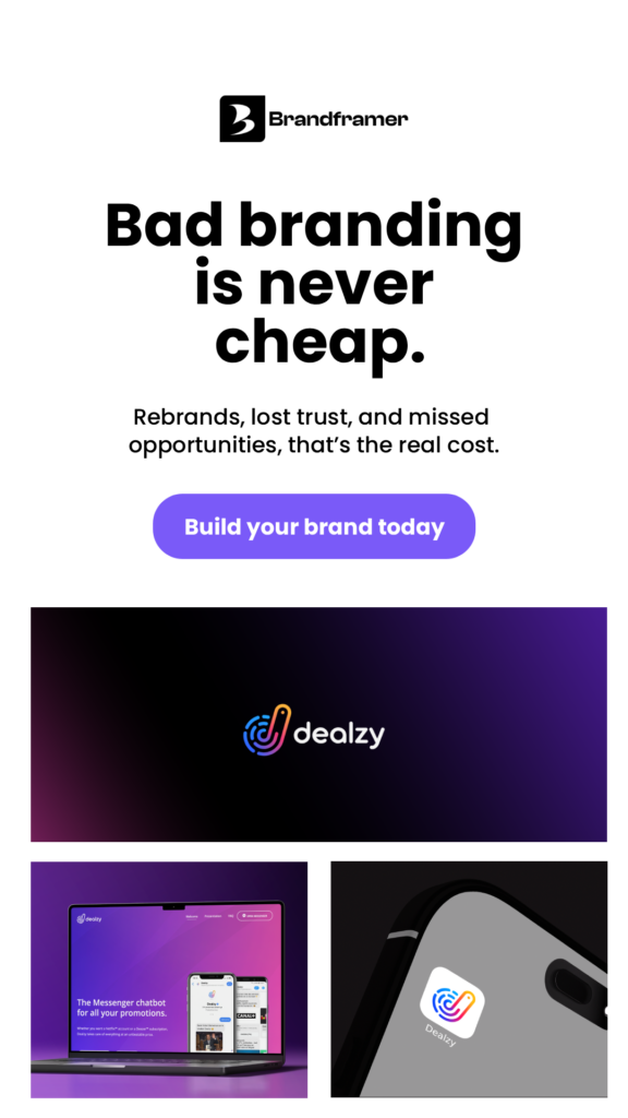
Get the full system, not just the mark
A logo is the start of something, not the end of it. If you’re investing in brand design, the question worth asking isn’t “what should my logo look like?” It’s “what does my business stand for, and how does every element of how it shows up in the world communicate that?”
Brandframer builds complete brand identity systems for businesses that want both: a logo that works and the full visual and verbal system behind it. Delivered in 48 hours, starting at $280. If you’ve been operating with a logo and not much else, that’s the gap worth closing.