55 Law Firm Logos That Get Branding Right (And What You Can Learn From Them)
 Jun 09,2026
A law firm logo is rarely just a logo. It’s the first signal a potential client receives before a single conversation takes place — before they read your practice areas, before they speak to your receptionist, before they decide whether to trust you with something that matters to them. In a profession where reputation is everything, visual identity isn’t decoration. It’s communication.
At Brandframer, we analyzed 55 law firm logos across six practice areas to understand what separates the marks that build trust from the ones that erode it. The patterns that emerged are clear, consistent, and surprisingly transferable — regardless of firm size, geography, or specialization.
Why branding hits differently in law ?
Most industries can afford an average logo. Law cannot. The stakes of a legal engagement — financial, personal, reputational — mean that clients apply a much higher standard of scrutiny before choosing a firm. A weak visual identity doesn’t just fail to impress. It actively signals risk.
The strongest law firm logos solve a four-part problem simultaneously: they communicate credibility, demonstrate competence, signal approachability, and stand apart from the competition. Solving all four in a single mark, without visual complexity, is harder than it sounds. The firms that get it right almost always do so through discipline rather than creativity. A strong logo is a starting point, not a finish line. Here’s the difference between a logo and a complete brand identity, and why it matters for professional services firms.
55 logos inspiration
Corporate and Commercial Law Firms
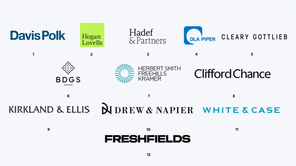
At the top of the market, where firms serve institutions and billion-dollar transactions, the visual language is almost universally one of restraint. These marks earn authority through precision, not decoration. Typography does the heavy lifting, and when a symbol appears, it justifies itself completely.
- Davis Polk — Compressed navy sans-serif with tight spacing. The density of the letterforms communicates BigLaw weight without a single decorative element.
- Hogan Lovells — The green square background breaks every convention of corporate legal branding deliberately. The result is one of the most instantly recognizable marks in the sector.
- Hadef & Partners — The ampersand anchors the composition, creating a natural visual hierarchy between the two names. The serif execution has a quiet editorial quality.
- DLA Piper — The rounded blue square enclosing the acronym creates a symbol system that works independently from the full wordmark. Exceptionally scalable.
- Cleary Gottlieb — All-caps, wide spacing, no symbol. The mark communicates that the name alone is sufficient. It is.
- BDGS Associés — The dotted geometric motif above the acronym adds structural interest without disrupting the overall restraint.
- Herbert Smith Freehills Kramer — The radiating circle is an unusually energetic choice for a firm this size. It generates strong visual presence at any scale.
- Clifford Chance — Careful proportions, clean sans-serif, contemporary execution. One of the few Magic Circle firms whose mark genuinely feels of its time.
- Kirkland & Ellis — Generous spacing, strong weight, zero ornamentation. Authority communicated entirely through typographic discipline.
- Drew & Napier — The interlocking DN monogram reads simultaneously as symbol and abbreviation. Distinctive without decoration. White & Case — The cyan is a deliberate differentiator in a category dominated by navy and black. Bold, clean, and memorable.
- Freshfields — The 2023 rebrand reduced everything to typographic force. Heavy caps, maximum impact, nothing extraneous. One of the strongest rebrands in recent BigLaw history.
Litigation and Trial Firms
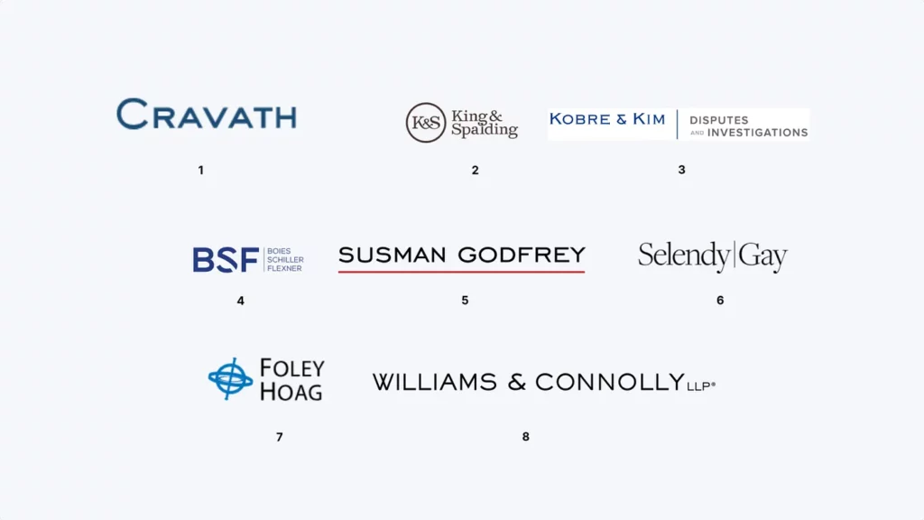
Litigation branding operates on different emotional logic. These firms need marks that project conviction, strength, and the willingness to fight. The best examples in this category use typography as a blunt instrument — bold, direct, and impossible to ignore.
- Cravath — The small caps serif with the oversized C creates elegant typographic hierarchy. Authoritative without aggression. The visual language of institutions that have never needed to prove themselves.
- King & Spalding — The circular K&S monogram in warm brown signals heritage and gravitas. Classic execution, cleanly done.
- Kobre & Kim — The vertical divider between firm name and practice descriptor is a structural choice that communicates specialization. Exactly right for a disputes-only firm.
- Boies Schiller Flexner — The BSF acronym in navy works as a standalone symbol. Direct and built entirely for credibility.
- Susman Godfrey — One red underline. That’s the entire design decision, and it’s a masterclass. Emphasis, confidence, and finality in a single horizontal stroke.
- Selendy Gay — The vertical bar separator with mixed type treatments creates visual tension that feels both intentional and modern.
- Foley Hoag — The circular crosshair symbol is genuinely unusual in legal branding. Bold, strong visual presence, highly distinctive.
- Williams & Connolly — All-caps with generous tracking. The LLP handled with complete restraint. Institutional authority in its purest typographic form.
Boutique and Specialist Firms
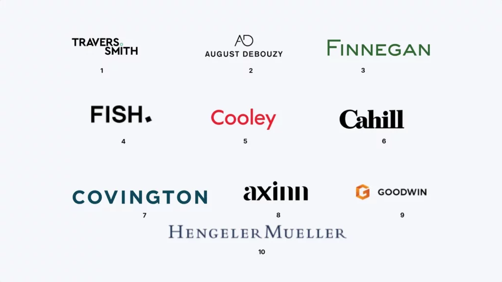
Boutique firms have creative latitude that BigLaw rarely does. The best marks in this category take that freedom seriously — using punctuation, unconventional color, and unexpected type choices to create identities that genuinely reflect a distinct personality.
- Travers Smith — A small teal dot between the names. The smallest possible design decision with the largest possible impact on distinctiveness.
- August Debouzy — The geometric AD monogram above a lowercase wordmark creates a two-tier identity with a contemporary, architectural quality.
- Finnegan — Deep green in a serif mixed-case mark. Unusual and confident. IP expertise communicated through visual distinctiveness.
- Fish. — The period is the entire brand statement. Finality, confidence, and memorability in a single punctuation mark. Full stop.
- Cooley — Red, rounded, approachable. Deliberately startup-friendly in a category that defaults to formality. The conviction behind the color choice makes it work completely.
- Cahill — High-contrast serif with extreme stroke variation. More luxury brand than law firm — which is exactly the intended signal.
- Covington — Wide-tracked teal all-caps. Space and confidence without sacrificing authority.
- Axinn — Lowercase, minimal, subtle dot accent. Informality as a deliberate cultural signal, restrained enough to remain professional.
- Goodwin — The orange G symbol is the boldest color move on this list. Completely apart from conventional legal branding, and completely committed.
- Hengeler Mueller — Mixed-case serif with generous spacing. The informality of the case softens what would otherwise be an entirely traditional European mark.
Real Estate and Property Law Firms
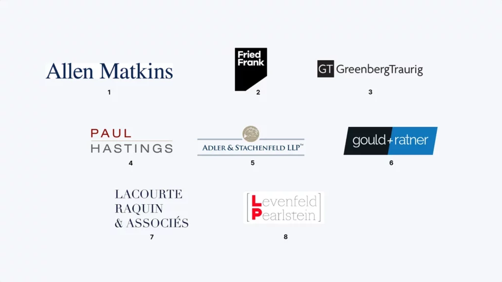
Property law sits at the intersection of stability and deal-making speed. The best marks here balance groundedness with energy — communicating the security clients need alongside the dynamism that drives transactions.
- Allen Matkins — Large, open serif in deep navy. Confidence and approachability in the same mark, without tension between them.
- Fried Frank — The black square with the cut corner is architectural, unexpected, and completely distinctive. Maximum contrast, zero ambiguity.
- Greenberg Traurig — The GT monogram paired with the full name creates a dual-identity system that scales cleanly across every format.
- Paul Hastings — The thin rule separating the stacked names creates structure. The red and grey color hierarchy adds contemporary confidence.
- Adler & Stachenfeld — Horizontal rules above and below create containment and precision. The medallion symbol adds measured heritage.
- Gould + Ratner — The parallelogram background with the plus sign is the most visually energetic mark on this list. It signals a firm that moves at transaction speed.
- Lacourte Raquin & Associés — Stacked all-caps serif with architectural composition. French legal elegance — formal, precise, and structured.
- Levenfeld Pearlstein — The LP bracket monogram with shared vertical stroke is clever construction. The red L accent creates instant recognition with minimal visual intrusion.
Technology and Startup Law Firms
Tech-focused firms need to communicate credibility to institutional clients while remaining approachable to first-time founders. The marks that succeed here share a willingness to break legal branding conventions — because their clients expect it.
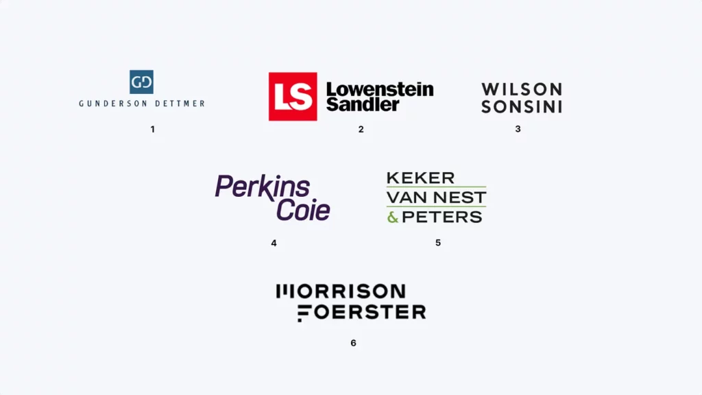
- Gunderson Dettmer — The GD monogram in a squared container scales independently from the wordmark. Wide-tracked all-caps adds structure. Built for the venture ecosystem.
- Lowenstein Sandler — The bold red LS square is the most assertive symbol on this list. High contrast, zero ambiguity, scales from favicon to signage without losing impact.
- Wilson Sonsini — Stacked all-caps, tight tracking, no symbol. In Silicon Valley, the name carries all the weight. The mark understands this completely.
- Perkins Coie — Italic purple serif. The most unconventional choice here — italics signal movement, purple signals differentiation. A firm unafraid to look different from its peers.
- Keker Van Nest & Peters — Stacked layout with thin green rules and a green ampersand accent. Structured, architectural, editorial. Right for a firm that takes tech litigation seriously.
- Morrison Foerster — Custom letterforms with geometric modifications. The flat-topped M and F create a mark that feels engineered. For a firm that navigates technical complexity, that precision is the message.
Family Law and Personal Legal Services
Family law branding requires something most legal marks don’t — emotional intelligence. The logo needs to communicate warmth and approachability without compromising the professional credibility that makes clients trust you with their most personal matters.
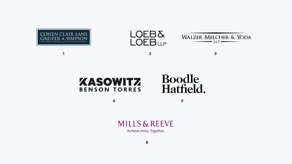
- Cohen Clair Lans Greifer & Simpson — The navy rectangle enclosure creates protection and solidity. A deliberate visual metaphor for a firm handling high-stakes family matters.
- Loeb & Loeb — The stacked repeated name creates rhythmic composition. The size differential between lines adds hierarchy without disrupting unity.
- Walzer Melcher & Yoda — Horizontal rules create containment and order. The serif execution communicates precision and established expertise.
- Kasowitz Benson Torres — Compressed all-caps with strong weight differentiation. High impact, immediately readable. A firm that wins.
- Boodle Hatfield. — The period defines the mark. Same logic as Fish. — finality and confidence in a single punctuation choice. One of the most quietly distinctive marks in English family law.
- Mills & Reeve — The only mark on this list that leads with an explicit emotional statement. Purple, warm, and direct. “Achieve more. Together.” baked into the visual identity itself.
International and Global Firms
Global legal marks must work across cultures, languages, and legal systems simultaneously. The constraint produces a specific kind of excellence — marks that are impossible to misread, regardless of context.
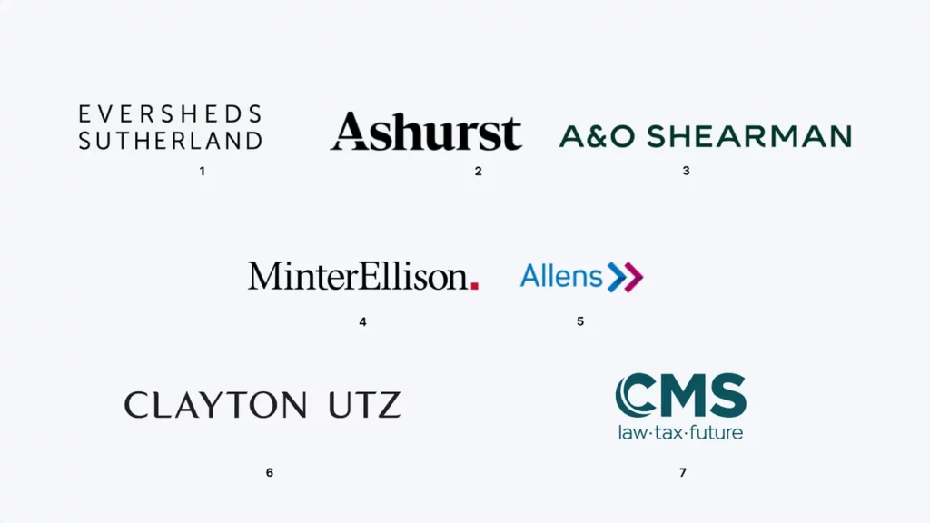
- Eversheds Sutherland — Ultra-light wide-tracked all-caps. Sophisticated, airy, and culturally neutral. A firm confident enough to whisper.
- Ashurst — Bold serif with strong stroke contrast. Authoritative across every context. One of the cleaner rebrands in the sector.
- A&O Shearman — The 2024 merger mark handles a typographic challenge cleanly. The teal ampersand creates unity from two established identities.
- MinterEllison. — The period again. Red dot accent, mixed case. Approachable at scale — exactly right for Australia’s largest firm operating internationally.
- Allens — The gradient chevron symbol is one of the most optimistic marks in global legal branding. Forward movement, direction, momentum.
- Clayton Utz — Wide tracking, strong weight, all-caps without aggression. Directness as a brand value, communicated typographically.
- CMS — The circular monogram scales perfectly. The “law·tax·future” descriptor is an unusually bold positioning statement. Ambition signaled where most firms signal only tradition.

What these 55 logos have in common ?
Studying marks across six categories and dozens of firm sizes, the same principles surface repeatedly.
Restraint is the discipline that separates lasting marks from forgettable ones. The logos that have survived decades share a resistance to complexity — no gradients, no effects, no visual noise that will feel dated in five years.
Typography is the primary tool. In legal branding more than almost any other context, the font carries the entire emotional register. Serif or sans-serif is the most consequential single decision in the process.
Color works as a differentiator, not decoration. Navy and black dominate because they communicate trust and authority. The firms that break from this palette — Hogan Lovells’ green, Cooley’s red, Goodwin’s orange — do so with complete conviction, which is why it works.
Scalability is the constraint that reveals quality. A mark that can’t hold up as a favicon, a business card, and a building sign simultaneously hasn’t been designed properly.
Ready to build a law firm brand identity that looks like the ones above?
The firms on this list didn’t design their logos in Canva or prompt an AI generator. They invested in professional brand identity work — and the result is a visual asset that builds trust and outlasts any individual marketing effort.
Brandframer delivers professional brand identities in 48 hours — logo, color palette, typography, and usage guidelines — starting at $280. No agency timeline, no AI shortcuts, no freelancer risk.