
M Logo Design: Styles, Examples, and How to Choose the Right One
 Jul 20,2026
There’s a reason so many brands land on a single letter. A strong M logo design does more work than a full wordmark ever could on a favicon, an app icon, or a business card someone glances at for two seconds. But a bad one just looks like a placeholder nobody finished.
M is one of the most common starting letters for brand names in English, which means it’s also one of the most competitive letters to own visually. Get it right and you have a mark that scales from a Slack avatar to a storefront sign without losing meaning. Get it wrong and you end up with something that looks like a stock icon, because a lot of “M logos” floating around online genuinely are stock icons.
This guide walks through what separates a monogram from a lettermark, the styles actually worth considering for a single M, how a double M logo works differently, what it costs to get one done properly, and how to pick the right direction for your brand instead of guessing.
What makes the letter M one of the most used logo initials
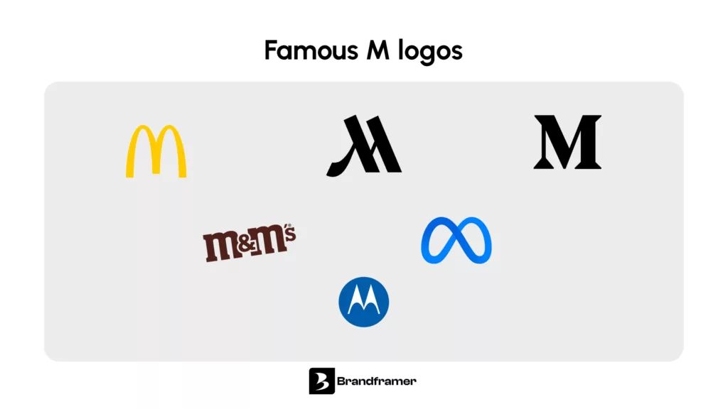
Founders gravitate toward M because it sits at the start of an unusually large share of brand, product, and personal names. Meta, McDonald’s, Marriott, and countless SaaS tools and DTC brands all lean on it. The letter also has useful bones for a designer: it’s symmetrical, it has strong vertical strokes, and it can be built from geometric shapes without losing legibility.
That popularity cuts both ways. A generic M mark blends into a sea of other generic M marks. The brands that get real equity out of a single letter usually pair it with something distinctive, a specific angle, a negative space trick, a color story, a proportion that’s slightly unexpected. Nobody remembers the letter. They remember the specific version of it.
If speed matters more than trial and error right now, this is exactly the kind of decision Brandframer handles inside a 48 hour turnaround, so you’re not stuck sketching M variations on a whiteboard for three weeks.
Is an M logo a monogram or a lettermark?
It depends on how the letter is treated. A lettermark uses a brand’s initials in clean, readable typography with little to no stylization, think IBM or CNN. A monogram goes further and fuses the letters (or the single letter) into one stylized, often interlocked graphic symbol that reads as an icon first and a letter second.
The idea itself is old. Monograms show up on Greek coins as far back as the fifth century BC, used to mark which city or mint produced them, long before anyone called it branding.
Most single M logos people mean when they say “M logo design” fall into the monogram camp. The letter is reshaped, mirrored, or combined with negative space until it becomes a mark rather than plain typography. Understanding this distinction matters because it changes the design brief entirely. A lettermark project is a typography exercise. A monogram project is closer to icon design.
We’ve written a more detailed breakdown of what a monogram logo actually is if you want the full picture before deciding which route fits your brand.
Popular styles for a single M logo
There isn’t one “correct” way to design an M. The right style depends on the industry and the personality you’re trying to signal, but a few directions consistently work well.
A minimal geometric monogram builds the M from two or three simple shapes rather than a full font outline. It reads clean at small sizes and ages well, which matters more than most founders expect when they’re only thinking about how the logo looks on a homepage hero image.
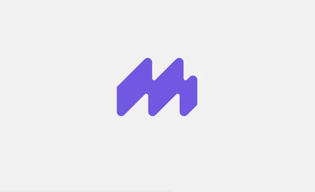
A negative space M hides the letter inside a broader shape, a mountain, an arrow, a fold. It rewards a second look and tends to work best for brands that want to feel discovered rather than announced.
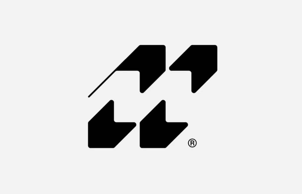
An abstract or tech-leaning M uses fluid geometric forms instead of a literal letterform. It’s a common choice for SaaS and startup brands because it signals modern without trying too hard.
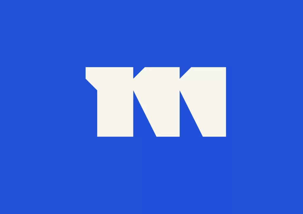
A premium, refined monogram leans closer to fashion-house proportions: thinner strokes, more elegant spacing, sometimes a serif influence. It fits professional services, hospitality, and luxury-adjacent categories better than it fits a scrappy early-stage app.
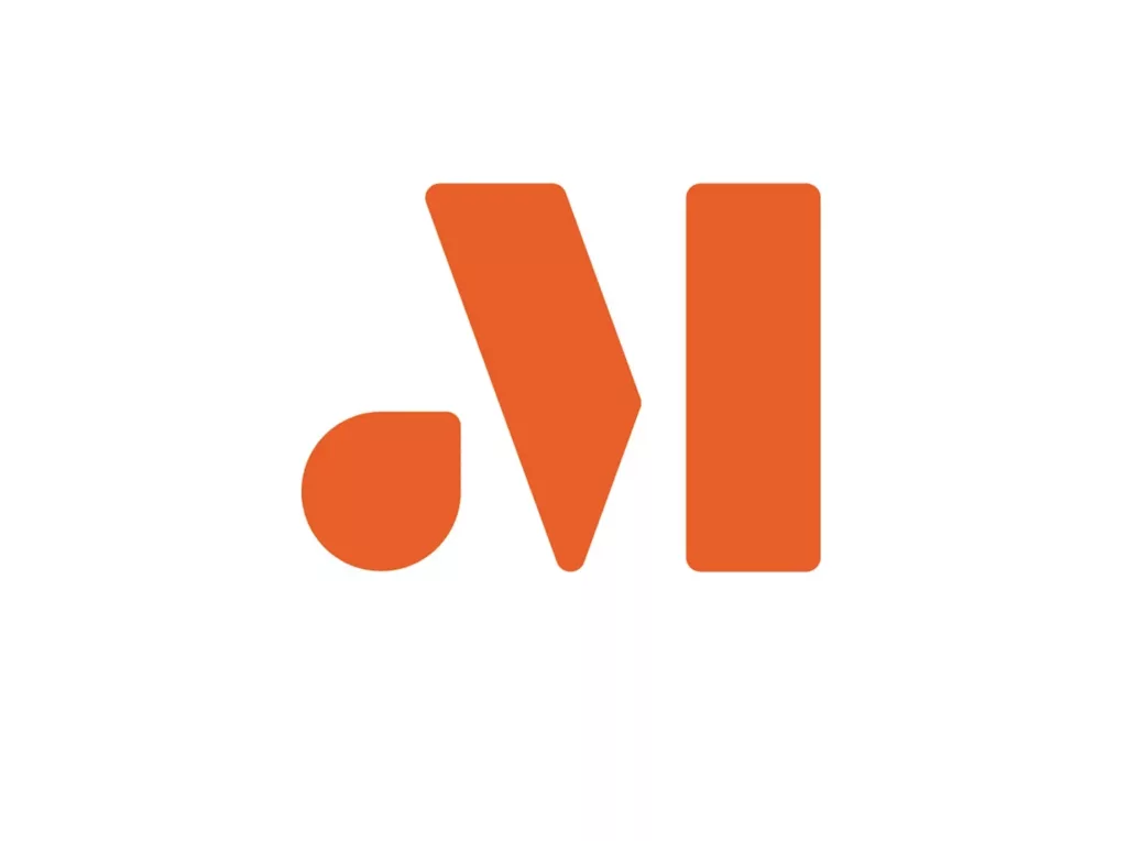
None of these are mutually exclusive with good typography principles. If you want the fundamentals that apply regardless of style, our guide on logo design principles covers the proportion and spacing rules that keep any of these directions from looking amateur.
Ready to see your brand’s name turned into one of these instead of reading about them? That’s the whole point of Brandframer’s process.
What are some popular styles for designing a double M logo?
A double M logo shows up more often than people expect, mostly for brand names with a repeated M (think agency names, family businesses, or two-founder brands sharing an initial). The core styles differ from a single M because the design problem is different: you’re balancing symmetry and readability instead of just shaping one letterform.
Interlocking double M overlaps the two letters into a single unified symbol, similar to how a luxury monogram works with two different initials. It reads as one mark rather than two letters standing side by side.
Mirrored double M treats one M as a reflection of the other, often meeting in the middle to form a diamond or a peak shape. This style tends to suit brands in finance, real estate, or hospitality where symmetry reads as stability.
Stacked double M places one M above the other rather than side by side, useful when the brand needs a taller, more vertical mark for packaging or signage.
A double M is harder to get right than a single M because there’s more room for it to look cluttered or accidental. It’s one of the few areas in logo design where doing less almost always beats doing more.
How much does a custom M logo design cost?
Pricing for a custom logo design ranges widely depending on who does the work and what’s included beyond the mark itself. Freelance platforms and marketplaces can run anywhere from under a hundred dollars for a quick turnaround to several thousand for an agency engagement with strategy work attached.
At Brandframer, a full identity system, not just a logo file, starts at $280 for the Basic plan, $480 for Premium, and $987 for the full BrandFramer 360 package, all delivered within 48 hours. That’s the difference worth paying attention to: you’re not buying a single PNG, you’re buying a logo built alongside color, typography, and usage guidelines so it actually holds up across every touchpoint. For a full pricing breakdown across plan types, see our guide on logo design pricing.
How to choose the right M logo style for your brand?
Start with where the logo has to work hardest, not where it looks best. A favicon and an app icon compress everything to a tiny square, so a monogram with fine detail or thin strokes can fall apart at 16 pixels even if it looks sharp on a 4K mockup. Test any direction small before falling in love with it large.. A favicon and an app icon compress everything to a tiny square, so a monogram with fine detail or thin strokes can fall apart at 16 pixels even if it looks sharp on a 4K mockup. Test any direction small before falling in love with it large.
Consider your industry’s visual norms, then decide whether to follow them or break them on purpose. A fintech brand leaning into a sharp geometric M signals precision. The same geometry on a children’s brand would feel cold. Neither is wrong, but it has to be a choice, not an accident.
Here’s the honest nuance: a single-letter logo, however well designed, carries almost no brand recognition on day one. It works because of repetition over time, not because the shape alone is inherently memorable. If you’re pre-launch and need people to actually learn your name, pairing the M mark with a wordmark version for early use is often smarter than going all-in on the initial from day one.
And don’t underestimate how much color and proportion do here. Two brands can use nearly the same M shape and feel completely different depending on whether it’s rendered in a sharp navy or a soft gradient. The letter is rarely the differentiator. The execution around it is.
Getting the M right isn’t really about the letter. It’s about everything Brandframer builds around it.
Turning your M into an actual brand
A good M logo isn’t a shape you pick from a gallery, it’s a decision built on your industry, your name, and how the mark needs to perform across every size and surface your brand shows up on. Monogram or lettermark, single letter or double, the direction only makes sense once it’s tied to a real strategy instead of a trend.
That’s the part most cheap logo tools skip entirely. Brandframer builds the full identity system around your M, logo, color, typography, and guidelines, in 48 hours, starting at $280. If you already know your brand name starts with M, you’re closer to a finished identity than you think.

