
What is a brandmark? The complete guide
 Jun 22,2026
A brandmark is a symbol-based logo that represents your brand through image alone, with no text attached. No company name. No tagline. Just a graphic mark that, over time, becomes synonymous with everything you stand for.
You already know the examples: the Nike swoosh. The Apple silhouette. The Twitter bird (before it became an X). None of those need a word next to them to be recognized. That’s the goal. And for founders building a brand from scratch, understanding what a brandmark is, and whether you actually need one, is one of the first real decisions you’ll face.
This guide covers the definition, the types, the decision framework, and the tradeoffs. No filler.
What does a brandmark actually mean?
A brandmark is a purely visual symbol that represents your business without relying on text. It’s the graphic component of your identity system, designed to trigger instant recognition the moment someone sees it, whether that’s on a product, a slide deck, or a 32x32px favicon.
The term is sometimes used interchangeably with “logo symbol,” “pictorial mark,” or “brand icon,” and that’s mostly fine. What matters is the underlying concept: a mark that can stand on its own, without your company name, and still communicate something meaningful about your brand.
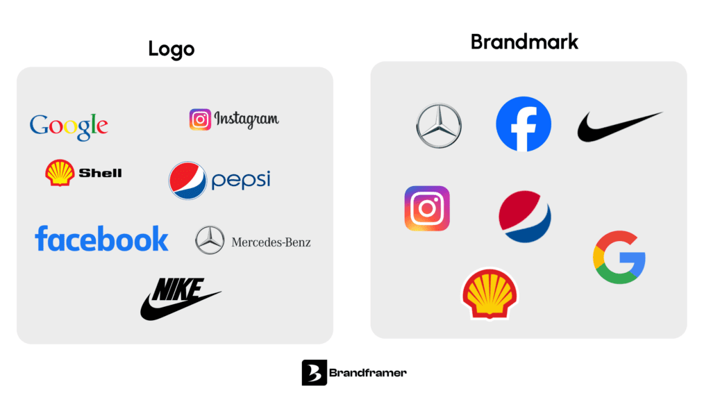
Note that this is different from a logo. A logo can include text (your name), a symbol (your brandmark), or both together. The brandmark is specifically the symbol component.
What’s the difference between a logo and a brand mark?
A logo is the full visual identifier for your brand, which might include a symbol, a wordmark, or a combination of both. A brandmark is the symbol-only element within that system.
Think of it this way: the word “Google” set in a distinctive typeface is a wordmark. The Google “G” icon used on mobile apps and browser tabs is the brandmark. Both are logos in the broad sense. But only one works at 16 pixels without losing legibility.
For most early-stage founders, the practical difference shows up in scalability. A wordmark that works beautifully on a website header becomes illegible when shrunk to an app icon or embroidered on a cap. That’s where a dedicated brand symbol becomes non-negotiable. If your brand will ever need to live in digital product environments, brand merchandise, or packaging, you’re going to need a mark that functions without text.
Not sure whether your brand needs a standalone symbol or a wordmark? That’s exactly the kind of strategic call Brandframer makes with you before touching a single pixel. Start at brandframer.com.
What are real brandmark examples?
The most recognized brand symbols in the world share one thing: they didn’t start iconic. They became iconic through consistent, deliberate repetition across every surface the company owned.
Apple’s original 1976 logo was an elaborate illustration of Isaac Newton under a tree. Beautiful, completely unscalable, and impossible to remember. The bitten apple that replaced it succeeded not because it was clever (though the byte/bite pun is genuinely good), but because Apple applied it relentlessly across every product and touchpoint for decades.
Nike’s swoosh was designed by a graphic design student in 1971 for $35. It meant nothing on day one. It means everything now because it’s been attached to thirty years of elite athletic performance.
Twitter’s bird worked as a graphic mark because it was simple enough to reproduce at any size, distinct enough not to be confused with anyone else, and coherent with the brand’s “short, fast, lightweight” positioning.
The lesson for founders isn’t “pick a famous symbol.” It’s that the mark earns meaning through exposure. The symbol is the vessel. Your brand fills it.
A professionally designed brandmark is included in every Brandframer package, from the $280 Basic to the $987 BrandFramer 360 package. No back-and-forth for weeks. Just a complete visual identity, delivered.
What are the different types of brandmarks?
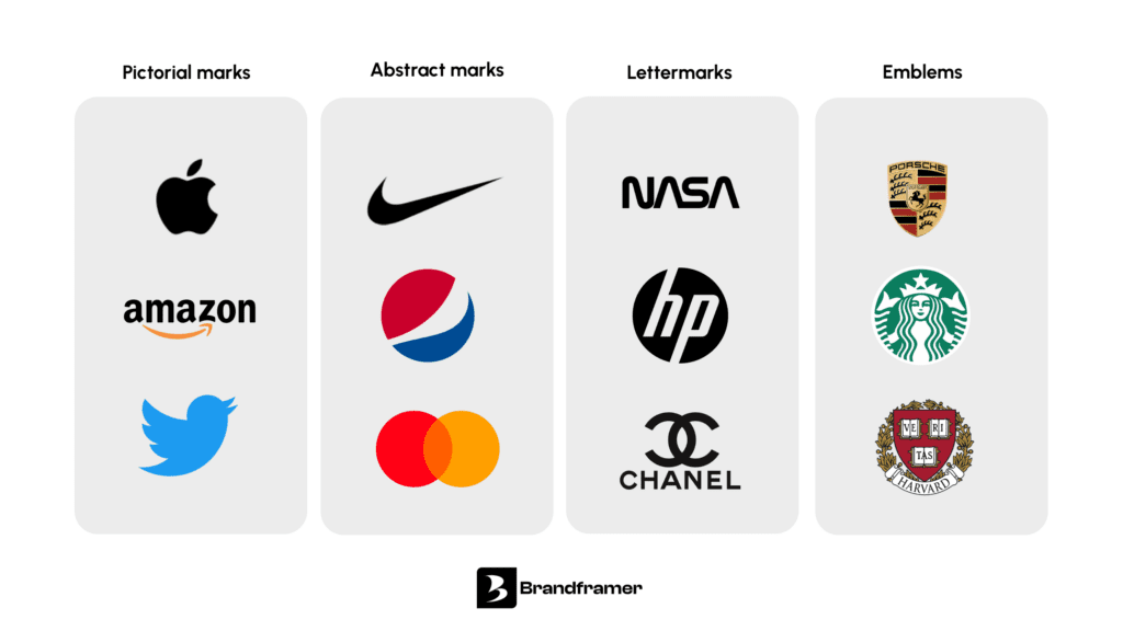
There are four main types of symbol-based logos, and choosing the right one depends on your brand name, category, and long-term positioning.
Pictorial marks use a literal or semi-literal image to represent the brand. Twitter’s bird, Apple’s apple, Amazon’s arrow. They’re concrete enough to be understood quickly, but abstract enough to carry meaning beyond the object itself.
Abstract marks use a geometric or non-representational shape that has no inherent meaning until the brand assigns it one. The Nike swoosh is technically abstract. So is the Pepsi globe. These require more time and investment to build recognition, but once established, they’re virtually impossible to confuse with anything else.
Lettermarks use stylized initials as the core symbol. Louis Vuitton’s interlocking LV, Chanel’s double-C, IBM’s striped monogram. These work particularly well when the brand name is long, non-intuitive, or in a category where authority and heritage matter. They sit somewhere between a wordmark and a pure symbol.
Emblems enclose the typography within the symbol itself, creating a unified badge rather than a separate mark and text. Harley-Davidson, Starbucks, most sports teams. They’re powerful in categories where tradition and belonging matter, but they tend to be less flexible in digital environments because the text inside becomes unreadable at small sizes.
Understanding these distinctions is part of what goes into building a strong brand identity package, not just a single file.
What is the meaning of brandmarking?
Brandmarking, as a practice, refers to the process of creating and applying a distinctive visual symbol to build brand recognition over time. It’s not just designing a mark. It’s the deliberate, consistent act of associating that mark with a specific set of values, experiences, and promises.
The word has roots in livestock branding, where a physical mark burned into an animal’s hide established ownership. The principle transferred to commerce: a mark identifies origin and stakes a claim. What’s changed is that modern brandmarking is about desire, not just origin. You’re not just saying “this came from us.” You’re saying “this stands for something you want to be associated with.”
For a founder, brandmarking is the long game. You build a mark, apply it relentlessly, and over years it accumulates meaning. The challenge is that most founders want the mark to do the work before the brand has earned the equity. It doesn’t work that way.
What’s the difference between a brandmark and a trademark?
A brandmark is a design concept. A trademark is a legal protection mechanism. The two aren’t mutually exclusive, and for any serious brand, they go together.
Your brandmark is the visual symbol you create. A trademark is the registered legal right to exclusive use of that symbol (or name, or slogan) within a specific category or jurisdiction. When you register your brandmark as a trademark with the USPTO, you get the right to stop competitors from using confusingly similar marks in your market.
The practical implication for founders: before you invest in building brand equity around a symbol, you need to know whether it’s registrable. A mark that’s too generic, too similar to an existing registered mark, or too descriptive of your product category will face challenges at registration. That’s why originality isn’t just a design preference. It’s a legal requirement.
This is worth knowing before you spend thousands on brand guidelines and packaging, only to discover three years later that someone else owns the mark in your category.
What makes a strong brandmark design?
This is where most articles list five vague adjectives (“memorable, timeless, versatile”) and call it a day. Let’s be more specific.
- Scalability is the first real test. Does the mark hold up at 16 pixels? Does it work reversed out in white on a dark background? Does it lose its shape when embroidered? A mark that only looks good in Illustrator at full size is not a functional brandmark. You need to see it at every scale before you commit.
- Distinctiveness within your category matters more than aesthetic beauty. A mark can be gorgeous and still fail if it looks like three other companies in your space. Before finalizing any symbol, it needs a competitive audit: search your category on Google Images, check trademark databases, look at what your five closest competitors use. If your mark rhymes visually with an existing brand, it will work against you.
- Conceptual integrity is optional but valuable. The best marks have some underlying logic connecting the symbol to what the brand actually does or stands for, even if that logic isn’t immediately obvious to a viewer. You don’t need to explain it. But when someone asks, you should have an answer that makes them say “that’s smart.”
One honest caveat: not every brand needs a standalone graphic mark right now. If you’re pre-launch, have a long or complex name, and are operating in a B2B context where trust and expertise matter more than visual recognition, starting with a strong wordmark vs brandmark combination, or even a wordmark alone, is a completely legitimate strategy. The symbol can come later, once the brand has more definition.
Brandframer has built complete brand identity systems for founders across SaaS, consulting, and e-commerce. Delivered in 48 hours. Starting at $280.
How does a brandmark fit into a full visual identity system?
A brandmark is one component. It doesn’t operate alone. The broader system includes your wordmark (the name set in custom or selected typography), your color palette, your type hierarchy, your icon language, and the rules governing how everything works together. Those rules live in your brand guidelines, which document how the mark is used, what spacing it requires, what backgrounds it can sit on, and what variations are permitted. See brand guidelines examples to understand what that documentation typically covers.
Without the system, the mark is just a graphic file. It’s the system that makes it a brand. This is also why the “logo in 48 hours” model falls flat when the deliverable is literally just a logo file. A brandmark without a defined color palette, without a typeface partner, without usage rules, is a symbol with no context. It’ll look different on every surface it’s applied to, and that inconsistency is what kills recognition.
The goal, for any founder serious about building equity, is a visual identity system where the mark, the type, the color, and the tone all reinforce the same positioning. That’s what compounds over time.
Your brandmark is a long-term asset, not a quick deliverable
A well-designed brandmark is one of the few visual assets that can appreciate in value the longer you hold it. Every consistent application builds equity. Every time someone sees your symbol and connects it to your brand, the mark gets stronger.
But that compounding only happens if you start with the right foundation: a symbol that’s distinctive, scalable, legally defensible, and rooted in a coherent brand positioning. The mark doesn’t create the meaning. Your brand does. The mark just holds it.
If you’re ready to build that foundation properly, Brandframer delivers a complete visual identity system, including your brandmark, wordmark, color palette, typography, and usage guidelines, in 48 hours. Plans start at $280.
