
The logo design process, explained step by step
 Jul 14,2026
Most founders hire a designer, wait a few days (or weeks), and get a logo back with no idea what happened in between. That’s a problem, because the logo design process is where the actual value gets built. It’s not one creative flash of inspiration. It’s a sequence of decisions, each one narrowing the field until a single mark survives.
Understanding that sequence matters for two reasons. First, it tells you what you’re actually paying for when you hire someone. Second, it gives you a way to judge the work you get back instead of just reacting to whether you personally like a color. Below is the process broken into the seven steps a professional studio actually runs, in the order they happen.
What is the logo design process?
The logo design process is the structured sequence a designer follows to turn a business’s identity into a single, functional visual mark. It typically moves through discovery, research, sketching, digital refinement, testing, and file delivery. Skip a step and the logo usually shows it later, on a billboard that doesn’t read at a distance or a favicon that turns into a smudge.
Every stage exists to answer one question: will this mark still work when it’s small, alone, in black and white, next to a competitor’s logo, or printed on a coffee cup at 2am by someone who’s never met the founder? That’s the actual bar. Not “does it look nice on a laptop screen.”
Step 1: Discovery and brief, what a designer actually needs from you
This is where most logo projects quietly go wrong. A designer can’t design toward a goal that was never stated, and “make it look professional” isn’t a goal, it’s a wish.
A proper discovery phase covers who the company sells to, what the brand needs to say without saying it out loud, what the competitive landscape already looks like, and where the logo will actually live: app icon, signage, packaging, a pitch deck cover slide. If nobody asks you these questions before sketching starts, that’s worth noticing.
A good brand identity can help you walk into that first conversation with answers ready instead of figuring them out live on the call.
Skipping this step to save a day costs more than a day. It costs a second round of concepts because the first ones were built on guesses.
At Brandframer, this discovery step happens in the first hours of the 48-hour window, not spread across three separate intro calls over two weeks. You answer a structured brief once, and the design work starts immediately after.
Step 2: Competitive and industry research
Before anyone picks up a pencil, a designer needs to know what the rest of the category looks like. What colors dominate? What shapes have been used to death? What’s been left untouched that could actually work in your favor?
This isn’t about copying what competitors did right. It’s about knowing the visual noise you’re stepping into so your logo doesn’t accidentally blend into it. A fintech startup that shows up with the same rounded blue wordmark as five other fintech startups isn’t being safe, it’s being invisible.
Research also protects against something worse: unintentionally landing close to an existing brand’s mark. Nobody wants to find that out after launch.
Speed matters here too. A studio with a decade of pattern recognition across industries doesn’t need three days to spot what’s overused in your category. That’s part of what shortens the whole timeline without shortening the thinking.
Step 3: Sketching and creative exploration
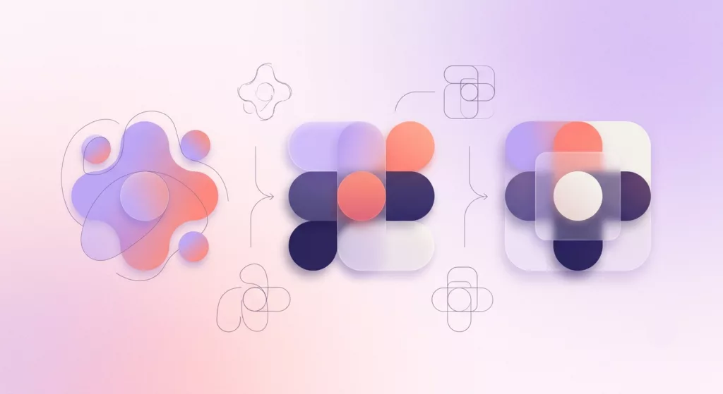
This is the step people picture when they imagine “logo design,” and it’s real, but it’s messier than the finished product suggests. Designers sketch dozens of rough directions on paper or in low-fidelity digital tools, not because most of them are good, but because volume is how you find the one idea worth developing.
Solid logo design principles guide this stage even at the roughest sketch level: does the shape hold up in silhouette, does it avoid relying on a gradient to be interesting, does it say something true about the brand rather than something generic about the industry.
Why does this stage need so many attempts? Because the tenth idea is rarely the best one, but you usually can’t get to the tenth idea without sketching the first nine.
By the end of this step, a small number of directions get chosen to move forward, usually two or three, not one. Committing too early here is how brands end up with a logo that’s fine instead of one that’s actually theirs.
Step 4: Digital drafts and iteration
The selected sketches get built in vector software, where color, weight, spacing, and typography finally become real decisions instead of pencil approximations. This is also where a shape that looked clever on paper sometimes falls apart once it’s clean and precise. That’s normal, and it’s exactly why this step exists before anything gets finalized.
Iteration here is quiet, deliberate work: adjusting a curve by a fraction of a degree, testing three shades of the same blue side by side, checking how the mark holds up at 16 pixels for a browser tab. None of it is glamorous. All of it is the difference between a logo that looks intentional and one that looks improvised.
This is also the stage where pricing tiers start to matter in practice. A basic wordmark refinement takes less iteration than a custom brandmark built around a symbol, which is part of why plans are usually structured by scope rather than a single flat number for everything.
Step 5: Testing and feedback
A finished digital draft isn’t a finished logo. It has to survive contact with the real world first: different screen sizes, print versus digital, full color versus black and white, sitting next to other brand marks in a crowded app store or trade show booth.
Feedback belongs here too, and it should come from more than one person’s gut reaction. Ask why someone likes or dislikes a direction, not just whether they do. “It feels cheap” is useful. “I just don’t love it” isn’t actionable for anyone.
And this is where the one honest caveat in this whole article lives: testing takes real time, and there’s no version of a rushed process that replaces it entirely. What can be compressed is the scheduling overhead around it, the back-and-forth emails and delayed replies that stretch a two-day task into three weeks. The actual testing itself still has to happen.
Step 6: Final file delivery
The last step is often treated as an afterthought, but a logo with the wrong file types is a logo you’ll be redoing sooner than expected. A proper delivery includes layered source files, high-resolution transparent PNGs, and outlined text so the logo doesn’t shift if the font isn’t installed on someone else’s machine.
This is usually where a logo becomes part of a broader brand identity package, since a logo alone without a color system, typography rules, and usage guidelines tends to get applied inconsistently within a few months. One file isn’t a brand. A system is.
If you only get a single PNG at the end of a project, that’s a signal the process stopped a step early.
How long does the logo design process actually take?
Traditionally, this whole sequence takes anywhere from two to six weeks at a typical agency, and a lot of that time isn’t creative work, it’s scheduling. Waiting for call slots, waiting for internal review cycles, waiting for someone to get back from vacation before round two can start.
None of that waiting makes the logo better. It just makes the calendar longer. The actual hands-on design time inside those six weeks is often a fraction of the total.
That’s the gap Brandframer’s 48-hour process is built to close: not by skipping discovery, research, sketching, or testing, but by removing the scheduling dead time between them and running the stages back to back. Curious what that costs across the three tiers?
The bottom line on hiring for this
A logo isn’t a single image, it’s the output of six deliberate decisions stacked on top of each other. When you understand that, you stop judging a designer by “do I like this on first glance” and start judging them by whether they actually walked through the process, or skipped straight to a font and a color and called it done.
Brandframer runs this exact sequence, discovery through final files, inside 48 hours, backed by ten years and thousands of completed projects across nearly every industry. If you’re ready to see what a fully-run process looks like on your brand instead of reading about one, the logo design packages page breaks down which tier fits where you’re starting from.

