
What is an abstract logo? Best definition and examples
 Jun 28,2026
An abstract logo is a brandmark built entirely from non-representational shapes, forms, and geometry rather than recognizable imagery or letterforms. No coffee cups. No globes. No literal depictions of what a company does. Just pure visual form, carrying meaning through composition, color, and proportion alone.
That might sound like design-school theory. But consider: you already know the Nike swoosh doesn’t look like a shoe. You know the Pepsi circle doesn’t depict a drink. And yet both are instantly recognizable, globally, without a single word of explanation. That’s what a well-executed abstract logo achieves. It earns its meaning over time, rather than borrowing it from a familiar object.
For founders specifically, this distinction matters more than most branding articles will tell you. The choice between an abstract logomark and a literal one isn’t just aesthetic. It shapes how your brand ages, how it scales across categories, and how much visual equity you can build before your company name carries its own weight.
What makes a logo truly abstract?
The simplest way to understand abstract logo design is to contrast it with what it isn’t. A literal logo depicts something recognizable: a bird, a house, a flame. A wordmark uses styled typography as the primary identifier. An abstract logo, by contrast, uses shape and form that carry no pre-existing cultural meaning on their own.
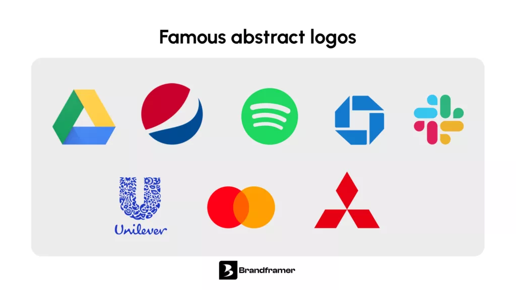
Think of the Chase bank octagon, the Spotify sound-wave circles, or the Mitsubishi three-diamond mark. None of these shapes refer to banking, music streaming, or automotive engineering directly. And yet each communicates something specific through the visual logic of the form itself: the Chase mark suggests interlocking systems and precision; the Spotify mark implies dynamic movement; the Mitsubishi diamonds convey structural strength and symmetry.
This is the defining characteristic of an abstract brandmark: it communicates through the emotional and psychological resonance of pure form, rather than through depiction. The meaning isn’t obvious at first. It’s designed in.
Why do so many companies choose abstract logos?
There’s a reason the world’s most durable brands, from Nike to Mastercard to Adidas, built their identity around abstract marks rather than literal imagery. It comes down to three things that any founder should care about: flexibility, longevity, and category independence.
A literal logo traps you. If your fintech startup uses a coin or a graph as its symbol, you’re locked into a visual metaphor that dates quickly and breaks the moment you expand your product offering. An abstract logomark doesn’t depict what you do today, which means it doesn’t become a lie when you pivot or grow tomorrow. This is why companies with broad ambitions tend to choose non-representational logos early: they’re buying visual optionality.
Longevity works the same way. Abstract shapes don’t carry the cultural expiration dates that literal imagery does. The trends change; the geometric form stays clean.
And then there’s category independence. If you’re building a SaaS product in a crowded vertical, a conceptual logo design that doesn’t look like any competitor’s gives you a distinct visual lane. You’re not borrowing from the visual vocabulary of your industry. You’re creating your own.
Every Brandframer package is built around this kind of strategic thinking, not just aesthetics. Complete brand identity systems delivered in 48 hours, starting at $280. See what’s included at brandframer.com.
What are the four types of logos?
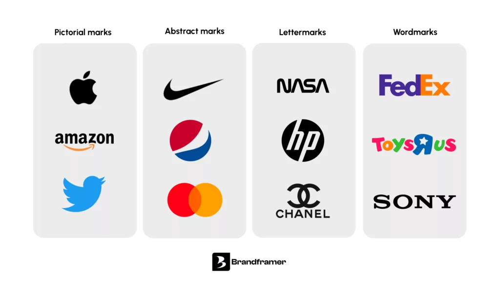
Most branding frameworks break logos into four categories, and understanding where abstract logos fit helps clarify when to use one.
- Wordmarks are pure typography, the brand name styled as the logo itself. Think Google, Coca-Cola, or FedEx. They work brilliantly when the name is short, distinctive, and easy to render across sizes.
- Lettermarks use initials rather than the full name: IBM, HBO, NASA. These work when the full company name is too long or when the abbreviation is already well-known.
- Pictorial marks (sometimes called brand marks or logomarks) use a recognizable image as the identifier. The Twitter bird and the Apple apple are pictorial marks. They’re literal, which makes them immediately legible but also limiting.
- Abstract logomarks use geometric or organic shapes that carry no pre-existing representational meaning. This is the category that includes the Nike swoosh, the Pepsi globe, the Spotify arcs. They require more time to build recognition, but they offer the greatest long-term flexibility and distinctiveness.
Some frameworks add two further categories worth knowing. Emblems fuse the brand name and symbol into a single badge-style mark, Starbucks and Harley-Davidson being the most cited examples. And mascot logos use an illustrated character as the primary identifier, think the Michelin Man or the KFC Colonel. Both are less common in the startup and SaaS world, but relevant depending on the industry and audience you’re building for.
Most brand identity packages include a decision framework for which type serves a given brand. If you’re evaluating your options before hiring a designer, this is the question to answer first.
What makes abstract logo design work?
A strong abstract logo depends on three technical decisions executed well: shape language, negative space, and color logic.
- Shape language is the emotional vocabulary of the form itself. Circles suggest continuity, wholeness, and approachability. Triangles carry tension, directionality, and authority. Organic, flowing curves read as natural and adaptable. Sharp angles signal precision and disruption. A founder building a legal tech platform and a founder building a wellness app shouldn’t be drawing from the same shape vocabulary, even if both want a “clean, modern” logo. The emotional signal is built into the geometry.
- Negative space is what separates an interesting abstract mark from a generic one. The white space within and around the form is as designed as the form itself. The FedEx arrow hidden in the negative space between the E and the x is the most cited example, but subtlety is the point: a shape-based logo that uses its negative space deliberately will feel more considered, more memorable, and more layered than one that treats empty space as leftover.
- Color logic in abstract marks works harder than it does in literal logos, because the form carries less inherent meaning. A literal coffee cup logo doesn’t need color to tell you it’s a café. An abstract mark needs its color palette to do real heavy lifting, establishing warmth or coldness, energy or calm, confidence or approachability. This is why choosing a color palette in isolation from the mark itself is a mistake. They’re co-dependent decisions.
What are the most famous examples of abstract logos?
The most famous abstract logos are also the most studied precisely because they’ve transcended their visual form and become pure brand equity.
The Nike swoosh was designed by Carolyn Davidson in 1971 for $35. It depicts nothing. It suggests movement, velocity, and forward momentum through a single curved stroke. Nike didn’t become Nike because of the swoosh; the swoosh became Nike because of everything the company built around it. That’s the key insight with abstract logos: the mark earns its meaning, it doesn’t arrive with it.
The Pepsi globe has been refined through multiple iterations, but its core logic, two contrasting semicircles creating a dynamic tension, has remained consistent for decades. It communicates energy and balance simultaneously without depicting either.
The Spotify arcs (three curved horizontal lines of decreasing width) are an abstract representation of sound waves, but they’re abstract enough that they don’t lock Spotify into audio. As the platform has expanded into podcasts, audiobooks, and video, the mark hasn’t needed to change. That’s exactly what abstract optionality looks like in practice.
Closer to the startup world: the Slack hashtag mark, redesigned by Pentagram in 2019, uses four speech bubbles arranged in a pinwheel to suggest conversation and connection. It’s abstract enough to scale across contexts, specific enough to carry meaning.
What all of these have in common isn’t complexity. It’s intentionality. Every shape decision is justified. Nothing is decorative.
Is an abstract logo right for your company?
This is the question most articles avoid, so let’s answer it directly. Abstract logos aren’t the right choice in every situation, and a good designer will tell you that.
They work best when your brand has the runway to build visual recognition over time. A well-funded startup with a strong distribution channel can afford to invest in an abstract mark, knowing that the shape will accrue meaning through repeated exposure. A local service business that needs to communicate what it does immediately, on a van or a street sign, probably needs a more descriptive mark.
They’re also more effective when the category is crowded with literal imagery. If every competitor in your space uses a variation of the same icon (a shield for security companies, a cloud for SaaS infrastructure), an abstract mark creates instant visual differentiation. But if your category has no established visual vocabulary yet, a more descriptive mark can actually help anchor the brand in a nascent space.
And they require more from the brand system around them. An abstract logo that isn’t supported by strong typography, a disciplined color palette, and consistent application across touchpoints will feel arbitrary rather than designed. The mark alone doesn’t carry the brand. The whole identity system does. This is why abstract logos almost always perform better when they’re delivered as part of a complete visual identity system rather than as a standalone file.
Not sure which tier is right for your stage? Brandframer’s three plans are structured around exactly that: $280 if you need the essentials, $480 for the full identity system, $987 if you want brand strategy included.
How to make an abstract logo that actually works?
Most DIY abstract logos fail at the same point: they start with a shape rather than a brand positioning. The shape is the last decision, not the first.
Start by articulating what your brand needs to communicate, and be specific. “Modern and trustworthy” describes 80% of startups. “Precise and unexpectedly human” is a brief a designer can work with. The more specific your positioning language, the more specific the shape language can be. And specific is what separates a modern abstract logo from something that looks like a template.
Then work through shape vocabulary before touching a design tool. Sketch forms that feel right, not forms that look finished. Abstract marks are almost always discovered through iteration, not designed in a single session. The Chase octagon went through dozens of variations. The Nike swoosh was chosen from a batch of options, and its creator wasn’t even certain it was right.
Test your mark at the sizes it will actually live at: app icon, email signature, business card, billboard. An abstract logo that only works large isn’t a logo, it’s an illustration. The form has to hold at 32 pixels and at 3 meters.
And commission it properly. The technical execution of an abstract mark, precise vector geometry, optical corrections, proper file formats, monochrome and reversed versions, matters more than most founders realize. A mark that looks sharp in a PDF can fall apart in production. Getting this right is exactly what separates a professional abstract company logo from something built in a template tool.
Brandframer has delivered complete brand identity systems for founders in SaaS, consulting, e-commerce, and professional services. In 48 hours. Starting at $280. See the full deliverables at brandframer.com.

