
Tech company logo design: what the best SaaS and startup brands do differently ?
 Jun 27,2026
There’s a moment every founder recognizes. You pull up a competitor’s website, and before you’ve read a single word, you already feel like they’re more serious than you. More funded. More real. That feeling isn’t coming from their product. It’s coming from their logo and everything built around it.
Tech company logo design is one of the most consequential decisions a startup makes in its first year, and one of the most consistently botched. Not because founders don’t care, but because they’re making design decisions with intuition instead of strategy. This article breaks down exactly what separates the logos that signal “this team knows what it’s doing” from the ones that quietly undermine every pitch deck, every cold email, every sales call they’re in.
What the strongest tech logos get right from the start?
The failure usually happens at the brief, not the execution. A founder hires a designer, says “something clean and modern,” and gets back exactly that: something clean, something modern, and completely interchangeable with a hundred other SaaS companies in the same category.
Clean and modern is an aesthetic mood board that tells a designer nothing about who you are, who you’re for, or why you exist. The best tech logos are successful because they’re built on a clear point of differentiation before anyone opens a design tool.
Think about what Stripe communicated with its identity: precision, developer trust, and quiet confidence. Nothing loud. Nothing trying too hard. That’s not an accident. It’s the result of a company knowing exactly who it was talking to and what that audience would respond to. The logo followed the strategy, not the other way around.
Brandframer has delivered complete brand identity systems for founders in SaaS, consulting, e-commerce, and professional services. In 48 hours. Starting at $280.
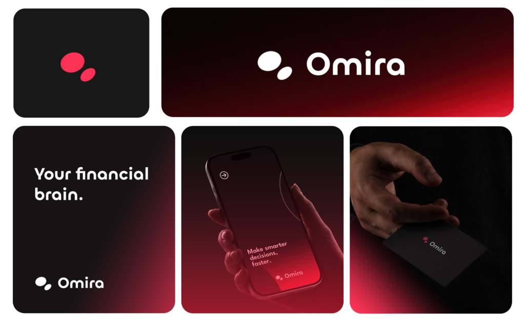
The difference between a startup logo and a scalable brand mark
A lot of tech founders conflate their logo with their brand. They’re related, but they’re not the same thing. Your logo is a single graphic element. Your brand is the entire visual language that carries your company across every surface it will ever appear on, from a 16×16 favicon to a 40-foot conference banner.
This distinction matters because a logo that works in isolation often collapses at scale. You’ll notice this pattern across early-stage SaaS companies: a wordmark that looked sharp in the pitch deck becomes illegible on a dark background, or too detailed to read at mobile size, or too generic to stand apart once you’re in a competitive market with similar typography.
The brands that hold up are built as systems from the start. A full brand identity package includes not just the logo but the color palette, typography, usage rules, and the spacing logic that makes everything feel intentional. That’s what investors see when they look at your deck. Not just a logo, but evidence that someone made considered decisions.
What actually makes a tech logo work at a technical level?
Scalability is the first filter. A strong tech logo works at 16 pixels and at 1600 pixels. This usually means it’s built around a simple, geometric form, with no thin strokes that disappear at small sizes and no decorative complexity that becomes visual noise when reduced.
Monochrome viability is the second filter. If your logo only works in full color, you’re going to have problems everywhere from embossed merchandise to grayscale print to social media avatars. The best tech logos are designed in black first, then color is added as a layer, not a crutch.
The third filter is what designers call semantic clarity: does the visual form communicate something true about the company, or is it purely decorative? This doesn’t mean your logo needs a literal icon of what you do (that approach almost always produces something forgettable). It means the shapes, proportions, and weight of the mark should feel congruent with the category. A fintech company and a consumer gaming app might both want “clean and modern,” but the specific version of that for each is very different.
Understanding logo design principles at this technical level is what separates founders who brief designers well from those who keep restarting projects wondering why nothing feels right.
Every Brandframer package includes the full visual identity system, from the $280 Basic to the $987 BrandFramer 360. No retainer. No surprise invoices. Just a complete brand, delivered fast.
Wordmark, brandmark, or both: how SaaS companies get this decision wrong ?
The default assumption in early-stage SaaS is to start with a wordmark, meaning the company name set in a distinctive typeface, and add a symbol later once the brand has equity. This logic is understandable but often backwards.
A wordmark-only strategy works if your company name is short, distinctive, and phonetically memorable. It struggles when the name is longer, more abstract, or operating in a crowded market where you need a visual anchor that works independently of language.
A brandmark (a symbol or icon) gives you more flexibility across surfaces and scales, but it requires more brand equity before it can stand alone. Most early-stage companies benefit from a lockup, a combination of mark and wordmark that can be used together or separately depending on context.
The choice between these isn’t arbitrary. It should be driven by where your brand actually appears: your app icon, your email footer, your LinkedIn profile, your pitch deck cover. The difference between a wordmark and a brandmark has real strategic implications that most founders discover too late, after they’ve already locked in one direction.
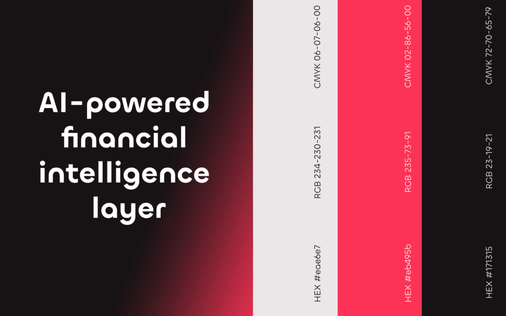
What top SaaS brands understand about color and typography?
Color in tech is about positioning. Blues and cool grays signal trust and infrastructure (think enterprise software). Greens signal growth, sustainability, or finance. Purples and deep jewel tones often signal creativity or premium positioning. Bright accent colors, neons, high-contrast palettes, signal consumer energy and speed.
It’s a starting point for understanding what your color choice is communicating before a word of copy is read.
Typography carries even more weight than most founders realize. The typeface in your logo tells a story before anyone reads the letters. A geometric sans-serif says precision and modernity. A humanist sans suggests warmth and approachability. A sharp, high-contrast serif says premium and established. A rounded typeface says friendly and accessible.
The mistake is choosing a typeface because it looks good instead of because it’s saying the right thing about the company. The two don’t always overlap.
Here’s an honest caveat worth acknowledging: color and type trends move. What signals “premium SaaS” in 2025 may read as dated in three years. The most durable tech brands tend to work slightly against the trend rather than with it, which requires some judgment about where the market is going, not just where it is now.
How to evaluate a tech logo before you commit to it?
Most founders evaluate a logo by looking at it on a white background in a PDF, which tells you almost nothing about how it will actually perform. Here’s a better testing framework.
Put it on a dark background. Then on a photo. Then shrink it to 32 pixels. Then blow it up to full-screen width. Then put it next to three competitor logos side by side. Ask yourself: does it still look like it belongs to a different company, or has it blended into the category?
Then do the hardest test: show it to someone who knows nothing about your company and ask them what kind of product or company it looks like. Not whether they like it. What it communicates. The gap between what you intended and what they perceive is exactly where your brief fell short.
Looking at brand guidelines examples from companies in your category is useful here, not to copy, but to calibrate what “professional” looks like in your specific market.
Not sure which tier fits your stage? Brandframer’s three plans are built around exactly that question: $280 if you need the essentials, $480 if you want the full system, $987 if you want brand strategy included.
When to invest in brand identity?
The “we’ll do branding later” logic costs founders more than they realize. Not in cash, but in opportunity cost. Every investor meeting you take with a weak brand is a harder meeting than it needed to be. Every enterprise sales call where your visual identity signals “early and uncertain” is pushing against you before you’ve said anything.
The argument for waiting assumes that investors and buyers are evaluating your product on its merits alone. They aren’t. First impressions are processed visually before they’re processed rationally. Brand is the frame through which your product is evaluated. A strong frame makes everything in it look better.
The counterargument is real though: there are stages where brand investment doesn’t make sense. If you’re still validating the problem, talking to your first ten potential customers, figuring out whether the market exists, spending money on brand identity is premature. Wait until you know you have something. Then invest before you start closing.
The founders who benefit most from professional brand identity design services are the ones who have found their market and are now trying to scale into it. That’s the inflection point where brand starts doing measurable commercial work.
The 48-hour brand: what serious founders do when they’re ready?
Most brand projects fail for two reasons: they take too long, or they cost too much, or both. A three-month agency engagement produces a beautiful brand system and costs you six months of momentum and a significant portion of your runway.
The founders who move fastest understand something the traditional agency model doesn’t account for: you don’t need six months of discovery and iteration to get a professional, scalable brand identity. You need a team that has done this enough times to move with confidence, and a process that is focused on delivery rather than prolonged collaboration.
If you’ve read this far, you already know more about tech company logo design than most founders who are currently shipping a mismatched visual identity to every channel they own. The next step is straightforward. Brandframer delivers a complete brand identity system in 48 hours: logo, color palette, typography, brand guidelines, and everything your team needs to deploy consistently from day one. Plans start at $280.
